SpinSlider August 15, 2024
This control offers interaction very similar to the SpinBox ( documentation here ). Or in other words, it offers a input box to enter numerical values. Yet, if both minimum and maximum values are desired to be enforced, then this widget will display a slider allowing to set the value through interaction with it.
In the screenshot bellow two instances of the SpinSlider are shown. The bottom one has been setup to enforce both minimum and maximum values to 0 and 100. As a result the slider appears bellow it.

Usage
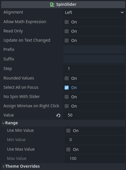
Usage of this control is very similar to the SpinBox. Selecting an instance of the SpinSlider shows the following properties in the inspector:
Bellow are these properties with some explanation.
alignment- Determines horizontal alignment of the numerical input within the box, between left, center or right.
allow_math_expression- When this is off the control will "block" non numerical characters from being added into the input box. When on, however, simple math expressions can be used to set the assigned value.
read_only- Setting this to on has the same effect of
editable=falsein theLineEditor theSpinBox. update_on_text_changed- If this is on then the internal assigned value will be updated at each keystroke in the input box. This can result in some rather finicky behavior and might also clash with
allow_math_expression = true. prefix- Allows adding a "prefix" text that will appear before the numeric value within the input box when it doesn't have focus.
suffix- Allows adding a "suffix" text that will appear after the numeric value within the input box when it doesn't have focus.
step- Determines the minimum "interval" between numbers.
- This can also be seen as a "delta" when interacting with the control through the arrows or slider.
rounded_values- If this is on then values will always be rounded towards its closest integer.
select_all_on_focus- If this is on then the entire numeric value will be selected when the control receives focus.
no_spin_with_slider- If this is on then the arrows will not be shown if the slider is meant to be visible. Or in other words, only the arrows or the slider will be shown, depending on how the
rangeis setup. assign_minmax_on_right_click- When this is on, right clicking the spin arrows will assign either the minimum or the maximum value into the box, depending on the vertical position of the mouse. If the cursor is on the top half, assign the maximum value, otherwise the minimum value. Note that this will occur even if
use_min_valueand/oruse_max_valueis/are disabled. range_use_min_value- If this is enabled then
SpinSliderwill enforce a minimum value. range_min_value- Only used if
range_use_min_valueistrue. When that's the case, attempting to input anything bellow the specified will assignrange_min_valueinstead. range_use_max_value- If this is enabled then
SpinSliderwill enforce a maximum value. range_max_value- Only used if
range_use_max_valueistrue. When that's the case, attempting to input anything above the specified will assignrange_ma_valueinstead.
Dealing with the SpinSlider through code is normally done by simply directly reading or assigning the various properties that are shown above. Yet, there are three functions that I want to mention.
The first one is get_line_edit(). This function returns a reference to the internal LineEdit used for the input. Please, do not delete it otherwise the SpinSlider will fail, most likely resulting in a crash! Obtaining this control is useful when you want to listen to some of the LineEdit events or maybe disable its context menu.
Then there are get_as_ratio() and set_as_ratio(). Those two functions only have meaning if the range_use_min_value and range_use_max_value properties are enabled. When that's the case it provides means to deal with the values through percent values instead, in the range [0..1].
The SpinSlider emits only two signals. The value_changed is emitted when the assigned value is changed. And the value_entered is emitted whenever the internal LineEdit emits text_submitted(). The parameter of this second signal contains the raw string, so possibly not a full numerical value.
Other
The table bellow lists all available theming options for the SpinSlider widget. Remember, overriding any of those is easily done through the Inspector. Creating a Theme resource to customize these elements require manually adding the desired entries within the theme editor. Please refer to the introduction for more information on how to customize the widgets using a Theme resource.
| Style Name | Type | What |
|---|---|---|
normal | StyleBox | Determines the background of the control when read_only is false |
read_only | StyleBox | Determines the background of the control when read_only is true |
focus | StyleBox | Style drawn on top of background when the control has input focus |
grabber | Icon | Directly assigned into the grabber theme entry of the internal HSlider |
grabber_highlight | Icon | Directly assigned into the grabber_highlight theme entry of the internal HSlider |
up_down | Icon | The two arrows placed at the right side of the control |
font_color | Color | Color of the "text" |
font_selected_color | Color | Color of the "text" when it's selected |
font_read_only_color | Color | Color of the "text" when read_only is true |
font_outline_color | Color | Outline color of the "text" |
caret_color | Color | Color of the caret in the input box |
selection_color | Color | Color of the selection highlight |
slider_color | Color | Background color of the internal slider |
slider_ratio | Color | Color of the ratio indicator when the slider does not have highlight (mouse isn't over it) |
slider_read_only_color | Color | Color of the slider when read_only is true |
font | Font | The font of the "text" |
font_size | Integer (font_size) | Size of the font |
slider_height | Integer (constant) | The height of the internal slider |
