ExpandablePanel August 15, 2024
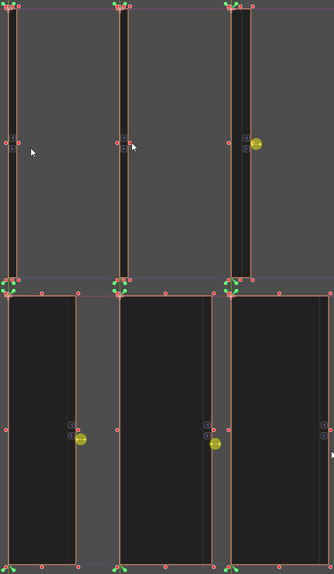
The ExpandablePanel is a widget that attaches itself into one of the four borders of its parent Control. It handles multiple pages of content. The panel can "shrink into the border" or expand into the viewport in order to hide/show the desired content page. The animation bellow showcases the panel in action when it's attached into the top border.
Usage
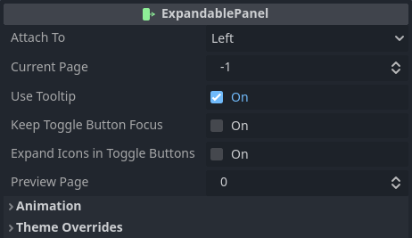
When an instance of the ExpandablePanel is added into the scene it will automatically attach itself into the left border of the parent Control. In this regard note that some (parent) controls might pose some problems. Mostly, any control that takes over the sizing and positioning of its children (box containers as example) will conflict with the expandable panel. Nevertheless, when the empty panel is selected, this will be shown within the Inspector tab:
As you can see, which border the panel is attached to can be defined by changing the border property. This is an option from the enumeration ExpandablePanel.AttachTo, which provides Left, Top, Right and Bottom.
The current_page property determines the index of which "page" will be expanded when the scene containing the panel is loaded. Setting it to -1 simply tells the panel should be shrunk from the beginning.
Enabling use_tooltip allows tooltips to be assigned into "page toggle buttons". The exact text can be defined and it will be shown how to shortly.
The keep_toggle_button_focus flag determines a little bit of the behavior related to the buttons used to toggle the state of the panel. Basically, if this property is off, when a button is clicked its input focus will be released. Depending on the desired behavior it might be necessary to preserve this focus (keeping this on).
Buttons in Godot contain a property named expand_icon under the Icon Behavior inspector category. The expand_icons_in_toggle_buttons is directly assigned into the buttons generated by the "pages" in the ExpandablePanel.
The preview_page property exists only in editor. It indicates the index of a page for easier previewing without messing with the desired default current_page.
Animation and theming will be shown later in this tutorial page. First lets see how to add "pages" into the panel. Whenever a Control is added into the ExpandablePanel it will be considered a "page" and will also generate a "toggle button" for that specific content. Because of that my recommendation here is to add a container (maybe VBoxContainer) or a common panel for each desired page. Alternatively add a scene in which its root is a Control (or anything extending it).
That said, by default the preview page is set to 0. Yet, even after adding a "page" there is a big chance the initial "expanded width" is also set to 0. In editor just expand the width manually, like in the animation bellow. When running the game/app, the final expanded width will match the one set in the editor:

Note that the same setup is also valid for the height in case the panel is attached to the top or the bottom border.
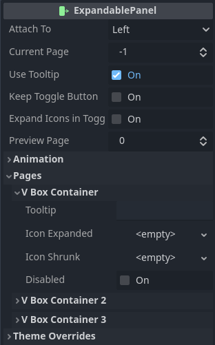
That said, the screenshot bellow shows the inspector once three VBoxContainer instances are added into the ExpandablePanel and not renamed. In it I have expanded the options for the first page.

If you have enabled use_tooltip option then the tooltip property of the page will be assigned into the corresponding toggle button's tooltip. Yet, if use_tooltip is disabled then the tooltip property of the page will be ignored.
The icon_expanded and icon_shrunk texture properties allow customization of the icons that are assigned into the toggle button of the page. If no custom icon is provided then the default arrows will be used.
It's possible to disable the toggle button of a page by setting the disabled property to on. When this is the case, that page will not be able to be shown. However if it's visible, interacting with the toggle button of another page that is not disabled will result in the expandable panel switching the shown page.
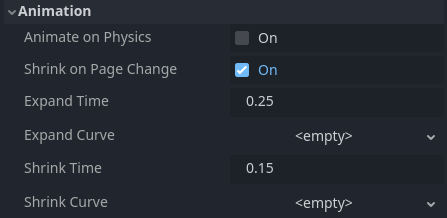
Let's move to the animation. The screenshot bellow shows the Animation category of the properties provided by the ExpandablePanel.
If animate_on_physics is enabled then animation will use _physics_process() instead of _process(). If you want more information regarding the differences I have written about it here .
The shrink_on_page_change property determines the behavior of the panel when attempting to display a page when another one is already shown. Basically, the default (on) is that the panel will first shrink current page then expand again to show the other requested one. Disabling this option will keep the panel expanded and simply switch visibility of the pages.
The duration of the expand and shrink animations can be changed individually by setting expand_time and shrink_time, respectively. These values specify the duration in seconds of the animations.
Finally, Curve Resources can be used to change the behavior of the animations. Assigning a curve to each expand_curve and shrink_curve allows that. The important thing to keep in mind is that the range of the X coordinate of the curve must be [0..1], which is the default one when a new Curve resource is created. Anything outside of this range will be ignored and obviously the result might not be the expected one.
There are a few functions that can be used to manipulate the "page properties" through code. In all snippets bellow the expandable is supposed to be a variable holding a referenced to an instance of the ExpandablePanel.
To enable or disable the toggle button of a page there are enable_page() and disable_page(), respectively. Both functions require a single argument, the index of the "page". I have provided a third function named set_page_disabled() that requires two arguments. The page index and a boolean specifying if the page should be disabled or not. In other words, calling set_page_disabled(1, true) is the exact same as calling disable_page(1).
# Enable page at index 1
expandable.enable_page(1)
# This does the same
expandable.set_page_disabled(1, false)

# Disable page at index 2
expandable.disable_page(2)
# This does the same
expandable.set_page_disabled(2, true)
It's possible to query if page is enabled or not by calling is_page_disabled(). This function requires de page index as sole argument.
# Toggle enabled state of the page at index 0
expandable.set_page_disabled(0, !expandable.is_page_disabled())
The amount of "pages" in the ExpandablePanel can be queried by calling get_page_count(). This function does not require any argument.
The expanded and shrunk icons can be set by calling set_page_icon_expanded() and set_page_icon_shrunk(), respectively. Both functions require two arguments. The first is the page index and the second one is the Texture resource holding the desired icon.
Function set_page_tooltip() can be used to assign the tooltip in the toggle button of the page. This function requires two arguments. The first one is the page index while de second is a String holding the desired tooltip. Remember that if the ExpandablePanel's use_tooltip property is false then the string will not be assigned into the button.
# Change the icons of the buttons related to the page at index 3
expandable.set_page_icon_expanded(3, icon_quests_shown)
expandable.set_page_icon_shrunk(3, icon_quests_hidden)

# Assign the "Quests" tooltip text to the button of the page at index 3
expandable.set_page_tooltip(3, "Quests")
To help react to interaction, the ExpandablePanel emits a few signals.
When the expand animation just begun, the expand_started is emitted. Then when the expand animation ends, the expand_finished is emitted. Obviously, there are the shrink_started and shrink_finished signals, which are emitted when the shrink animation starts and ends, respectively. In all cases a single argument is provided, which is the page index that triggered the event.
Whenever the user clicks a toggle button, the page_button_clicked signal is emitted, providing the page index as sole argument.
Other
The table bellow lists all available theming options for the ExpandablePanel widget. Remember, overriding any of those is easily done through the Inspector. Creating a Theme resource to customize these elements require manually adding the desired entries within the theme editor. Please refer to the introduction for more information on how to customize the widgets using a Theme resource.
| Style Name | Type | What |
|---|---|---|
background | StyleBox | The overall background of the panel, not including the toggle button bar |
bar | StyleBox | The background of the bar holding the page toggle buttons |
button_normalbutton_hoveredbutton_pressedbutton_disabledbutton_focus | StyleBox | Directly assigned into the toggle buttons of each page |
toggle_buttons_separation | Integer (constant) | The spacing between each toggle button |
button_min_width | Integer (constant) | The custom minimum width assigned into the toggle buttons |
button_min_height | Integer (constant) | The custom minimum height assigned into the toggle buttons |


