Accordion August 15, 2024
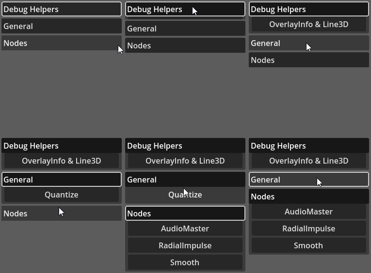
This UI widget borrows its name from web design UI. The basic idea is to create "categories". Each category generates a button. Additional UI elements can be added into each category. Clicking on the corresponding button should show/hide the additional content of that category.

Usage
This plugin adds two new nodes, Accordion and AccordionItem. After adding an instance of Accordion, add into it one AccordionItem for each desired "category". Think about the AccordionItem as a "slot" for the contents to be shown in the Accordion.
When an item is added into the accordion, a button is automatically created. As mentioned, this button is used to toggle the visibility of the contents associated with that "category" (item - AccordionItem). By default the label of that button will be identical to the name of the AccordionItem node. The screenshot bellow attempts to show that:
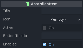
Renaming the node will also reflect the label fo the button. However, what if node naming conventions would "clash" with the desired display label of the button? Think for example when dealing with localization. For that the AccordionItem provides a property. In fact, there are a few other properties that are meant precisely to change behavior and appearance. The exact properties are shown in the screenshot bellow:

The title property is used to change the label of the button.
Buttons in Godot can have icons in them. Assigning an image in the icon property will add it into the button.
The active property tells if the contents in the AccordionItem are meant to be shown or not. Or in other words, toggled on vs toggled off.
The button_tooltip property should be pretty self explanatory, no?
Finally, there is the enabled property. Basically this enables or disables the toggle button. This wont directly change the active property.
The AccordionItem does not have any function other than those used to set/get the properties.
Before moving into the details of the Accordion itself, there is one last thing to consider regarding the AccordionItem. This widget is derived from Container, meaning that its children are automatically distributed. To be more specific, the AccordionItem behaves very similarly to the VBoxContainer. Or in other words, each child will automatically use the full width of the item but will have its height determined by the combined minimum height of the children. What this means is that you don't have to add a container inside of the AccordionItem unless there is a good reason for that. A good example here is the HBoxContainer to create a "line" of widgets.
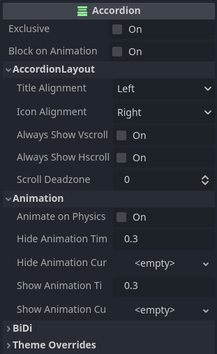
Now lets take a look into the properties of the Accordion:

If exclusive is enabled then a single AccordionItem can be active at a time. The result of that is that if you have one button toggled on then clicking on another "category", the current one will be toggled off while the new one will become visible.
The block_on_animation is there to better control one small problem related to the animation (I will mention it when reaching the animation properties). That said, if this property is enabled then an AccordionItem cannot have its active state changed if it's currently performing an animation.
The title_alignment and icon_alignment should be self explanatory, and apply directly into the toggle buttons' text and icon alignments.
The Accordion is also a container and will display scroll bars if necessary. However always_show_vscroll and always_show_hscroll allow for those scroll bars to be always visible instead of shown only when necessary.
Finally the scroll_deadzone determines the deadzone for touch scrolling. Lower values make the scrolling more sensitive.
Now to the animation. The first property in there is animate_on_physics. If this option is enabled then animation will be processed in the physics iterations instead of the so called "idle frame". If this were scripted, it would reflect _physics_process() vs _process() functions. I have written about this topic and it can be found here .
Setting hide_animation_time to 0 effectively disables the hide animation. Nevertheless, this value specifies how long, in seconds, it should take to hide item contents.
A curve can be used to change the behavior of the hide animation by assigning a Curve resource into the hide_animation_curve property.
The show_animation_time and show_animation_curve behave exactly like the counterparts for hiding.
One important aspect to consider here is related to the curves. Consider the situation in which the animation to show the contents is currently being performed. Then the user clicks the toggle button again. This means that the animation must "reverse" to hide it. Depending on how the curves are shaped, this reversal might not be possible to be smoothly done. That's why block_on_animation has been added, as it will simply prevent the user from attempting to change states when animations are occurring.
If you notice that your assigned curves result in weird animations when toggling on and off in the middle of an already occurring one, then consider either changing the shape of the curves or enabling block_on_animation.
The Accordion also does not contain any function! However it does have two signals, scroll_started() and scroll_ended(). These two events are emitted only when scrolling through touch, not when dealing with mouse.
Other
The table bellow lists all available theming options for the Accordion widget. Remember, overriding any of those is easily done through the Inspector. Creating a Theme resource to customize these elements require manually adding the desired entries within the theme editor. Please refer to the introduction for more information on how to customize the widgets using a Theme resource.
| Style Name | Type | What |
|---|---|---|
background | StyleBox | Background of the Accordion |
content_background | StyleBox | Background of the contents in the AccordionItem |
button_normalbutton_hoveredbutton_pressedbutton_disabledbutton_focus | StyleBox | Directly assigned into the toggle buttons in each AccordionItem |
hscrollvscrollscroll_focusscroll_grabberscroll_grabber_hlscroll_grabber_pressed | StyleBox | Directly assigned into the scroll bars |
font | Font | Directly assigned into the toggle buttons in each AccordionItem |
font_normalfont_hoveredfont_focusfont_pressedfont_hover_pressedfont_disabledfont_outline | Color | Directly assigned into the toggle buttons in each AccordionItem |
icon_normalicon_pressedicon_hovericon_hover_pressed<br/>icon_focus<br/>icon_disabled` | Color | Directly assigned into the toggle buttons in each AccordionItem |
font_size | Integer (font size) | Directly assigned into the toggle buttons in each AccordionItem |
font_outline_size | Integer (constant) | Directly assigned into the toggle buttons in each AccordionItem |
button_space | Integer (constant) | Vertical spacing between each AccordionItem |
inter_space | Integer (constant) | Vertical spacing between controls inside AccordionItem |
