User InterfaceApril 13, 2020(edited August 15, 2022)
This addon is meant to provide custom user interface Control nodes. You can install only the controls that you want to use and activating the addon will make those available for use.
- CustomControlBase: Provides a base for custom controls, "automatically" dealing with the theme system.
- FancyLineEdit: Implements most of the
LineEditcontrol functionality, but allows image rendering as well as some text formatting. - Inventory: Offers two widgets (
InventoryBagandInventorySpecialSlot) bringing an inventory system with several options to customize the behavior. - TabularBox: Brings tabular data viewing and editing.
- ExpandablePanel: Provides a panel that attaches itself to a border of a parent Control that expands or shrinks to show or hide contents.
- SpinSlider: Basically a
SpinBoxthat substitutes the spin buttons by a slider in case a well defined value range is set.
CustomControlBase
As mentioned, this is a base class for custom control implementations within Godot. The idea is to provide means to deal with the theme system while exposing to the inspector the various possibilities to override the theme entries relevant to the implemented Control. The problem that this class attempts to solve follows.
When we try to retrieve a theme object/value, the default behavior is that the control instance will check if there is a valid Theme object assigned to it. If not, it will go recursively through its parents until one is found or the root is reached. If still none is found, the default Theme object is used to retrieve the desired style name with the specified type category.
While this is very interesting for providing really easy means to style an entire application/game by simply applying a theme resource to a parent node, it also imposes a limitation for custom controls, specially when implemented in pure GDScript. The major problem is that we don't have access to the default Theme object in order to insert default entries in it.
Another problem is that if we do like I did in the past (you can see in the FancyLineEdit and the Inventory widgets), which is to create a theme object if one does not exist and create the entries within the obtained theme, then we pollute it with category/values that may never be used. What if we decide the control is not exactly for the project and remove it? The style entries will remain within the theme resource unless we manually clean it up!
This base class attempts to solve this problem while also "automatically" exposing to the inspector the possibility to easily override the style values of a given instance, much like any core Control.
Based on this information it should be clear that this "addon" is primarily meant to those wanting to create new custom Controls with pure GDScript. Any future UI control I release as part of this addon pack will derive from this class. Unfortunately I can't change previous Controls without breaking compatibility so those will remain the way they are, at least until the pack is ported to Godot 4.
As mentioned this class is meant to be used as a base for custom Controls. Basically all you have to do in this case is create a new class extending CustomControlBase:
tool
extends CustomControlBase
class_name MyCustomControl
Notice the fact that I have added the tool keyword at the top of the script. Without this the control wont be drawn when it's added in the editor.
Anyway, when a Control is created extending CustomControlBase there is a single function that must be overridden, named _create_custom_theme(). This function doesn't receive any argument and it should not return any value. It will be called when there is the need to deal with the theme entries relevant to the implemented widget. For that there are a few functions that can be used in order to add those entries with their default values/objects.
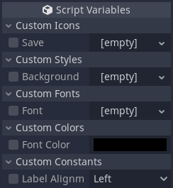
Bellow is the list of those functions and in all cases if the expose argument is set to true (which it is by default) then this base class will automatically expose the registered property into the inspector allowing the user to override the relevant theme entry, much like any core Control in Godot:
| Function | Description |
|---|---|
| add_theme_icon(name, texture, expose) | Use this to add a texture/icon entry within the "internal theme" with the provided name (String). The texture obviously should be a valid resource. |
| add_theme_stylebox(name, style, expose) | Style boxes are used everywhere in Godot's UI system and those provide means to easily deal with rendering of most of the UI. The relevant style should be anything derived from StyleBox. |
| add_theme_font(name, font, expose) | Use this to add font entries within the theme. The object should be a valid font object, either dynamic or bitmap, it doesn't matter here. |
| add_theme_color(name, color, expose) | Add a color entry to the theme. The provided object should be an instance of Color. |
| add_theme_constant(name, constant, expose, enum_string) | This is used to add a simple integer entry within the theme. Note that this can also be exposed as an "enum", that is, edited with a drop down menu. All that must be done in this case is provide the list of options within the enum_string String argument (obviously the expose argument must be true in this case). |
As you can see, all categories of theme entries can be added through any of the add_theme_*() functions. Under the hood the base class will create some data that will allow means to easily obtain those entries, even if those are actually present on a valid Theme object or if those should be retrieved from any override.
All that said, bellow is an example of adding one of each within the function meant to create the theme:
enum Alignment {
	Left, Center, Right
}

func _create_custom_theme() -> void:
	# Add a texture/icon, assuming the file is in the same directory of the custom control script
	add_theme_icon("save", preload("save_icon.png"))

	# Add a style box for the background
	var back: StyleBoxFlat = StyleBoxFlat.new()
	back.bg_color = Color(0.2, 0.2, 0.2, 1.0)
	add_theme_stylebox("background", back)

	# Add a font from a resource within the same directory of the custom control script
	add_theme_font("font", preload("mono.tres"))

	# Add a color
	add_theme_color("font_color", Color(0.8, 0.8, 0.8, 1.0))

	# Finally a constant with three alignment options
	add_theme_constant("label_alignment", Alignment.Center, true, "Left, Center, Right")
Adding an instance of the MyCustomControl class into a scene and selecting it will reveal the following options in the inspector:
Those exposed properties allow easy overriding of the exposed theme entries. Anyway, later on we will definitely want to use those when dealing with custom control, most likely when rendering it. Controls normally offer get_icon(), get_stylebox(), get_font(), get_color() and get_constant() functions, which are meant to retrieve those values/objects from the assigned theme. In all cases we have to provide the name of the entry and the type, which normally is the name of the Control "owning" that style.
Because this base class somewhat deals with the default theme entries in a different way, we have to obtain the desired data using the functions provided there, which just insert a "prefix" before the style category we want to retrieve, like get_theme_icon(), get_theme_stylebox(), get_theme_font(), get_theme_color() and get_theme_constant().
Those functions will attempt to retrieve the desired data using the following order:
- Check if there is an override with the specified name. If so, return it.
- Check if the theme object has the desired object name under the specified type (again, normally the name of the Control). If it exists, return it.
- Retrieve from the "registered" default internal container, as set through the various
add_theme_*()functions. If found, return it. - If the category deals with object, return null, otherwise "0" when the name is not found within any of the objects holding theme data.
All that said, we can use those functions to retrieve the data we registered early and render something, within the _draw() function:
func _draw() -> void:
	# Obtain the "objects" from the theme
	var save_icon: Texture = get_theme_icon("save", "MyCustomControl")
	var back: StyleBox = get_theme_stylebox("background", "MyCustomControl")
	var font: Font = get_theme_font("font", "MyCustomControl")
	var font_color: Color = get_theme_color("font_color", "MyCustomControl")
	var label_alignment: int = get_theme_constant("label_alignment", "MyCustomControl")

	# This label will be rendered - obviously this can be a property
	var label: String = "Save"

	# Use the string to calculate its rendering size - which will be necessary to position it based on the alignment setting
	var txt_size: Vector2 = font.get_string_size(label)

	# Draw the background using the entire control size
	draw_style_box(back, Rect2(Vector2(), rect_size))

	# Calculate center coordinates to draw the save_icon
	var ix: float = (rect_size.x - save_icon.get_width()) / 2
	var iy: float = (rect_size.y - save_icon.get_height()) / 2

	# Draw the icon centered on the Control's area
	draw_texture(save_icon, Vector2(ix, iy))

	# Calculate the X coordinate of the text label based on the alignment setting. By default assume it will be on the left
	var tx: float = 0.0

	match label_alignment:
		Alignment.Center:
			tx = (rect_size.x - txt_size.x) / 2

		Alignment.Right:
			tx = rect_size.x - txt_size.x

	# Draw the label
	draw_string(font, Vector2(tx, font.get_ascent()), label, font_color)
The result of that code looks something like this:
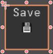
As mentioned, we can easily override any of the theme entries by interacting with the corresponding property within the inspector tab, like in the image bellow:
CustomControlBase - Overriding
Notice something that is a "bonus feature" of this base class. I have purposefully selected the Left alignment option because its value is 0. The default behavior of Godot is that if you attempt to assign 0 as a constant override you actually remove it instead of setting to that value. In here we can use 0 as a valid override value because we have different means to remove them. Besides un-checking the relevant checkbox, we can use code, which will be shown shortly. But before I have to show how to add overrides through code.
The default core Controls of Godot offer the add_icon_override(), add_stylebox_override(), add_font_override(), add_color_override() and add_constant_override(). All of those functions require the name of the style that we want to override then the value itself. For the first 3 functions if we provide null then the override will be cleared. There is no way to clear a color override with the default Godot system. Then, as mentioned, if we provide 0 as the constant override then it will be cleared.
To add an override using this CustomControlBase with have to prefix the category with theme, add_theme_icon_override(), add_theme_stylebox_override(), add_theme_font_override(), add_theme_color_override() and add_theme_constant_override(). The signature of those functions match that of the default Godot, that is, name then value. For the first three cases we can use null to clear overrides, but that's just a byproduct of how those objects work. In any case, we can use any value for constants, including 0, which may very well be a valid override.
OK, but then, how to remove those overrides if we so desire to? Well, I have provided the clear_theme_icon_override(), clear_theme_stylebox_override(), clear_theme_font_override(), clear_theme_color_override() and clear_theme_constant_override(). By providing specialized functions to perform the clearing we are free to use any value for the constants and we actually have one way to clear color overrides!
With the core Controls we can check if a style name exists with one of the has_icon() or has_icon_override(), has_stylebox() or has_stylebox_override() and so on. If you need to perform this kind of check within any CustomControlBase derived widget, then use has_theme_icon() or has_theme_icon_override() and so on.
That's pretty much it on how to use this "addon"!
One important thing here to mention is that Controls require default style values. Instead of polluting a theme resource with those, this class uses various internal containers (Dictionaries), one for each category, icon, stylebox, font, color and constant. In each dictionary the key is the name of the style, while the value is an instance of an inner class named _ThemeEntry, which contains the default style value (style), a flag indicating if the style should be exposed to the inspector for easy overriding, the override value (override) and three other properties (type, hint and hint_string) that are used to expose the properties to the inspector.
Basically whenever we want to add a style, the interface function will directly change the corresponding internal dictionary and create the relevant entry within it. When we want to retrieve a style, the function will first check within the dictionary if the override property is not null. If that's the case then the function return it because there is an override for the requested style. In case there is no override then the default has_*() function is used in order to check if any theme object within the hierarchy has the desired style entry. Finally, if one is not found, just return the style property of the _ThemeEntry instance stored in the dictionary.
Now notice the fact that this class "automatically" exposes those styles into the inspector. To do so this class rely on the _get_property_list(), _set() and _get() functions. I have a tutorial that explains how those work here.
The important thing here is that the _get_property_list() requires us to return an array containing the list of properties that should appear within the inspector. Each property should be represented as a Dictionary within this array, containing the name of the property (as it will be shown within the inspector) and a few other values that will help Godot decide how the property will be edited. Three of those values are type, hint and hint_string, hence why I have added those within the _ThemeEntry inner class.
So, basically, from the _get_property_list() all of the internal dictionaries will be iterated through and data will be used in order to build the array entries required by Godot.
Notice from the _set() function that in the end there is a deferred call to the notification() function. With this we have the opportunity to handle the NOTIFICATION_THEME_CHANGED to force updating the rendering of the Control whenever any override style is changed, even if it's cleared. The deferred is required in order to give some time for the value to be effectively set.
One last thing that I want to talk about is related to the theme creation itself. The basic usage requirement of any derived class is to override the _create_custom_theme() function. It will be called whenever the theme is changed, when the control enters the tree or when the script is initialized. This can be seen in the _notification() and _init() overrides near the bottom of the script file.
FancyLineEdit
This control is meant to be used as input for consoles and/or chat boxes, thus not all of the functionalities of the LineEdit control are implemented in it.
It allows images to be rendered within the box, automatically scaling them based on the used font height. Depending on how the image is built it should result in something that matches the rendered text.
Text can be formatted, that is, colored as well as decorated (bold, italic, underline...).
The basic idea of this control is to configure a few rules that will automatically change how the entered text is rendered.
Creating a new instance of the FancyLineEdit is the same as adding any other node into your scene hierarchy:
Fancy Line Edit Control
This control offers a few properties that can be configured through the inspector and they should be pretty self explanatory. The Raw Text property is basically the input and not necessarily what will be rendered when running the code. In this regard, because the rendering requires some "rules" to be set, images and formatting will not be visible in the editor, only the raw text will be shown.
As mentioned, this control requires a few rules to be configured in order to affect how the input will be rendered. There are two "major types" of rules that can be applied:
- Strict: This is basically an identification set of characters (or word) that must match exactly in order to change the rendering. As an example, ":)" can be set as the identification to render an smiley image.
- Pattern: An starting (and an optional ending character) is indicated and when the internal code parses the input, a function will be called in order to tell if the entered text must be changed or not.
The strict rule should be pretty straight forward and provides the simplest formatting usage to this control. The pattern name is probably a bit misleading, specially if you know regular expressions. Problem is, that's the name I came up with when implementing and changing it afterward would probably be a bit problematic. A better name here would probably be "Dynamic" and if you see this name during this tutorial, please don't be alarmed. Nevertheless, system is a little bit more advanced but provides a lot of control over how things will be rendered.
OK, all that said, let's see in practice how to use the control. First, let's assume we have this control's node named "fancyle" within the hierarchy (this is meant mostly to identify the control in the various snippets of code).
We begin by specifying two simple strict rules, one for ":)" and another for ";)" meant to render an image for each of the rules. This is done by calling the add_strict_image function, which requires 3 arguments. The first one is meant to specify the identification text which, in this example case is either ":)" or ";)". The second argument is a texture containing the desired image to be rendered. The last argument is the color. The snipped bellow sets the rules to render yellow images:
$fancyle.add_strict_image(":)", load("res://smile.png"), Color(1.0, 0.86, 0.39))
$cancyle.add_strict_image(";)", load("res://wink.png"), Color(1.0, 0.86, 0.39))
Then, if the input text is Some text :) with ;) images then it may look something like this:

Image With Text Example 1
Perhaps there is some desire to change the color and underline certain words, still using the strict rule. This can be done with the add_strict_text function, which requires 6 arguments (4 of them are just toggles anyway). The first argument is the identification text and the second one the color. Then, in this order, italic, bold, underline and "anywhere". Of those the "anywhere" requires some explanation. If this is set to true, then the triggering text (the identification - first argument) can occur anywhere in the string (as long as surrounded by spaces), otherwise only if at the beginning.
Important: bold and italic are "decorations" that require the used font to "support it", which is not the case for the default Godot font. So, if you want those things, it will be necessary to set a theme using a custom font then assign it to the control. This will be shown shortly in this tutorial. Underline decoration is font independent, so you don't have to deal with themes.
With all that in mind, let's define two strict words, one that will be rendered in red with underline ("bigword") and another one that will be rendered in green ("niceword"):
$fancyle.add_strict_text("bigword", Color(), false, false, true, true)
$fancyle.add_strict_text("niceword", Color(), false, false, false, true)
And so running with input text Testing bigword and niceword example will look like this:

Simple Format Text Example
Using the "strict formatting" is rather simple and doesn't require much. However, suppose there is the desire to use this control as input for a console, where commands can be entered. Then take advantage of the auto-formatting to display valid commands in green and invalid commands in red, while keeping the rest of the raw text rendering with the default white. With the strict words it's probably impossible to do so. Enter the "pattern" formatting.
The "pattern auto-format" is registered using add_pattern_autoformat() function, which requires 4 arguments. The first argument specifies the character that is meant to "start the pattern" and will trigger the formatting. The second argument is the character meant to end the "pattern" and can be empty ("") if desired. The third argument, if set to true, indicates that the pattern can occur anywhere in the string, otherwise only at the beginning. The last argument is a function reference, that will be called when the formatting is triggered (more on this shortly).
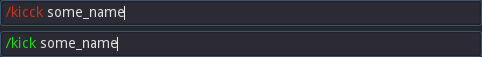
Let's continue with the command example. In this case we use the "/" character to trigger the formatting (meaning, commands must be prefixed with that character). It doesn't make any sense for commands to occur anywhere in the string, so it should be registered to be only at the beginning (setting third argument to false). All that said, registration is as simple as this:
$fancyle.add_pattern_autoformat("/", "", false, funcref(self, "on_autoformat_command"))
How about the on_autoformat_command() function? This receives two arguments. The first one is the word, including starting and characters, that triggered the auto-formatting. As an example, the current registration code with input /something will result in this argument being set to /something. The second argument indicates if the "pattern" has ended or not. Since we opted to register this with an empty ending character this argument can be ignored.
Then this function is required to return an object of the FancyLineEdit.RenderableData type. The addon offers two classes derived from it, TextRenderable and ImageRenderable, which should be pretty self explanatory what they are meant to do, so I won't get into it. Nevertheless, the desired (with the example) is to just change the color of "commands", red for invalid and green for valid ones. That means we have to return a TextRenderable.
Constructing a TextRenderable requires 4 arguments. The first one is meant to indicate the text to be rendered. This means that we could render a text that is different from the input, if so desired. The second argument is the font to be used to render the text. This can be an alternative to use the theme in order to obtain text decorations (italic and bold), however it can lead to inconsistent sizes during the text rendering if the fonts are not properly set (albeit this can be true if dealing with themes). The third argument is the color of the text. Lastly a boolean indicating if the text should be underlined (true) or not (false).
Now, to explain the body of the on_autoformat_command() function. In it we first strip out the starting character of the word in order to obtain the actual command. Then take this value and call a function to tell if the command is valid or not. If true, then assign the green color to an internal variable that assumes the command is invalid (thus, defaults to red). Once that is done, we return a new object of TextRenderable with the proper settings:
func on_autoformat_command(word: String, _is_closed: bool) -> FancyLineEdit.RenderableData:
	# Strip out the starting character from the word
	var id: String = word.substr(1, -1)
	var color: Color = Color(0.8, 0.2, 0.1)    # Assumes invalid command (Red)

	if (command_exists(id)):
		# Ok, the command is valid. Assign green color
		color = Color(0.1, 0.86, 0.1)

	return FancyLineEdit.TextRenderable.new(word, $fancyle.get_normal_font(), color, false)
The following image showcases the result of an invalid command then a valid one:
Invalid/Valid Command Example
For the next example suppose we want the "pattern" :emoji_id: to be used. In this case, the ":" character is used to start and end the pattern. Then, if emoji_id is valid we transform that into an image and if not, render a red underlined text. With an extra thing, if the pattern is not ended, render normally as a white text. We begin by registering the auto formatting:
$fancyle.add_pattern_autoformat(":", ":", true, funcref(self, "on_autoformat_emoji"))
Then we have to implement the on_autoformat_emoji() function. The core of the functionality is based on first checking if the pattern is closed or not. If so, we first strip out the starting and ending characters in order to find out if the specified "emoji_id" is valid or not. Having a valid emoji, then we return an ImageRenderable object, otherwise a TextRenderable object set to render underlined red text. Then, by default, we return a TextRenderable object set to render the text with default font and color.
The ImageRenderable object requires 3 arguments to be built. The first argument is the texture to be rendered. The second argument is a font that will be used to determine the height in order to automatically scale the image. The third argument is the color to modulate the rendered image.
With all that in mind the on_autoformat_emoji() becomes something like this:
func on_autoformat_emoji(word: String, is_closed: bool) -> FancyLineEdit.RenderableData:
	if (is_closed):
		# Strip out starting and ending characters
		var id: String = word.substr(1, word.length() - 2)

		var emoji: Texture = get_emoji_tex(id):
		if (emoji):
			# The emoji is valid. Return it modulated to yellow
			return FancyLineEdit.ImageRenderable.new(emoji, $fancyle.get_normal_font(), Color(1.0, 0.86, 0.39))
		else:
			# The emoji is not valid, but pattern is closed, so indicate that with underlined red text
			return FancyLineEdit.TextRenderable.new(word, $fancyle.get_normal_font(), Color(0.8, 0.2, 0.1), true)

	# If here then the pattern is not closed. Return default text
	return FancyLineEdit.TextRenderable.new(word, $fancyle.get_normal_font(), $fancyle.get_default_font_color(), false)
With this example, if the input is Some :smiler: test with :wink :smile: image, the function will be triggered 3 times. One for smiler, one for wink and another for smile. In the image bellow, smiler is invalid, smile valid and wink incomplete (not closed):

Image With Text Example 2
To end this tutorial I would like to talk about the theme specifically for this control. When you assign a theme resource to an instance of the FancyLineEdit, the theme will automatically be filled with the necessary entries that are specific for this widget. This is valid for either a completely new theme or for one that already exists.
Important: Once the theme entries are added, removing them must be done through code so I would recommend that you first backup at least your theme if you are unsure if this control will indeed be used or not in your project.
After the theme is assigned to the control, clicking the property in the inspector will expand and some settings, including the ones specifically related to the FancyLineEdit control, will be revealed. Alternatively, double clicking the theme resource file that has been assigned to the control will also reveal those settings within the inspector tab:
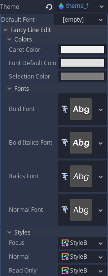
The vast majority of these properties should be pretty self explanatory. The Styles probably require a little bit of explanation. Basically, those are what define how the input box will be drawn. Quoting from the documentation:
StyleBox is Resource that provides an abstract base class for drawing stylized boxes for the UI. StyleBoxes are used for drawing the styles of buttons, line edit backgrounds, tree backgrounds, etc.
This control must be able to render something based on a rule that may not be exactly what is in the input. To help with that, whenever the input text is changed, the value is parsed and it will generate a collection of objects derived from the inner RenderableData class, which is meant to be perform the rendering based on the given data. This is the basic overview of the internal functionality of this UI control.
Because this script extends the Control node, we have the option to implement the _gui_input(InputEvent) function, which is the main user interaction point. If you take a look at this function you will see that I'm relaying the various types of events (mouse button, mouse motion and key) to specialized internal functions. This is meant mostly to help keep the code a bit more readable. Nevertheless, most of the interaction will be based on the various key strokes, which will cause the internal raw_text property to be changed.
There is one inner RenderHelper class that is used to scan input text looking for something that matches the registered rules. Internally there are two instances of this class, one for the raw_text and another for the placeholder text. When either one is changed, the corresponding parser will be triggered.
When no rule is found within the input, the entire text will generate a single RenderableData object, more specifically the TextRenderable. Depending on the rule, one ImageRenderable object may be generated instead. "Pattern" rules will call user function in order to obtain the desired RenderableData object for that rule. At the end of the scanning it's possible the RenderHelper object will be holding a collection of RenderableData objects.
Objects derived from RenderableData must override a few functions and the most important one is the render() function. From the control's _draw() function, the internal collection of RenderableData objects will be iterated through, calling the render() function of each one of them.
The parsing is based on a very simplistic finite state machine and for this case should be enough, specially because there are only 4 states in this design. The scanning occurs character by character, which will determine state transitions. This means that very long strings can hinder the control's performance.
The auto-format rules are stored in the internal _autoformat dictionary, that by itself contains two main "fields", the strict and the pattern. When one of the functions is called to register a new rule, an instance of the inner FormatData class is created and added into the relevant field of the mentioned dictionary.
The FormatData contains information related to what an specific sequence of characters should result in. One thing that may come to mind when first looking into this inner class is that it contains a variable named patt_end but there is no "start". The variable is meant to hold the ending character of a "pattern auto-format", however the starting character is used as key to obtain the correct FormatData instance within the container of registered rules.
Because the rendered contents may differ from the raw text two different indices exist. One that is directly related to the raw text and the other to the rendered. To help understand, :wink: may be rendered as an image and will count as a "single character" when moving the cursor around the control. But the raw text length must be taken in account when manipulating its contents. To that end, there is the _render_index_to_raw() function that converts from rendered index into the raw text index.
Text selection is controlled by an instance of the inner SelectionData class, which contains the starting and ending indices of the selection. Those are "rendering index". The internal variable to controls where the caret/cursor location is also "rendering index". This make things easier to deal with between these two and to perform the rendering. However, when a manipulation is necessary (adding or removing characters into the input string), the raw text (and indices) must be used.
Most of the manipulation of the raw text is performed by the add_text_at() and the delete_selection() functions. The first function takes the "rendered index", convert into "raw index", splits the raw string in two at that point then rebuild it using first part + new text + second part. The second function converts the starting and ending indices of the selection into the "raw index" versions. With those values, the characters are erased from the raw text.
When a character is typed in, or text is pasted into the control, basically this content will be given to the add_text_at() function, using the caret index as the location. When backspace or delete keys are pressed without a selection, internally the control temporarily creates a selection of a single character then call the delete_selection() function.
Copy and paste use functionality provided by Godot, OS.set_clipboard(content) to copy/cut and OS.get_clipboard() to paste. According to the documentation, the clipboard may not be available on some platforms, so keep that in mind.
Inventory
This addon actually incorporates two Control nodes, both derived from InventoryCore (which is not meant for direct usage):
InventoryBagrenders several slots in a grid. The number of columns and rows can be defined as properties from within theInspector. Items can optionally span across multiple columns and rows.InventorySpecialSlot, intended to be used as the slots that represent the used/equipped items. One special slot may optionally be "linked" to another just so "two handed items" can occupy both them. A "filter list" can be created in order to automatically allow/block certain item types.
Some of the features (besides what was already mentioned above) that are available:
- Custom drag & drop system, which allows for a finer control over when and how to start/stop the process.
- Items can have sockets and socketing/unsocketing can be automatically handled by the custom drag & drop.
- Sorting items within the bag.
- Saving/loading inventory state into/from JSON data (binary support is in the TODO).
- Inventory bag can be expanded shrinked without affecting item placement.
- Special Slots can override maximum stack sizes to create specialized storing systems (like stash tabs with increased capacities).
When the UI addon is activated with the Inventory System installed, several new options will be added into the Project Settings window, under the Keh Addons/Inventory category:
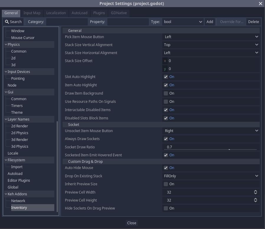
Inventory Project Settings
As you can see, there are several options to change the overall behavior of inventory system. As I go through the tutorial I will mention those settings and at the end of this how to use tab there is a table that can be used as a reference for those options.
The inventory system brings two new controls to be chosen:
Inventory Nodes
OK, technically there are 3 additional nodes, but the InventoryBase is not meant to be directly used, so somewhat "ignore" it. Also, please forgive the rather ugly icons. Anyway, bellow I will got through each node in its own sub-topic.
Before doing that, though, I have to mention something that is basically the "bridge" between this system and any other game code. The important thing that must be kept in mind is the fact that this system is designed to be as generic as possible, being just a visual representation to item data. That said, actual item data must be stored elsewhere. Don't worry though, I explain in this tutorial how those things work and the demo project does contain a very basic "item database" in JSON format.
Nevertheless, most of the interaction with the inventory system through code is done with item data stored in a Dictionary. There are several required fields as well as others that are optional. All of those will be fully listed in a table at the end of this how to use tab so you can use it as a reference. Just know that every time I mention item data dictionary I'm referring to this information set.
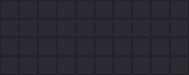
InventoryBag
Once an instance of the bag is added into the scene, the default one will already be rendered:
Also, a few options are available from the Inspector:
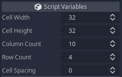
The first two properties (Cell Width and Cell Height) are meant to specify the size in pixels of each slot. Note that if you provide a custom theme, this value does not need to match the texture being used as the image will be scaled to the specified size.
Then the Column Count and Row Count are used to specify how many columns and rows are desired to be available within the bag. As mentioned before, you can add/remove columns/rows through code while keeping any stored items in their current locations!
Finally, the Cell Spacing is used to determine how many pixels will be added between each slot within the bag.
Once the properties have been set to the desired values, the rest is pretty much done from code.
InventorySpecialSlot
The special slot is handled in a different way, in the sense that it is designed to be, primarily, the widgets used to represent equipped items. That said, if the game does contain items that span across multiple cells, the special slot must be as big as the biggest item, but it if a smaller item is added into it, the rendered icon will be centered.
With that in mind, the several additional options can be explained:
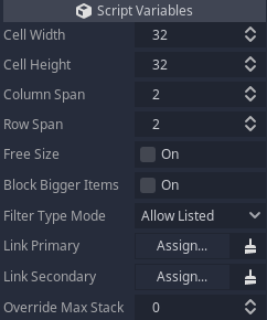
The cell width/height are somewhat directly linked to the column/row span properties. While Cell Width and Cell Height determine the size in pixels of "each cell", Column Span and Row Span determine how many "cells" are there within this special slot. Please note that this will still be rendered as a single slot, it just determines how things are rendered and maybe how the slot will behave. To help understand, the default values of those properties will result in a slot that is 64x64 pixels allowing items that can span through 2 columns and 2 rows when stored within an InventoryBag control.
The Free Size property is still in the TODO list. Regardless, this property is meant to untie cell width/height from the column/row span. In away, if you enable this property you can freely resize the special slot, basically making the code "ignore" the specified width and height values.
The Block Bigger Items property is meant to make this slot a bit more restrictive related to what can be stored in it or not. Basically, the default value (false) allows items that span more columns/rows than the configured Column Span and Row Span, however the result will be a shrinked item icon just so it fit the slot.
The Filter Type Mode can be set to either Allow Listed or to Deny Listed. Basically a "filter list" can be created by adding item type ids into it. If the mode is set to Allow Listed then trying to drop an item type that is not in the list will simply be blocked. If the property is set to Deny Listed then the item will be blocked if its type is in the list. Another way to think about this is that the internal list will be treated as white list (Allow Listed) and black list (Deny Listed).
The next two properties, Link Primary and Link Secondary are meant to allow special slots to be linked to each other. Think, for instance, main hand and off hand. In the main hand special slot you would then assign the off hand into the Link Secondary property. Once you do that, the script will automatically set the Link Primary property of the off hand widget. Note one important thing here is that it's not possible to create a "chain linking", meaning that only two slots can be linked to each other.
Another important thing. When two slots are linked, only in editor some additional rendering will be done in order to help determine the linking status. More specifically, a green frame will be rendered around the primary slot while a red frame will be rendered around the secondary slot. Also, a line will be drawn from the primary slot into the secondary:
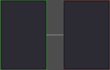
Special Slot Linking
This extra visual information will not be rendered when running the game.
Now, to the last property of the special slot, Override Max Stack. This property allows items stored within this slot to override the specified maximum stack size. An example of where this would be useful is if you wanted to create a special stash tab where each slot is meant to hold a specific item on a much larger (or smaller) stack size than it would usually be. Setting this value to 0 effectively "disables" this feature on this slot.
Adding Items
Now that you know the basics of each control and have setup the desired layout you obviously want to add items into the inventory. That is mostly done through code. Both widgets provide the function add_item(). On both cases you must provide a "single" argument, which is a dictionary containing the item data (as mentioned before, detailed information related to this data is given in a table at the end of this how to use tab).
Once returned, the provided dictionary will have the stack field modified and will hold the remaining stack, meaning that if it's set to 0 then the entire stack was added into the inventory container.
When adding a stacakble item into the InventoryBag the stack may potentially be split into multiple locations. Because of that this version of the function will return an array where each entry is a dictionary with three fields, column, row and amount. The first two fields indicate the location where the item was added and the third field tells how much of the stack was added into that spot. Please remember, the add_item() function on the InventorySpecialSlot does not return any value, only the bag version does that.
Another specific thing related to the InventoryBag is that you can add column and row fields into the item data dictionary, which are meant to specify the exact cell where the item is meant to be stored at. If the item spans across multiple columns/rows, then this cell should correspond to the top-left section of the item. If those two fields are not given then the script will try to find a location to store the item at, beginning with any possible existing stack of the same item.
Provided the default settings were not changed, clicking the added item with the left mouse button should pick it from the inventory container. Moving this dragged item around should highlight the slots that would be occupied if dropping the item on that spot. This automatic highlighting can be disabled from the project settings by simply un-ticking the Slot Auto Highlight setting. If the item is dragged above another one, that placed icon will also get a highlight indicating that a "swap" can be triggered, provided the dragged item can indeed be dropped in there. Or if dragging above multiple items, those will be marked with a "can't drop here" highlight. This item highlight can be disabled with the Item Auto Highlight setting.
For a practical example, we will add a stack of 3 potions, with desired maximum stack of 20, into an inventory bag at column 1 and row 2. Remember that at the end of this how to use tab there are detailed information regarding the item data dictionary.
Another thing, within this example some things are hard coded just to make things simpler, but ideally most of the values would be retrieved from a database. I will comment about that later in this tutorial.
# Add stack of 3 potions into the bag
var idata: Dictionary = {
	"id": "healing_potion1",
	"type": ItemType.Potion,
	"icon": load("res://textures/potion_healing1.png"),
	"stack": 3,
	"max_stack": 20,
	"column": 1,
	"row": 2,
}
$some_bag.add_item(idata)
Removing Items
When an item is picked from the inventory container it is automatically removed from it. However, maybe there is a desire to remove the item through code. Think for example a hot key used to drink a buff potion. In this case, the InventoryBag provides the remove_item_from() function, while the InventorySpecialSlot provides the remove_item(). The arguments are slightly different.
The remove_item_from() requires 3 arguments. The first two are the column and row where the item is stored at. The last one is the amount of that item to be removed. If given -1 then the entire stack will be removed. If no item is found at the specified spot then the function will silently do nothing, so you should ensure there is something to be removed.
As for the remove_item() function only one argument is required, which is the amount to be removed. Again, if -1 is given then the entire stack will be removed.
Now let's remove a single potion from the stack we added on the previous topic. Let's also assume the potion was not moved, so it is still at column 1 and row 2:
$some_bag.remove_item(1, 2, 1)
Picking Items
By default left clicking an item will pick it from the inventory. The button can be changed from the project settings window through the Pick Item Mouse Button setting. It can even be set to None, which will basically disable the automatic handling of item dragging. That is meant so you can manually deal with this task, from code. That said, to programmatically pick an item, the InventoryBag provides the pick_item_from() function while the InventorySpecialSlot provides pick_item().
The pick_item_from() requires 3 arguments. The first two are the column and row where the item is stored at. The last argument is the amount to be picked. If -1 is given, then the entire stack will be picked. If no item is found at the given spot then the function will silently do nothing.
The pick_item() only requires the amount to be picked. Again, if -1 is given then the entire stack will be picked. Well, sort of. Remember that I mentioned early that special slots can override the maximum stack size? Picking items from the inventory cannot go above the maximum value specified through the item data dictionary. To better picture this, suppose there is a special slot inside a stash tab meant to store a crafting material. When you add it to the inventory you want the player to be able to carry at max 30 of that item on each stack. But when storing into the stash tab you want to allow 9000 of that item to be stored there. Even if the stored stack is at 9000, picking from it will only retrieve 30 because it is the specified maximum stack size.
For a practical example, let's pick a single potion from the stack we have added before:
$some_bag.pick_item_from(1, 2, 1)
Note that once this is done, the custom drag & drop operation will start.
Get Item Data
If needed you can obtain an item data dictionary corresponding to one that is stored. For that there is the get_item_data() function.
In the case of the InventoryBag it requires 3 arguments. The first two are the column and row where the item is stored at. Then, a boolean indicating how you want the resources to be stored within the dictionary. If set to true then resources will be given as strings indicating their paths. Otherwise those will be the actual resources.
As for the InventorySpecialSlot, only that boolean argument is required.
If there is no item on either the specified column/row or in the special slot, then the returned dictionary will be empty. Remember, the contents of this dictionary are fully described in a table at the end of this how to use tab.
To better explain the "resource as path" argument. Suppose our potion stack is still on column 1 and row 2.
var idata1: Dictionary = $some_bag.get_item_data(1, 2, true)
var idata2: Dictionary = $some_bag.get_item_data(1, 2, false)
print(idata1.icon)
print(idata2.icon)
This would output (please note that the number after StreamTexture will most likely be different because it represents the resource ID):
res://textures/potion_healing1.png
[StreamTexture:1389]
Changing Item Data
There are several item state values that can be assigned when adding them into the inventory, as fields in the item data dictionary. But what if it's necessary to change something after they are already in the inventory? There are several functions meant to update a single placed item. Bellow I comment on each one of those functions, which are available with the same name on both the InventoryBag and InventorySpecialSlot widgets. The main difference is in the argument list, where the InventoryBag will always have column and row, respectively, as the first two arguments. With that in mind, in the list bellow I will only mention the special slot version mostly to focus on the arguments that are common to both widgets simply because they are meant to do the same thing.
Nevertheless, the column and row arguments should already be known as they are meant to indicate where the item is stored at within the inventory bag. Finally, on all cases, if there is no item at the given place (or special slot) then the functions will silently do nothing.
set_item_datacode(dcode: String)
While there is no "public" interface to change an item's ID or Type after it's placed, the data code field can be changed with this function. The main reason one would want to do that is that the data code may contain some information regarding the item generation, specially if it contains random stats. And then maybe a crafting system might result in some changes that would affect the data code.
set_item_enabled(enabled: bool)
This function can "enabled/disable" an item. By default it will only change how the item is rendered (use a darker color modulation with a bunch of transparency). In other words, if you disable the item (enabled = false) it will remain interactive, that is, will still respond to the mouse events. This behavior can be changed by disabling the Interactable Disabled Items option from the Project Settings window.
set_item_background(tex: Texture)
Items can optionally have background textures assigned to them. Note that the rendering of those background images must be enabled from the project settings through the Draw Item Background option, which is disabled by default.
set_item_material(mat: Material)
One thing that I didn't mention is that when items are created through the inventory system they become internal Controls. That means those can have their own materials assigned to them. Shader wizards can create some rather interesting effects to morph how those items will be drawn. Just keep in mind that they require either a Shader Material or a Canvas Item Material, just like any other Control in Godot. Also there is an official tutorial on this subject.
set_item_sockets(socket_data, columns, block_if_socketed, preserve_existing)
As mentioned, items can have sockets. The socket_data argument must be an array containing the necessary information to create the sockets in the item. Each entry must be a dictionary. The contents of each will be fully described in a table at the end of this how to use tab. Just know that currently the sockets will be "distributed" through the item icon by equally spacing them while using the specified number of columns.
If columns is not normally provided when creating the item then it will default to be the same as the column span of the item. That said, if -1 is given as columns argument then it will preserve current value.
If the block_if_socketed argument is set to true then the function will not change anything if at least one of its sockets contains an item.
Finally, the preserve_existing argument controls how the change will be performed. If it give with the default value (false) then all sockets will be set to be equal to the given array data. However, if this is set to true then the existing sockets will not change. Well, sort of. If the array data is bigger, the additional sockets will be added matching the extra entries in the array, however the existing ones will not change at all. However, if the given array is smaller, then sockets will be removed until the amount matches the given array, while still not changing the remaining sockets.
morph_item_socket(socket_index, socket_data, block_if_socketed)
Instead of dealing with a socket data array, you can change a single socket in the item with this function. The socket_index indicates which socket should be changed. Note that it is 0-based indexing.
The socket_data is a dictionary representing what the socket should "morph to". Remember that the expected contents of this dictionary will be fully described at the end of this tutorial tab.
Finally, if the block_if_socketed argument is true then the function will simply do nothing if the socket in question is not empty.
Socketing An Item
With the default settings it is rather easy to add an item into a socket by just drag (or rather pick) and dropping it into the socket. Still, it is possible to this operation through code with the function socket_into(). As it was with several other functions, the major difference between InventoryBag and InventorySpecialSlot is that the bag version contains column and row arguments before the other two that are common to both widgets. So in here I will focus on those two common arguments because by now you should already know what column and row are meant to do, right?
The first common argument is the socket_index. This is a 0-based index that points to which socket the item must be added into.
The other common argument is an item data dictionary. Its format is the exact same as the one described at the end of this tutorial tab! The most important thing here is that both socket and item have a property named socket_mask. This mask is rather important to understand the socket system so here comes a brief explanation of how it works.
The overall idea is that the mask should be seen as a bit masking. This is how the system can handle multiple types of sockets which could be setup to accept just certain types of socketable items.
To better help here, you could setup a socket type meant to receive only sapphires, another socket type to receive only rubies and so on. In this case you could set the first bit to be for sapphires and the second bit for rubies. A generic socket meant to allow both gems could be created, by just setting both bits. When a socket is created, if no mask is given it will default to all bits being set, meaning it will accept any socketable item.
Now, when an item is created, if no socket mask is given it will default to 0. A mask with this value means that this item cannot be inserted into any socket. In other words, you can consider an item with socket mask equal to 0 to be non socketable.
When trying to socket an item, both masks (item and socket) will be compared and if there is no match, the socketing will be denied.
Considering all of that, this system gives the possibility to have up to 32 socket types.
Some people may have noticed that you use a full item data dictionary to socket an item. In theory that would mean that you can create socketable items that can also receive sockets. To avoid problems I have added code to prevent socketable items (those with non zero socket masks) to also have sockets. The system will also "spit out" a warning message if you try to create an item that can be socketed and also have some socket data.
Slot Highlight
Early I mentioned about automatic slot highlighting, which can be disabled from the project settings window. Still, you can manually set the slot highlight. Even if the automatic highlighting is enabled, manually highlighting will basically "block" the automatic system, meaning that the priority is given to manual highlight setups.
The highlight type is controlled by a value from the InventoryCore.HighlightType enum, which have the following options:
- None → Render the slot without any kind of highlight.
- Normal → By default just a darker version of the slot (through color modulation).
- Allow → By default this highlight modulates the slot to green.
- Deny → By default this highlight modulates the slot to red.
- Disabled → This option is not used by the automatic highlighting system, but it does have a special use case.
To change the slot highlight there is the set_slot_highlight() function. Again, the InventoryBag version requires two arguments (column and row) before the common one, which is a value from the mentioned enum specifying which highlight type to be set.
The brief description of each highlight type mentions that the Disabled does have a special use case. Indeed, changing the highlight type is basically a way to specify which style should be picked from the theme in order to render the slot. By default a slot that is set to this highlight will block items from being placed there. This behavior is controlled by the Disabled Slots Block Items option from the project settings window (again, by default it is set to true).
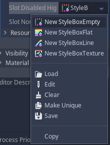
Disabling slots have an interesting use case in the sense that you could create oddly shaped inventory bags. To achieve this, change the Slot Disabled Highlight option within the bag theme to be a StyleBoxEmpty. It is provided as one of the options:
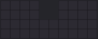
For a practical example, suppose the bag is with the default column count (10) and default row count (4). Also suppose this bag is referenced by a variable named bag. The desired is to remove 4 slots, on the first two rows at the two central columns. The following snippet achieves that:
$bag.set_slot_highlight(4, 0, InventoryCore.HighlightType.Disabled)
$bag.set_slot_highlight(5, 0, InventoryCore.HighlightType.Disabled)
$bag.set_slot_highlight(4, 1, InventoryCore.HighlightType.Disabled)
$bag.set_slot_highlight(5, 1, InventoryCore.HighlightType.Disabled)
Because of that empty style box, the bag will be rendered like this in game:
Another interesting use case for disabled slots would be to create an inventory bag that begins at a small size but as part of the progression the player could buy more space. Those disabled slots could be rendered in a way (again, controlled by the style box within the theme) to serve as a clue to the player that the inventory can be expanded.
Item Highlight
Items can also have highlights. Those can be set through the set_item_highlight() function. The argument common to both bag and special slot is the highlight type. Remember, the bag version have two arguments before the type, that are column and row, specifying where the item is stored at.
The highlight type here have the exact same coding from the enum mentioned in the previous topic. The major difference here is that the default styles used for those highlights are frames that result in a border to be drawn around the item icon.
There is one other very important thing to mention here. In a previous topic I have shown that you can enable/disable items with the set_item_enabled() function. That function will not change the highlight because it is meant, primarily, to deal with the color modulation of the item as well as possibly blocking the item from receiving player interaction. The highlight, however, can be used to add some extra rendering effect to disabled items, through some kind of frame or something like that. In other words, specifying the disabled highlight type is not a different way to disable items within the inventory.
Saving/Loading State
Currently the way to store/load the inventory state is to use JSON format. It's in the TODO list the possibility to save/load the state into/from binary data.
Saving the state is actually something that must be done as part of the game code, however the Control widgets do provide the JSON formatted data in a way that can be easily retrieved and loaded at a later moment. That said, the function get_contents_as_json() is provided. It requires a single string argument on both versions, bag and inventory slot, indicating which indentation should be used to format the JSON data. The returned value a String that holds the container contents.
Calling this function on a special slot will return a string that has the following format:
"SpecialSlotNodeName": { ItemData }
However, if this is called on a bag, the returned string will be in the following format:
"BagNodeName": [ {ItemData1}, {ItemData2} ... ]
For a practical example, assume there are 2 special slots that are saved on variables named special1 and special2, then there are two bags on variables named bag1 and bag2. The following snippet creates a file the writes contents of the slots and bags into it:
var file: File = File.new()
if (file.open("PATH_TO_THE_SAVE_FILE", File.WRITE) != OK):
	# Ideally some error message should be displayed
	return

# Ensure the file will be holding a "dictionary"
file.store_string("{")
# Store the contents of the two special slots
file.store_string(special1.get_contents_as_json())
file.store_string(special2.get_contents_as_json())
# Now the bags
file.store_string(bag1.get_contents_as_json())
file.store_string(bag2.get_contents_as_json())
# Close the dictionary
file.store_string("}")
Now that there is a file storing the inventory state, to restore it the function load_from_parsed_json() is provided. It requires a single argument on both version, bag and special slot, which is the retrieved JSON data. There are a few very important things to note here:
- The function on the special slot requires a
Dictionarywhile the bag version requires anArray. If you take a look at the format that is returned by the save functions, it should make sense. - Based on the previous bullet, it should be clear that what the load functions require are the values assigned to the keys (which are the node names) instead of the entire
"node_name": "value".
The following snippet is a short example of how to load the data from the saved file, assuming the special slots and bags are cached on the same variables of the previous snippet:
var file: File = File.new()
if (file.open("PATH_TO_THE_SAVE_FILE", File.READ) != OK):
	# Ideally some error message should be displayed
	return

var jpres: JSONParseResult = JSON.parse(file.get_as_text())
# File is not needed anymore so close it
file.close()

if (jpres.error == OK && jpres.result is Dictionary):
	# Retrieve data for the special slots
	special1.load_from_parsed_json(jpres.result.get(special1.get_name(), {}))
	special2.load_from_parsed_json(jpres.result.get(special2.get_name(), {}))
	# Retrieve data for the bags
	bag1.load_from_parsed_json(jpres.result.get(bag1.get_name(), []))
	bag2.load_from_parsed_json(jpres.result.get(bag2.get_name(), []))
There is a detail on this snippet that maybe require some comment. To begin with, remember that the result property of the JSONParseResult is normally either a Dictionary or an Array, depending on how the JSON is actually formatted. For more info on this, refer to the documentation.
In this specific case the expected is to have the result to be a Dictionary. And based only on the saving snippet, the dictionary should have only 4 entries, with keys matching the names of the nodes. Thus, when trying to retrieve the value from the result the dictionary with the get() function the node's name (get_name()) is being used.
The dictionary get() is used instead of directly accessing the key because it allows us to specify a default value in case the key does not exist within the dictionary. An example of a case where it can occur is if a game update incorporates new slots or bags and the player is loading an older save game.
Finally, to end this topic it's important to mention that the snippets shown are not taking into account the fact that inventory bags can have their sizes (number of columns and rows) changed. If the games does use the size changing feature it's very important that this information also becomes saved with the items. Then, when loading, the size becomes restored before the items.
Bag Specific
Up to this moment I have only mentioned functions that are common to both the inventory bag and the special slot, with the major difference normally being only on the argument list. Now I mention the functions that are exclusive to the inventory bag.
mass_highlight(funcref, res_as_path)
While you can individually highlight items, this function is meant to basically streamline the process. What this does is call the given function reference for each stored item within the bag. That function will get the corresponding item data dictionary as argument. If the res_as_path argument is set to true then all resources will be given as paths inside the data dictionary. This behavior has already been mentioned before in the Get Item Data topic.
The function that is called must return a dictionary. Bellow I list the options that can be used, just remembering that every single one is optional. If not given I mention what will be used as default value:
→ item_highlight: The highlight type that will be assigned to the item. By default it will be set to InventoryCore.HighlightType.None.
→ slot_highlight: All slots occupied by the item will receive this highlight type. By default it will be set to InventoryCore.HighlightType.None.
→ enabled: If set to false then the item will disabled, as if the set_item_enabled() was called with false. The default is true.
→ material: Specifies the material that will be assigned to the item, as if calling the set_item_material() function.
As you can see, this function can be used for something beyond just highlighting the items!
clear_all_slot_highlight()
This can be used to quickly clear all slot highlighting. This includes those that are automatically set.
find_first(type, id, datacode)
Find the first stored item that matches the given type (integer), id (string) and datacode (string). The returned dictionary contains two fields, column and row. -1 will be assigned on both fields if no item matching the criteria is found. The datacode argument defaults to an empty string, meaning that if this property is not in use on the project it can be completely ignored when using this function.
find_spot(item_data, vertical_scan)
This function can be used to find a spot that can fit the given item data. If the item is stackable and the inventory contains existing stacks with remaining space, those will have priority over the scanning. That said, if there are no stacks (or item is not stackable), then the slots will be scanned. If vertical_scan is set to true, then it will perform the scanning as top-to-bottom then left-to-right. Otherwise, it will be left-to-right then top-to-bottom. The following image should somewhat depict that:
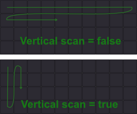
The return value is a dictionary that will be empty if no spot is found. Otherwise, it will contain two fields, column and row.
sort_items(bigger_first, vertical)
Stored items within the bag can be sorted. The first thing that is compared when going through the items is their size. That said, if bigger_first is set to true then the bigger items will be placed before the smaller ones. Then, if vertical is set to true then the items will be distributed by first top-to-bottom then left-to-right. Otherwise, left-to-right then top-to-bottom.
Before moving to the next function, the priority used to perform the comparison when sorting the items is item size, item type then item id. Currently there is no way to use custom sorting but it is in the todo list.
get_items_of_type(type, include_position, resource_as_path)
Returns an array of all items of the specified type. Each entry is a dictionary containing the item data. If include_position is set to true then within each item there will also be column and row fields, specifying where that item is stored at. And, if the resource_as_path is set to true, then the resource fields (texture, materials etc) will be given as paths rather than the resources themselves.
get_contents_as_dictionaries(include_position, resource_as_path)
This function returns an array where each entry is a dictionary containing the item data corresponding to each stored item. If include_position is set to true then within each item there will also be column and row fields, specifying where that item is stored at. And, if the resource_as_path is set to true, then the resources (textures, materials etc) will be given as paths instead of the resources themselves.
can_add_columns(amount)andcan_add_rows(amount)
As mentioned early, the inventory bag can be expanded by adding rows and or columns. But obviously there is a limit. To be more exact, you can have up to 65.535 columns and that same value for rows. That said, you can check if you can add amount columns or rows by calling one of the mentioned functions, which will return true if there is still enough "room" to expand the bag.
add_columns(amount)andadd_rows(amount)
Then you can add amount columns or amount rows by calling the mentioned functions. If there are items in the inventory, those will not change their positions.
get_column_remove_count()andget_row_remove_count()
Those functions are used to retrieve the maximum amount of columns and rows, respectively, that can be removed from the bag. Those values take into account items that are stored within the bag and correspond to the values that can be used without resulting in items becoming "outside of the bag".
remove_columns(amount)andremove_rows(amount)
Can be used to remove columns and rows, respectively. To prevent any problem if amount is bigger than the maximum number of columns/rows that can be removed from the bag, then the function will silently do nothing. And if amount is negative then the function will remove the maximum amount that can be done. That said, item placement will not be affected.
Special Slot Specific
The InventorySpecialSlot also contains functions that are exclusive to this widget. In here I mention them.
add_to_filter(item_type)
This function is used to add an item type into the filter list of the special slot. Remember that the behavior depends on the Filter Type Mode property. Nevertheless, the item_type is just an integer that is used as part of the item identification.
is_filtered(item_type)
Returns true if the given item type is part of the filter list in the special slot.
remove_from_filter(item_type)
If for some reason you don't want a given item type to be part of the filter list anymore then you can use this function to do so.
set_filter_function(object, function_name)
Optionally you can set some extra filtering to the special slot. Basically this assigns a function (function_name) that is in the given object that will be called whenever the filter is necessary. That function will receive the item data dictionary as argument and must return true if the items is meant to be allowed within the slot. Note that the function will only be called if the item type filtering has not blocked before.
Special Slot Linking
As mentioned at the introduction of this "sub-addon", special slots can be linked in order to allow "two handed weapons" to occupy both linked slots. The actual slot linking has already been shown when describing the widget properties that can be edited from the Inspector. However, item data require some extra setup in order to make use of this feature, which is basically just an extra number, obtained from the InventoryCore.LinkedSlotUse enum.
Aside from the default None that is assigned to each item when requesting to create the item through the add_item() function, there are only two options:
SpanToSecondary→ If this is set then the desired is to make the item occupy mainly the primary slot while spanning into the secondary slotSpanToPrimary→ This is the reverse of theSpanToSecondary.
Then, to make a two handed weapon be placed on the main hand and also occupy the secondary slot, one just have to set the linked field in the item data dictionary. For a practical example:
# Add a two handed weapon, 2 columns wide, 3 rows "tall", that spans into the secondary slot if dropped into a special slot
var idata: Dictionary = {
	"id": "fighting_stick",
	"type": ItemType.TwoHanded,
	"icon": load("res://textures/fighting_stick.png"),
	"column_span": 2,
	"row_span": 3,
	"linked": InventoryCore.LinkedSlotUse.SpanToPrimary,
}
$some_bag.add_item(idata)
Note that in this snipped the item was actually added into a bag. This is on purpose. The idea here is to showcase that the item data provided to the addon is merely telling how the system should handle the item. So, if the item is picked from this bag then dropped into a special slot, the item will be placed on the primary slot and will also occupy the secondary one. Even if the item is dropped into the secondary slot.
Changing and Retrieving Settings
Most of the project settings can be changed from code. The settings that affect the rendering will immediately update the drawing. There are two things to be kept in mind here, and those are somewhat related to the "same issue".
- When you want to change a project setting you will need to do so by using any instance of either
InventoryBagorInventorySpecialSlot. There is no need to call the desired function on each existing instance. - Retrieving settings cannot be done when the tree is being initialized (
_ready(),_init()and so on during scene loading). Although if you need to obtain those values as part of the initialization, like setting up a GUI window to show current settings, you can create a separate function specifically to do this task and defer the call to it from within the_ready()function.
Those two details are somewhat related to how the system works internally and if you are interested in knowing why this is the case, it is explained in the how it works tab.
OK, there is a third detail, but it is completely different. Settings that are changed through those functions will not persist. In other words, if it is desired to offer options to the players it is necessary to manually deal with saving/loading the settings.
Again, please remember:
Those functions must be called from an instance of either
InventoryBagorInventorySpecialSlotbut there is no need to call them for each instance in your scene/game.
That said, I will only list the functions (set/get) and which setting is affected (albeit they should be pretty self explanatory). What those settings do are explained in the Reference - Project Settings topic.
set_pick_item_mouse_button(button: int)andget_pick_item_mouse_button()=Pick Item Mouse Button. From code you can assign anyBUTTON_*value but obviously it only makes sense if you put mouse buttons in there.set_unsocket_item_mouse_button(button: int)andget_unsocket_item_mouse_button()=Unsocket Item Mouse Button. The same note from the previous functions, related to theBUTTON_*values.set_stack_vertical_align(align: int)andget_stack_vertical_align()=Stack Size Vertical Alignment.set_stack_horizontal_align(align: int)andget_stack_horizontal_align()=Stack Size Horizontal Alignment.set_stack_size_offset(offset: Vector2)andget_stack_size_offset()=Stack Size Offset.set_slot_autohighlight(enable: bool)andget_slot_autohighlight()=Slot Auto Highlight.set_item_autohighlight(enable: bool)andget_item_autohighlight()=Item Auto Highlight.set_draw_item_background(enable: bool)andget_draw_item_background()=Draw Item Background.set_interactable_disabled_items(enable: bool)andget_interactable_disabled_items()=Interactable Disabled Items.set_disabled_slots_block_items(enable: bool)andget_disabled_slots_block_items()=Disabled Slots Block Items.set_always_draw_sockets(enable: bool)andget_always_draw_sockets()=Always Draw Sockets.set_socket_draw_ratio(ratio: float)andget_socket_draw_ratio()=Socket Draw Ratio.set_socketed_item_emit_hovered_event(enable: bool)andget_socketed_item_emit_hovered()=Socketed Item Emit Hovered Event.set_auto_hide_mouse(enable: bool)andget_auto_hide_mouse()=Auto Hide Mouse;set_drop_on_existing_stack(mode: int)andget_drop_on_existing_stack()=Drop On Existing Stack. Should be a value from theInventoryCore.DropModeenum.set_inherit_preview_size(enable: bool)andget_inherit_preview_size()=Inherit Preview Size.set_preview_cell_width(width: int)andget_inherit_preview_width()=Preview Cell Width.set_preview_cell_height(height: int)andget_preview_cell_height()=Preview Cell Height.set_hide_sockets_on_drag_preview(enable: bool)andget_hide_sockets_on_drag_preview()=Hide Sockets on Drag Preview.
Item Database
Up to this point I have hard coded some information that must be given to the inventory system in order to create the items. Ideally that information should be retrieved from a database, specially if you intend to have many items in your game. The information stored in this database is completely game dependent and it should store all the data required for your project.
Although I can't exactly tell how your database should be structured, specially because each project will have different needs, I can provide some guidelines to make things easier to take the required information and plug into the inventory system which, again, is designed to be a visual representation of what is stored in that database.
Within the inventory system, items are identified by two required fields, one that is type and the other is id. There is one third optional field named datacode data is also internally used to compare items. Bellow I will describe those in slightly more details.
The type is simply an integer. The original intention of this number is to help categorize the items. You could think about assigning a number for rings, another for helmets, another for one handed weapons and so on. Normally you would have a table for each item type, meaning that you would end up assigning that number for the corresponding table. In a way, whenever you have to display extra information, maybe as a tooltip when hovering the mouse over an item, this type would indicate which table you have to consult in your database.
The id field is actually a String. Yes, that may sound rather strange but after a lot of consideration I decided to use this because of the extra flexibility that is given by strings.
Items are somewhat constantly added into games. Managing string IDs is rather easier than pure numbers. There is also a "hidden" side effect here, related to the item sorting feature given by InventoryBag widget. After comparing the item type, if those are equal the next comparison factor is precisely the item ID, meaning that if your IDs are closer to the item names then you will end up with alphabetical sorting as a result!
Nevertheless, if the item type indicates the table from which the item data is being pulled from, the id tells from which row.
Depending on the requirements you may need some extra information attached to the items, which go beyond the single table for a given item type. For that there is the datacode field. It is also a string property simply because it does have huge flexibility. While it may result in some extra effort in encoding/decoding the stats into/from strings, it also greatly simplifies the "bridging" between the game logic and the inventory system.
Part of the flexibility that comes with strings for the datacode field is the fact that it is also possible to attach some other information that you could use as part of an anti cheating system. In other words, you can basically attach pretty much any information you want, as long as you can encode it into strings.
Now, a short summary here. Each item type in the game might result in the creation of a table within the database. Each of those tables then get a number assigned to, which is then used as the value of the type field when feeding/retrieving data to/from the inventory system. Each row in each table is then identified by a string, which is used as the id field. Finally, a generic extra information datacode field can be used to maybe refer to other tables in the database or pretty much any other kind of information that you desire.
Reference - Item Data Dictionary
The item data dictionary is the main data structure used to exchange information between the game logic and the inventory system addon. The table bellow contains all the expected fields of the dictionary, an indication of wether they are required or not, the expected data type and a brief description of what they should represent. Please note that field names are case sensitive (as long as you remember that everything is lower case then you should be fine).
| Field Name | Required | Type | Description |
|---|---|---|---|
| type | yes | int | Indicate the item type, which might point into a specific table within the game item database. |
| id | yes | String | Identify the item itself, given its type. Might point to a row on a table listing all items of some type. |
| datacode | no | String | Can be used to attach pretty much any extra information into the item. Defaults to empty string. |
| icon | yes | Texture | This is the image used to represent the item within the inventory. |
| background | no | Texture | Items can optionally have a background rendered, which is this texture. It defaults to null. |
| material | no | Material | Controls in Godot can have either CanvasItemMaterial or ShaderMaterial assigned to them. This defaults to null. |
| column_span | no | int | Indicates how many columns this item occupies within the inventory bag. Defaults to 1. |
| row_span | no | int | Indicates how many rows this item occupies within the inventory bag. Defaults to 1. |
| stack | no | int | This is the current stack size. Defaults to 1. |
| max_stack | no | int | Indicates the desired maximum stack size. If this is set to 1 then internally it will not be considered as stackable. Defaults to 1. |
| linked | no | "int" | This is meant to be a value from the InventoryCore.LinkedSlotUse enum. Refer to the Special Slot Linking topic above for more about this. It defaults to None. |
| socket_mask | no | int | A bit mask indicating which socket types this item can be added into, 0 meaning that it isn't socketable. Defaults to 0. |
| enabled | no | bool | Tells if the item is "enabled" or "disabled". Defaults to true (enabled). |
| socket_columns | no | int | Tells how many columns of sockets to perform "distribution" over the icon. Defaults to the same value of column_span. |
| socket_data | no | Array | If this item contains sockets, this array holds information regarding them, including if they are socketed or not. Each entry is a dictionary, which is described in the Reference - Socket Data Dictionary topic. Defaults to empty array (no sockets). |
| highlight | no | "int" | Should be a value from the InventoryCore.HighlightType enum. Indicates which highlight this item is currently using. Defaults to None. |
| column | no | int | This indicates the column where this item is stored at in an inventory bag. When adding an item it will bypass automatic scanning for a place to store the item. |
| row | no | int | Indicates the row where this item is stored at in an inventory bag. When adding an item it will bypass automatic scanning for a place to store the item. |
Important: the
columnandrowfields may not even be present on certain situations so please be careful when retrieving data and dealing with the dictionary. The simplest way to get those fields without having extra if ... statements is to useitem_data.get("column", some_default_value).
Reference - Socket Data Dictionary
The sockets are also represented by dictionaries when bridging game logic and the inventory system. All fields are optional so this column will not be present. Regardless, the table contains the field name, the expected type and a brief description, which includes the default value if not provided.
| Field Name | Type | Description |
|---|---|---|
| mask | int | A bit mask indicating which types this socket is. Defaults to 0xFFFFFFFF, which is basically every single bit enabled (all types). |
| image | Texture | How this socket will be visually represented. By default it uses a provided texture, named socket.png within the same script directory. |
| item | Dictionary | If the socket is not empty, this dictionary holds the item data representing what is stored. It follows the format described in the Reference - Item Data Dictionary topic. |
Reference - Events
There are a few tasks that one would want to perform based on certain events, or signals in the Godot nomenclature. For that there are several events providing a single argument, which is an object derived from InventoryEvent class. This base class contains two properties:
item_data→ A dictionary holding item data (in the format described in the Reference - Item Data Dictionary topic) relevant to the event.container→ A reference to the control that emitted the event (eitherInventoryBagorInventorySpecialSlot)
The emitted events can be separated into three major categories:
- Inventory Mouse Event → "Generic" mouse events like mouse over item, item clicked and so on. The objects given to those events are instances of the
InventoryEventMouseclass. - Inventory Container Event → Emitted when the contents of a container (bag or special slot) are changed. Generated objects for those events are instances of
InventoryEventContainer. - Inventory Socket Event → Events specifically related to the sockets. The argument type for those events is
InventoryEventSocket.
Inventory socket events also have a "sub-category" of mouse events on sockets. Those have arguments of InventoryEventSocketMouse type, which are derived from the InventoryEventSocket.
The InventoryEventMouse contains these additional properties:
local_mouse_position→ AVector2indicating the position of the mouse cursor relative to the control that emitted the event.global_mouse_position→ AVector2indicating the position of the mouse cursor relative to the game window.is_dragging→ A boolean value telling if currently there is an item being dragged (true) or not (false).is_dragged_equal→ A boolean that is only relevant if there is an item being dragged, in which case tells if the dragged item matchestype,idanddatacodewhen compared to theitem_data.button_index→ Tells the index of mouse button that was pressed when this event got triggered.shift→ If true, the shift key was pressed when the event got triggered.control→ If true, the control key was pressed when the event got triggered.alt→ If true, the alt key was pressed when the event got triggered.command→ If true, the command key was pressed when the event got triggered.has_modifier→ A "shortcut" boolean that is set to true if any of the previous four modifiers was pressed when the event got triggered.
The InventoryEventContainer only has a single additional property:
amount→ As mentioned, those events indicate changes in the container. This property tells the amount of the givenitem_data. Obviously if the item is not stackable, then this will always be 1.
The InventoryEventSocket contains the following additional properties:
mask→ This is the bit mask of the socket that triggered the event.index→ The 0-based index of the socket within the item.owner_data→ This is a dictionary containing item data related to the item owning the socket that emitted the event. As usual, the format is the exact same of the one described in the Reference - Item Data Dictionary topic.
As for the InventoryEventSocketMouse type, the following additional properties (again, deriving from InventoryEventSocket, which derives InventoryEvent):
local_mouse_position→ AVector2holding mouse position relative to the socket.global_mouse_position→ AVector2holding mouse position relative to the game window.is_dragging→ A boolean value that, if true, means that an item is being dragged.dragged_socket_mask→ Only relevant ifis_draggingis true. Nevertheless, holds the socket mask of the dragged item.button_index→ Index of the mouse button what was pressed when this event got triggered.shift→ If true, the shift key was pressed when the event got triggered.control→ If true, the control key was pressed when the event got triggered.alt→ If true, the alt key was pressed when the event got triggered.command→ If true, the command key was pressed when the event got triggered.has_modifier→ A "shortcut" boolean that is set to true if any of the previous four modifiers was pressed when the event got triggered.
One important thing to note about the InventoryEventSocketMouse is that the item_data property may be empty, reflecting the socket state. In other words, if this property is filled with data then the socket is holding another item.
Now that you know what each event object contains, the table bellow lists the events, which type is given as argument and when they are triggered:
| Event Name | Argument Type | When |
|---|---|---|
mouse_over_item | InventoryEventMouse | Emitted whenever the mouse moves above an item. |
mouse_out_item | InventoryEventMouse | Emitted whenever the mouse leaves an item. |
item_mouse_down | InventoryEventMouse | Emitted as soon as a mouse button is pressed when the cursor is over an item. |
item_mouse_up | InventoryEventMouse | Emitted as soon as a mouse button is released when the cursor is over an item. |
item_clicked | InventoryEventMouse | Emitted whenever a "full click" (mouse down then up) is done when the mouse cursor is over an item. |
item_picked | InventoryEventContainer | This is given whenever an item is picked (drag & drop) from the inventory. In a way, this can be seen as "drag & drop" started. |
item_dropped | InventoryEventContainer | Given whenever an item is dropped into the inventory. Note that this does not necessarily mean end of drag & drop as a dragged stack may only be partially dropped in. Note that when this event is given the item_added event will not be emitted. |
item_drop_denied | InventoryEventContainer | This is given whenever an attempt to drop an item is denied. |
drag_ended | none | After items are dropped, if the drag & drop operation has ended then this event will be triggered. Note that this event does not have any argument. |
item_added | InventoryEventContainer | This is emitted whenever an item is added but not from a drop event. In other words, when an item is dropped this event is not triggered. |
item_removed | InventoryEventContainer | Emitted whenever an item is removed from the container but not as a result from picking the item. In other words, when an item is picked, it will not trigger item_removed. |
item_socketed | InventoryEventSocket | Given whenever an item is inserted into a socket. |
item_unsocketed | InventoryEventSocket | Given whenever an item is removed from a socket. |
item_socketing_denied | InventoryEventSocket | Given whenever an attempt to socket an item through dropping was denied. |
mouse_over_socket | InventoryEventSocketMouse | When the mouse cursor enters a socket this event is emitted. This is an alternative way to determine when mouse moves above an item that is inside a socket. |
mouse_out_socket | InventoryEventSocketMouse | When the mouse cursor exits a socket, this event is emitted. This is an alternative way to determine when mouse moves out of an item that is inside a socket. |
Reference - Project Settings
In the Project Settings window you may have noticed that the properties are separated into sub-categories. So, instead of having a single table with all settings, bellow there will be a table for each sub-category.
- General sub-category
| Setting | Description |
|---|---|
| Pick Item Mouse Button | The index of the mouse button used to pick items from the inventory. If set to none (0) it basically disables the automatic drag & drop handling. |
| Stack Size Vertical Alignment | Stackable items will have the current stack size rendered somewhere and this property indicates if it will be at the top, middle or bottom section of the icon. |
| Stack Size Horizontal Alignment | Stackable items will have the current stack size rendered somewhere and this property indicates if it will be at the left, middle or right section of the icon. |
| Stack Size Offset | Depending on the art style used it may be necessary to further offset the rendered stack size number, which is given by this property. |
| Slot Auto Highlight | When this is enabled, a bunch of visual clues are automatically set based on various events. This property allows you to disable those effects without having to change the theme. |
| Item Auto Highlight | When this is enabled, a bunch of visual clues are automatically set based on various events. This property allows you to disable those effects without having to change the theme. |
| Draw Item Background | Even if you set an item background image, it will only be rendered if this option is enabled. |
| Use Resource Paths On Signals | The events emitted by the widgets in this addon always contain item data. The resource fields on those dictionaries can be given as their paths rather than the resource references. |
| Interactable Disabled Items | If this option is enabled then disabled items will still emit events. In other words, user will still be able to interact with items that are disabled. |
| Disabled Slots Block Items | This option allow for slots that are set with the Disabled highlight to also be considered as occupied. |
- Socket sub-category
| Setting | Description |
|---|---|
| Unsocket Item Mouse Button | The index of the mouse button used to remove an item from the socket, effectively starting a drag & drop. If set to none (0) it basically disables automatic unsocketing. |
| Always Draw Sockets | If this is false then sockets will be drawn only if the mouse cursor is above the item owning them. Some players may prefer this option in order to see the item art. |
| Socket Draw Ratio | This is a percent value related to the "cell size" where the item is stored at. This basically tells the size in which the socket will be drawn. |
| Socketed Item Emit Hovered Event | When this is disabled the normal mouse_over_item and mouse_out_item events will not be triggered by items that are placed on sockets. |
- Custom Drag & Drop sub-category
| Setting | Description |
|---|---|
| Auto Hide Mouse | If this option is enabled then the mouse will be automatically hidden as soon as an item is picked from the inventory. The visibility value will be restored when item is fully dropped. |
| Drop On Existing STack | If set to FillOnly then dropping a partial stack into a full stack of the same item will result in nothing. If set to AllowSwap then the described situation will result in the dragged stack being placed while picking the existing full stack from the inventory. |
| Inherit Preview Size | If this is on then the icon representing the dragged item will inherit the drawn size from the inventory container, possibly ignoring some settings that are specifically to determine the size of the preview icons. |
| Preview Cell Width | Determines the width, in pixels, that will be used to calculate the size of the preview icon when dragging an item. The total size is basically the result of $ \small S_c \times C_w $ where $ S_c $ is column span and $ C_w $ is cell width. |
| Preview Cell Height | Determines the height, in pixels, that will be used to calculate the size of the preview icon when dragging an item. The total size is basically the result of $ S_r \times C_h $ where $ S_r $ is row span and $ C_h $ is cell height. |
| Hide Sockets on Drag Preview | If you have the Always Drag Sockets enabled there is still the possibility of not wanting the sockets to be rendered when dragging the item. Enabling this option will result in that behavior. |
Reference - Theme
When a theme is assigned to any widget in this addon it will be filled with several additional entries under the inventory category, which can be edited from the Inspector. Other than specifying when those are used there isn't much to tell about them, specially because those are edited as any other theme style/color...
First, for the color options:
- Item Disabled - this is the color modulation applied to the item texture when item is set to be disabled.
- Item Ghost - when an item spans into a linked slot, the "ghost" (the spanned icon) will use this color modulation.
- Item Hover - color modulation applied to the item texture when it is hovered by the mouse.
- Item Normal - the color modulation used to render the item texture when nothing different is happening with it.
- Stack Size - color used to render the stack size text.
Then the style boxes:
- Item Allow Highlight - when the item is set to the highlight type
Allow, this style box will be rendered using the item box size, before the item texture. - Item Deny Highlight - when the item is set to the highlight type
Deny, this style box will be rendered using the item box size, before the item texture. - Item Disabled Highlight - when the item is set to the highlight type
Disabled, this style box will be rendered using the item box size, before the item texture. - Item Normal Highlight - when the item is set to the highlight type
Normal, this style box will be rendered using the item box size, before the item texture. - Slot - this style box is used to render the slots.
- Slot Allow Highlight - when the slot is set to the highlight type
Allow, this style box will be used instead. - Slot Deny Highlight - when the slot is set to the highlight type
Deny, this style box will be used instead. - Slot Disabled Highlight - when the slot is set to the highlight type
Disabled, this style box will be used instead. - Slot Normal Highlight - when the slot is set to the highlight type
Normal, this style box will be used instead.
There is also a font, that is used to render the stack size.
If you take a look into the keh_ui/inventory directory you will see several script files.
Before going into those files, I have to tell about the drag & drop. Yes, Godot offers means to perform this kind of operation, however the system is rather limiting in how to control the overall behavior.
To understand, suppose that you want to start a drag operation by clicking an item. Easily done with the Godot system. But then, just clicking again will simply end the operation. What if the player attempted to drop an item above two other items? My first implementation started to add a rather large amount of checks in order to start the drag operation again if the user attempted to drop the item where it shouldn't. But no matter what, it always resulted in the item preview flickering, which can be rather distracting. In the end I decided to implement everything and bellow, among other aspects of the design, I explain how the custom drag & drop works.
core.gd
Well, this is obviously the core functionality of this inventory system. Not only several constants used throughout the addon are defined at the top of this file, most of the data used by the main widgets are also defined here. And what is arguably one of the most important aspects of an inventory system, the drag & drop, is implemented here.
I will begin explaining the inner _StaticData class, which extends a CanvasLayer. The first thing I have to talk about is why it was created. As I mentioned I decided to implement a custom drag & drop operation in order to have full control over its behavior. However, one important aspect of this kind of operation is that all Controls must know if something is actually being dragged or not.
Unfortunately GDScript does not have static variables, which are basically values shared across instances of the same class. The suggested approach is usually to go the singleton route, that is, create a node script file and add it into the auto load list. With that, any script will have access to the auto-loaded one. However I didn't want to litter the auto-load script list with yet another one, meant to basically handle a state that I wanted to somewhat keep "hidden" from external code.
The solution was then to create a node that would be attached to the tree and, during initialization, the widget would retrieve that node and cache it to be used whenever necessary. It works, albeit with a few limitations that will be explained later.
The _StaticData inner class is precisely this node. If you take a look into it, there are several properties that basically determine the overall state of the system. The comments in there pretty much explain what the property is meant to do. One thing that should be noted is that I also decided to cache all of the project settings into this node in order to be easily obtained when necessary.
Notice that it extends CanvasLayer. The first attempt was to simply extend Node as there aren't much requirements related to positioning or anything for this specific node. However, as I explain shortly, when a custom drag & drop operation begins, a Control node is indirectly attached to the _StaticData instance. If the container is placed in a canvas layer (which usually should), the preview will be hidden unless it is also on a canvas layer. In this regard, I have set it to a very high number as a way to try to ensure it will be rendered after everything else.
Some of the properties in the _StaticData are instances of other inner classes. One of them is the _DragNode, which is derived from Node2D. The sole purpose of this node is to follow the mouse. When a custom drag & drop operation begins, the item will be attached to this node. In this way, the icon preview will indirectly follow the mouse.
The Item inner class is derived from Control. While it probably would be easier to maintain this class if it were placed on a separated script file, it was stuffed as an inner class to prevent this Control from appearing in the Create New Node window. Indeed, it is not meant to be directly used!
The item itself contains a bunch of properties, some of them are bit masks combining multiple properties into one. Most of the data is used to determine how it behaves and how it is rendered. One important thing to note here is that when handling mouse events, this control somewhat notifies the _StaticData about it mostly so the entire system can know the overall state.
Another interesting aspect of the item control is in its _ready() function. In it a fake mouse button event is dispatched. The reason for that is that once the item is dropped some events may not correctly trigger. The result of this is that the internal state will be incorrect if the mouse remains stationary once the item is dropped and picking that item again would require two clicks rather than only one. Interestingly, faking the mouse button event (in this case a release) does the trick and updates the overall state. A fake mouse motion event was first attempted but it didn't work.
The ItemGhost inner class is also derived from Control and is a very simplified version of the Item. It is only used when an item is set to span into linked special slots and when the item itself is placed on one of those slots. The reason this control exists is that a bunch of errors appeared when dealing with only the Item class. While this resulted in some minimal duplicated code, it greatly simplified checks done within the special slots.
The Slot inner class is where the items are stored at. The posx and posy are relevant only for the inventory bag and are cached for easier rendering. You may have noticed that it is not derived from a Control! Rather, the control that owns the slot calls the slot's render function during the _draw() operation.
The ItemSocket inner class is yet another Control. Originally the sockets were completely handled by the Item but dealing with mouse events started to be a problem. One thing to note here is that its mouse filter is set to MOUSE_FILTER_PASS, meaning that mouse events will also go through to the item owning the socket. Depending on the (GUI) event, however, a call to accept_event() is done in order to "consume it", meaning that it completely stops propagation of that event.
There are several other inner classes that should be pretty self explanatory, although the _DropData will be explained later in this tutorial tab.
base.gd
This is the base control for the main widgets InventoryBag and InventorySpecialSlot. Not only the common operations are performed here, the interface to change the settings obtained from the Project Settings window is given from here. And as I have promised in the how to use tab, the reason as to why those functions require an object but there is no need to call those on every single container instance will be given now. And this is basically a result of the shortcoming of using a "hidden node" to share data across the objects within the inventory system.
When the container enters the tree (_enter_tree()), it defers a call to the function _init_static_data(), which is basically the function that obtains the _StaticData instance. Well, it create this node if it doesn't exist. But, for that, it must verify if the node is there in the first place. Problem is, at this point the tree might still be in its initialization process, and it will simply fail to tell if the node exists or not. Because of that the initialization of this static data must be delayed.
It would be really nice to have static functions to change or set the project settings within the static node instance. However, because there is no way to defer calls from static functions, it is necessary to have an instance of some object to do that. If you take a look into any of the set_*() setting functions in this script, notice that every single one first verifies if the cached shared data is valid or not. If not, the operation is deferred, otherwise immediately done. Retrieving data is a completely different case so the best that I could do here was to warn if the function is called before the initialization could be completed.
Another detail that is part of the initialization of the base control is the register_item_holder() call, which is done just after obtaining the _SharedData object. What happens here is that each container will register itself within this "shared data". The reason for this is to make things easier to immediately update rendering whenever a call is done to change a setting that does affect how things are drawn. In a way this is how it is possible to call one of the set_[some_setting]() functions on a single container instance and the change propagate to every single one in the scene.
There are several _notify_[some_event_name]() function in this script. Those functions build the event argument and then emit the signal in question. While it should be pretty straightforward when seeing those functions being called from internal code, those also are used from some classes in the core.gd script. An example of such case is in the ItemSocket class. When an event happens there, it first locates the item owner then the container holding the item. This container is tested and if the notify function exists it is called.
The mouse events are handled in this script and, depending on the state, relayed to the derived classes through functions that must be overridden. Such example is in the _handle_mouse_move() function. When the mouse is moved above the widget, it "notifies" a derived container only if there is some item being dragged, by calling the _dragging_over() function. Most of the reason for this separation is that the inventory bag manages several slots while the special slot has a single one. In a way, the special slot is designed to hold a single item. Even if this item is a stack, technically speaking it is still a single item. The bag on the other hand is meant to hold multiple items. And dragging an item over it certainly requires more checks than the special slot!
The last thing I have to talk about this script is the _check_item_data() function. It basically takes an item data dictionary and returns another one. The primary objective of this function is to verify if the required fields are given in the input and build the optional ones using default values. But then, why does it return a new dictionary instead of just filling the missing fields on the given input dictionary? The reason for that is that the caller might still need the data that was given to this function. Further manipulations would probably result in problems! Think for example external code calling the add_item(). That code could potentially want to compare the given data to something else after the call. If it is changed it would certainly lead to unexpected behavior. That's the reason the code creates a copy with all the fields that are expected by the system.
bag.gd
Ok, first stating the obvious: this script implements the InventoryBag widget.
Then I will talk about two internal arrays. One for the slots (_slot_container) and the other for the items (_item_container).
The _slot_container is meant to hold instances of the InventoryCore.Slot class. Even though the slots are distributed as columns and rows, internally those are held in a single array. Another approach that could have been used was to use array of array. For certain tasks it's easier to deal with a single array while some others it is easier when using a two dimensional array. The conversion between one dimensional vs two dimensional indices is simple anyway.
To convert from column/row indices into the corresponding array index this simple calculation can be used:
var array_index: int = column_count * row + column
But if if you have the array index and want to convert into column and row indices, the following can be used:
var column: int = array_index % column_count
var row: int = array_index / column_count
Note that in Godot the row computation will trigger a warning related to integer division.
The Slot class does have a property that is a reference to the item occupying it. Yes, there is the _item_container array, meant to hold instances of Item. While this is redundant storage, this array is extremely useful because it gives a simple way to iterate through the items without having to go through each slot! There is another important thing, if an item spans through multiple cells, all Slot instances occupied by that item will have its item property set to that reference.
Moving on to some internal functions. First, the _dragging_over(), which is an override from the InventoryBase. This function mostly checks what is bellow the dragged item. It primarily relies on the _get_colliding_data() function, which I will explain shortly. The important thing here is that if the dragged item is on a completely empty spot it will simply mark a cached internal state (_drop_data) indicating that the item can be dropped there. Now, if the dragged item is above multiple other different ones, then the algorithm will simply mark that a drop can't occur in there.
Note that _drop_data contains two item properties, add and swap. If dragged item is above a different one but just one, then the algorithm fill the swap property (with the item bellow the dragged one) basically telling that a "dragging swap" should occur in case the player attempts to drop the item on that spot. But, if the dragged item is stackable and of the same type+id+datacode of the one bellow it then the add property will be filled with the placed item sort of telling that a drop attempt should add from the dragged stack into the existing one.
The _get_colliding_data() is a rather important function as it is used to check the the cells that would be occupied by an item. The code in here takes into account items that are bigger than a single cell. For some needs finding a "collision" would be enough to end the algorithm prematurely, however this is not the case here. The thing is, whenever multiple items are bellow a dragged item, it is interesting to highlight those as a way to tell that some item can't be dropped at some spot because of "those other items".
Continuing with the scanning algorithms, there are two functions, the _find_matching() and _find_fitting_spot(). The first one simply tries to find a slot that is holding a stackable item that matches the given one. If one is found then the function immediately returns, in a dictionary, the column and row of the cell. As for the _find_fitting_spot() it basically try to locate a place that can hold the given item, taking column and row span into account. For that, it uses the _get_colliding_data() function to help with the scanning process. Note that there is room for optimization in this function in the sense that if bigger items "collide" with some other, moving it a single column or row will still probably result in a collision, meaning that some cells could be skipped. Still, it hardly will become a problem in terms of performance so the code is left as is (at least for the moment).
I have mentioned in this topic that all slots occupied by an item get its item property set to that control. This becomes easily done with the function _set_slot_content(), which iterates through the necessary entries in the _slot_container array while setting the given item.
The add_item() function does have some extra code. The first thing to note is that it checks for the presence of the column and row fields within the given dictionary. If they are not given then the code will scan for places where the item can be placed at. The first thing that it tries to locate is existing stacks if the requested item is indeed stackable. For that it uses the _find_matching() function, mentioned early.
If the item is not stackable or if there isn't a proper existing stack (that is, with some room for more) then the code will move into trying to find a place where the item could fit the given item. This is done with the _find_fitting_spot(). One thing I didn't mention related to this function, though, is that it is possible to specify a column and row from where the scanning process should begin. This is interesting because it may avoid having to run the scanning multiple times on places that are already known to not have space.
Now note that the algorithm in here keeps scanning until the entire stack is placed into the bag or there isn't any room left to add anything. Perhaps someone may think that it's not necessary to continuously run the scan as if an item is placed into an empty spot it should be the entire stack. Indeed, if the proper checks are performed before calling the add_item() then it would not be necessary. However, this code ensures that items in the bag will always respect the requested maximum stack size. In a way, if the given item data dictionary contains a stack bigger than the maximum value, then instead of placing everything into the first fitting spot, the stack will be split and distributed wherever they can be placed.
Now to the item sorting function, sort_items(). There is a little bit of "cheating" in it. First, the contents of the bag are saved in an auxiliary array. This auxiliary array is sorted using a feature given by Godot's array class, through the sort_custom() function. This allows us to specify a function that will be called in order to compare the stored objects. In here the code feeds the sort_custom() with static functions that are in the _ItemSorter inner class. There are 4 "major" functions that will obtain the necessary data from the item data dictionaries then relay into the actual value comparison function using the order that will result in the desired sorting.
After the auxiliary array is sorted, the actual contents of the bag are cleared and finally re-added by taking the data from the sorted array! The side effect here is that the item_added signal will be triggered multiple times, but the item_removed signal will not!
The final aspect I want to mention here is related to the bag expansion or shrinking feature. Adding rows is extremely simple because all that is necessary is append new slots in to the _slot_container array. Removing rows is similarly simple because all that must be done is remove entries from said array. If you check the column/row to array index conversion code you will probably notice that the number of columns is used on both formulas but not the number of rows. Indeed, the column indices are left intact after changing only the number of rows.
However, changing the number of columns will affect indexing of everything stored in the bag. The code basically recalculates the new indices and applies into every item. A helper function, _verify_item_placement() is called in order to reset all slots then re-assign the item using _set_slot_content() for each item in the _item_container array.
Before moving to the next script file I will explain a little bit of how the new indices are calculated. Or rather, the why of that rather simple formula (new_index = old_index + (row * added_columns)). Each row basically gets an additional number of columns. This means that on the second row, indices will be shifted by precisely the additional number of columns. On the third row this shifting is sort of accumulated (thus the row * added_columns). On the very first row nothing will change as the additional columns come at the end of the row itself. But because the indices are zero based, for the first row we end up with 0 * added_columns which will basically keep any items in their current position.
specialslot.gd
Most of the "complexity" of the code within this script comes from the fact that special slots may be linked to another. Wasn't this the case, the checks would be relatively simple as the slot would simple be occupied or empty and that is it. Most of the logic behind the internal upkeep is the same of the inventory bag, only that it can be simplified in some way because a "single slot" is managed.
Perhaps the most important aspect to be explained from this script is precisely the slot linking. Primarily the linking is performed only from the editor, by using the Inspector and assigning either the link_primary or link_secondary properties. Those are basically NodePath, which should give a rather familiar interface to choose another node within the same scene.
For obvious reasons the desired is that this control only points into other special slots and no other type of node. For that, the setget feature was used in order to perform the verification of the chosen node type. The logic on each assigned function is basically the same so I will just explain it without explicitly telling which one I'm talking about.
The first thing to note here is that the actual verification of the node type is not done from the specified setter function. Rather, the function defers the call to the function that do verifies the value in case the node is still not in the tree or if the script is running in editor. The first case is common when the scenes is just being loaded while the second one is mostly when the script is just recompiled.
From within the function that actually checks the assigned node path, the first thing is to check if the given path is empty or not. In case it is, some cleanup is necessary, which is indeed performed. Then the code attempt to retrieve the node given by the path by using the get_node_or_null() function. This one is rather interesting because it will return null if the node does not exist (which obviously will be the case for empty node paths) without complaining. It does save some manual if statements! Nevertheless, the code checks if the retrieved node is valid and it is indeed an InventorySpecialSlot. In case it is, then the linking is finally performed, otherwise things are cleared up.
One very important thing to note is the node.is_class("InventorySpecialSlot") call. Anyone with some experience with Godot will know that it normally will not work because the get_class() function will always return the base class and not the one that is being created. A little "hack" has been used here. The functions get_class() and is_class() are implemented in this script. While those function are not officially declared as virtual, it's interesting that overriding those like in this script does work!
Just one last note before I end this tutorial tab: the get_class() is actually not necessary in this script, but is now part of it as a "left over".
TabularBox
The TabularBox widget offers means to edit and view data in a tabular way, that is, through rows and columns. The information shown is based on a data source, which is the main interaction point between logic and the widget itself. The Control offers several features to customize the behavior. It also provides a system to expand to different "types of columns" that would allow custom viewing/storing of the data.
This Control depends on the CustomControlBase.
Once the UI plugin is enabled within the editor, and provided the TabularBox files are installed, the Create New Node window will offer the option to add the Control into a scene:
Add Tabular Box Node
By default the Tabular Box looks like this:
Tabular Box - Default Look
In order to display data it needs a Data Source, which is a Resource derived from a class named TabularDataSourceBase. For simple uses the addon provides a default implementation of the data source named TabularSimpleDataSource. This means that it's possible to create a new resource and select the default implementation as its type:
Simple Data Source Resource
Note that this simple data source does not expose anything to the inspector. Nevertheless, selecting the Tabular Box allows us to assign the new data source (as well as a bunch of other options - those will be explained shortly):
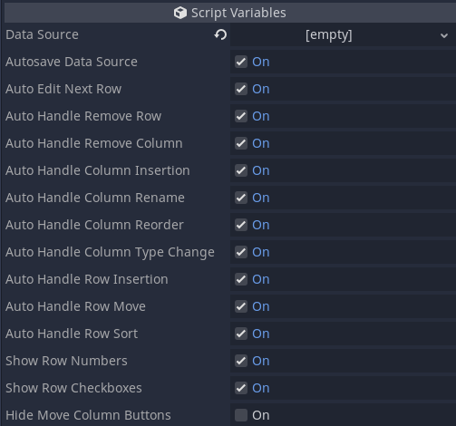
Tabular Box Properties
Once the data source resource is assigned to the Data Source property, running the project will allow the Tabular Box to manipulate the data (provided no other option has been changed). Nevertheless, right clicking the box will bring the context menu that allows data manipulation of the assigned resource:
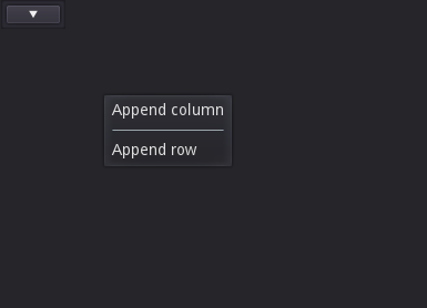
Tabular Box - Context Menu 1
After appending two columns and five rows, this is how things will look:
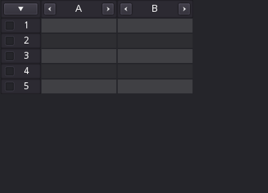
Tabular Box - Some Data
This data source will automatically name and assign String type to newly created columns. Both the name and the type can be easily changed. The first case is by clicking the column header, which is basically a line editor:
Right clicking a column will allow us to change its value type:
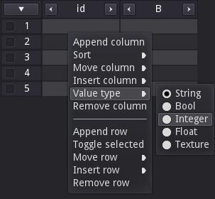
And once the Integer type is selected, the column will be updated:
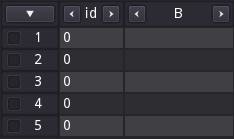
Now notice how all cells within that column are now rendering 0. This is because this simple data source requires integer types to default to this value, while strings can be empty. Shortly I will talk more about the data sources and how those define a lot of the internal behavior of the Tabular Box.
Anyway, you probably noticed a few arrow buttons plus the checkboxes within the row numbers. Those can be disabled, but before I tell which flags must be toggled, let me explain what are those. The checkboxes are meant to allow us to select/deselect rows. Clicking the button with the arrow pointing down brings a menu that allows us to easily change row selection (as well as deleting selected rows):
As for the buttons with the arrows pointing sideways, those allow us to move the columns, basically reordering them.
Now, if you want to disable those buttons, there are 3 option flags specifically meant to deal with those. First is the Show Row Numbers flag, which basically disables the rendering of the row numbers. Disabling the Show Row Checkboxes will basically disallow us to select rows because the boxes will not be rendered. Because of that the button with the arrow pointing down will also be removed in this case. Finally, the Hide Move Column Buttons can be enabled in order to hide the buttons to reorder columns. In this specific case those buttons will be shown when the mouse moves above the relevant column, but will be hidden by default. There is a way to completely remove the buttons, but that requires dealing with the data source implementation (which will be shown later).
This covers all of the basics of the Tabular Box! However, before I move on to the advanced usage, I have to mention one specific behavior of it when using the editor. When you edit the data with the project running, after you stop it you may have noticed that nothing happens in the editor. However, if you open a different scene then open again the one containing the Tabular Box with the edited data source assigned to it then it will update and display the data. This happens because I couldn't find a way to detect when the "play in editor" has finished (or even started) and force an update within the Control. If you know how to do that (if at all possible), please let me know and the code will be updated (obviously credit will be given)!
Data Sources
Data sources are the main way to interact with the Tabular Box through scripting. Besides determining how the data is actually stored, whenever an user interaction occurs, those will be somewhat relayed from the Tabular Box into the assigned data source. This means that on most cases there wont be any need to deal with the signals emitted by the Control. That said, the TabularDataSourceBase class contains some empty functions that are meant to be overridden in order to determine the overall behavior. Those functions and what they are meant to do are listed bellow.
| Function | Description |
|---|---|
get_type_list() | Must return a Dictionary containing information related to which value types are supported/handled by the data source. Each entry is meant to represent a value type, key being the identifying type code and the value a string with the "name" of the type. This string will be shown within the UI as part of the context menu that is provided to change the column types. |
has_column(title: String) | This function should return true if there is a column with the given title name. |
get_column_count() | Should return the number of column currently stored in the data source. |
get_column_info(index: int) | Given a column index, this function should return a Dictionary containing information relevant to that column. With the exception of title, all fields are optional and, if not provided, will default to the value in the description (see table bellow). |
insert_column(title: String, type: int, index: int, extra: Dictionary = {}) | This is meant to be used to insert a column. The Tabular Box expects this function to be able to deal with default values (empty title and type -1). Also, when index is -1 it is expected that the column is meant to be appended. The extra can be used to provide extra settings if the custom data source requires it. |
remove_column(index: int) | Given an index, this function is meant to remove that column from the stored data. |
column_ui_created(col: ColumnBaseT) | Whenever a column is created within the TabularBox, this function will be called providing the new instance. This is meant for additional setup and for most cases there is no need to override this function. |
rename_column(cindex: int, to_title: String) | This will be called whenever a column (specified by its index) is being renamed. The new requested title is given through the to_title argument |
change_column_value_type(cindex: int, to_type: int) | Called when attempting to change the value type of the given column index. The new type is given through to_type argument and will match the key of the selected type corresponding to its associated code, as given through the get_type_list() function |
move_column(from: int, to: int) | This is meant to reorder the column from index (from) into to index |
get_row_count() | Must return an integer with the amount of rows currently stored within the data source |
insert_row(values: Dictionary, index: int) | This is called in order to insert rows. If index is -1 then the Tabular Box expects the new row to be appended. The values Dictionary is usually empty but if filled it will contain the titles of the columns as fields, holding their corresponding values. |
remove_row(index: int) | Used to remove a row from the specified index (remember that this is index, which is 0 based, not row number which 1 based) |
move_row(from: int, to: int) | Called in order to move a row from index from into to index |
get_row(index: int) | This function must return a Dictionary containing the values of each column of the specified row index |
get_value(col_index: int, row_index: int) | This is meant to return the value of a single cell, given its column index and row index |
set_value(col_index: int, row_index: int, val) | Called in order to set the value of a single cell, given its column index and row index |
sort_by_col(col_index: int, ascending: bool) | This is called in order to sort all rows based on the values of the specified column index. If ascending is true then the expected result is that the cells on that column are in ascending order |
The table bellow contains information related to the expected fields of the Dictionary that should be returned by the get_column_info() function:
| Field | Description | Default Value |
|---|---|---|
title | Should be the name/title of the column | This is required, so no default |
type_code | The identification code of the value type of the column, which should match the desired type as given by get_type_list(). | 0 |
column_class | Specify the column script class that will be instanced when creating a column of this type. | TabularColumnString |
flags | Settings based on TabularColumnBase.FlagSettings (more on this in the Column Flags topic). | FlagSettings._Default |
As you can see, there are several functions that must be implemented in order for the Tabular Box to properly display/edit the data. How this data is stored is entirely up to you. It can even be done through an external database if so desired. In fact, I have done something like this in the Database Plugin. Still, simply changing internal data wont do anything to the rendering if the Tabular Box isn't notified. If you take a look at the top of the datasourcebase.gd file there are several signals defined in there. Those are meant to perform this notification. Note that there is no need to directly emit those signals, instead there are a few functions that can be used as interface in order to perform this task. The functions are listed bellow:
| Signal | Description |
|---|---|
_notify_new_column(index: int) | Call this function to tell the Control that a new column has been inserted in the given index. When the insert_column() is run, you should call this notifier if the column is indeed inserted, otherwise the display will not be updated. |
_notify_column_removed(index: int) | Used to notify the Tabular Box that a column has been removed |
_notify_column_moved(from: int, to: int) | When a column is reordered this function must be called, providing the original and the final index values. |
_notify_column_renamed(index: int) | Use this to notify the Tabular Box that a column has been renamed. Notice that only its index is necessary. The new title will be retrieved by other means. |
_notify_column_rename_rejected(index: int) | Suppose that in the rename_column() function, the provided new title should not be used. This notifier should be used to tell the Control about this fact. |
_notify_new_row(index: int) | Use this to notify the Tabular Box that a row has been inserted. |
_notify_row_removed(index: int) | And this to notify that a row has been removed. |
_notify_row_moved(from: int, to: int) | When a row is reordered, call this specifying the original and the final index values. |
_notify_value_changed(cindex: int, rindex: int, nval) | Use this to notify that a single cell value has been changed, providing the column and row indices as well as the new value. |
_notify_value_change_rejected(cindex: int, rindex: int) | In the set_value() function, if for some reason the new value is invalid, then notify the Tabular Box about this fact by calling this notifier. |
_notify_type_changed(cindex: int) | When the column value type is changed, use this notifier. |
_notify_sorted() | When all rows are sorted, this notifier must be used. |
For a sample implementation of a data source, check the simpleds.gd file, which implements the TabularSimpleDataSource class.
Options and Signals
As you probably noticed, there are several flags exposed that can be toggled in order to change how the box behaves. The majority of those flags is directly tied to how the data source is used by the Tabular Box. Not only that, several signals will only be emitted if a "corresponding flag" is set the a specific state. Bellow is the list of the flag options and the result of the state.
| Flag | Description |
|---|---|
Autosave Data Source | If this flag is enabled then the Tabular Box will attempt to save the resource whenever something changes. |
Auto Edit Next Row | When a cell is edited, pressing the enter key will select the cell on the row bellow of the same column if this flag is enabled. |
Auto Handle Remove Row | If this is is disabled then attempting to remove a row will not directly call the data source's remove_row() function. Instead the row_remove_request signal will be emitted by the Tabular Box. |
Auto Handle Remove Column | Similarly, if this is disabled attempting to remove a column will not directly call the data source's remove_row() function. Instead the column_remove_request signal will be emitted by the Tabular Box. |
Auto Handle Column Insertion | If this is disabled, attempting to insert a column will not directly call the data source's insert_column() function. Instead the insert_column_request signal will be emitted by the Tabular Box. |
Auto Handle Column Rename | Attempting to rename a column will not directly call the data source's rename_column() function if this flag is disabled. Instead the column_rename_requested signal will be emitted by the Tabular Box. |
Auto Handle Column Reorder | Attempting to reorder a column by either using the buttons or the context menu will not directly call the data source's move_column() function if this flag is disabled. Instead the column_move_requested signal will be emitted by the Tabular Box. |
Auto Handle Column Type Change | Attempting to change the value type of a column will not directly call the data source's change_column_value_type() function if this flag is disabled. Instead the column_type_change_requested signal will be emitted by the Tabular Box. |
Auto Handle Row Insertion | Attempting to insert a row will not directly call the data source's insert_row() function if this flag is disabled. Instead the insert_row_request signal will be emitted by the the Tabular Box. |
Auto Handle Row move | Attempting to reorder a single row will not directly call the data source's move_row() function if this flag is disabled. Instead the row_move_request signal will be emitted by the Tabular Box. |
Auto Handle Row Sort | Attempting to sort rows will not directly call the data source's sort_by_col() function if this flag is disabled. Instead the row_sort_request signal will be emitted by the Tabular Box. |
Show Row Numbers | If this flag is disabled then the row numbers will not be shown within each row. |
Show Row Checkboxes | If this flag is disabled then the checkbox of each row will not be rendered. This will also hide the button with the arrow pointing down as row selection is no longer possible. |
Hide Move Column Buttons | If this flag is disabled then the buttons meant to reorder the columns will be hidden by default. Provided nothing else is changed within the column settings then those buttons will be shown when the mouse cursor is over the column. |
Although the list above has listed several of the possible signals that can be emitted by the Tabular Box, the details of each one are missing. So, bellow is the list of all the signals:
| Signal | Description |
|---|---|
insert_column_request(at_index) | Emitted when attempting to insert a column and the Auto Handle Column Insertion is disabled. A single argument is given, specifying the requested index where the column should be inserted at. Remember that -1 is a valid index, which is expected to be "append". |
insert_row_request(at_index) | Emitted when attempting to insert a row and the Auto Handle Row Insertion is disabled. A single argument is given, specifying the requested index where the row should be inserted at. Remember that -1 is a valid index, which is expected to be "append"; |
column_remove_request(column_index) | Emitted when attempting to remove a column and the Auto Handle Remove Column is disabled. A single argument is given, specifying the requested index of the column that should be removed. |
column_rename_requested(column_index, new_title) | Emitted when attempting to rename a column and the Auto Handle Column Rename is disabled. The first argument is the index of the column to be renamed and the second argument is the requested new title. |
column_move_requested(from_index, to_index) | Emitted when attempting to reorder a column and the Auto Handle Column Reorder is disabled. The first argument is the original index of the column and the second argument is the target index where the column should be placed at. |
column_type_change_requested(column_index, to_type) | Emitted when attempting to change the value type of a column and the Auto Handle Column Type Change is disabled. The first argument is the index of the column to be changed and the second argument is the type code, as specified through the data source's get_type_list(). |
column_resized(column_title, new_width) | This is emitted regardless of flag settings and happens when a column is manually resized. The first argument is the title of the changed column while the second argument gives the new width. This is useful in order to save layout. |
value_change_request(column_index, row_index, value) | Emitted when attempting to change th value of a single cell when the relevant column has a flag indicating that it should notify external code (more on this shortly). The first two arguments specify the column and row indices, respectively. The third and last argument is the new value. |
row_remove_request(index_list) | Emitted when attempting to remove one or more rows and the Auto Handle Remove Row is disabled. The argument is an array containing the list of rows that should be removed. To make things easier the array will be sorted in descending order. |
row_move_request(from_index, to_index) | Emitted when attempting to reorder a single row and the Auto Handle Row move is disabled. The first argument is the original index of the row and the second argument is the index where the row should be placed at. |
row_sort_request(column_index, ascending) | Emitted when attempting to sort all rows and the Auto Handle Row Sort is disabled. The first argument is the "reference column" and the second argument is a flag indicating if the resulting order should be ascending (true) or descending (false). |
Column Flags
In the descriptions of the signals, there is one specific case (value_change_request) where I mentioned that it will only be emitted if a flag is set within the column. But, how to set the flags? And what are those? If you recall in the function list of the data source, there is get_column_info(), which should return a Dictionary. In it there is a field that can contain these flags. The expected values are defined within the FlagSettings enum in the data source base script. Bellow is the list of flags:
| Column Flag | Description |
|---|---|
AllowTitleEdit | If this flag is not set, then renaming a column wont be allowed. |
AllowMenu | If not set then the context menu options specific to columns will not be shown for the affected column(s). |
AllowResize | If not set then the column will have its width fixed and it will not be possible to drag the right border in order to resize the column. |
LockIndex | If this is not set then the reorder buttons will not be shown for the affect column(s). |
AllowTypeChange | If not set then it won't be possible to change the column value type |
AllowSorting | If not set then it won't be possible to sort rows based on the affect column(s). |
ValueChangeSignal | If this is set then the value_change_request signal will be emitted whenever attempting to change the value of a cell of the affected column(s). |
By default AllowTitleEdit, AllowMenu, AllowResize, AllowTypeChange and AllowSorting are set, with LockIndex and ValueChangeSignal being disabled.
Custom Column Types
When the Tabular Box requests information about the columns (with get_column_info()), one of the fields that is used is the column_class, which is basically a Script derived from columnbase.gd. Notice the fact that I have not provided a class_name within this script, simply because the class defined in there is a Control and it's not meant to be directly used. If a class_name were given, then the column base would appear within the Create New Node screen, which is not desired. So, in order to create a custom column type the way to extend the base class follows:
# mycustomcolumn.gd
extends "res://addons/keh_ui/tabular/columnbase.gd"
Then, when requiring this custom column type:
var column_info = {
	title: "Some Title",
	column_class: preload("res://some_path/mycustomcolumn.gd")
}
Deriving from the column base is relatively simple because there are only 4 functions within the base class that we have to take a look at (any other override is probably coming from Control). The functions are:
| Function | Description |
|---|---|
set_row_value(cell: Control, value) | This will be called whenever the value of a cell must be changed. Note that that cell Control instance is given as the first argument, while the second argument is the new value that must be assigned. If the cell does not use a LineEdit as its main control then this function must be overridden, otherwise there is no need to deal with it. |
create_cell() | This function must return the main Control used to represent the cell's value within the Tabular Box. By default it creates a LineEdit clearing its styling. This means that if there is no need to use something more advanced then there is no need to override this function. |
get_min_row_height() | This should return the minimum height for a cell of this type. The height of a row is determined by the largest minimum height of all columns. By default it takes the used font and adds top and bottom margins defined within the Tabular Box cell style. |
check_style() | This function is called whenever the style within the Tabular Box is changed and is meant for the column to update its internal rendering. Depending on how the cells are created, this function may be needed in order to update those Controls. |
For sample implementations I have provided 5 default column classes that are defined in the columnbool.gd, columnfloat.gd, columnint.gd, columnstring.gd and columntexture.gd script files. Respectively, those functions are meant to deal with boolean, floating point, integer, strings and texture values. Note that the texture is actually internally holding the path to the texture resource, but a small thumbnail will be rendered as a preview within each cell.
Internally the Tabular Box relies on the Data Source and column Controls derived from the provided column base, which is coded in the columnbase.gd script file. Basically the Tabular Box takes the information provided by the data source in order to create instances of the relevant columns, while dealing with the layout (sizes and positions) of those Controls.
In order to make the styling process simpler this derives from CustomControlBase. Yet, because of how this Control works, by creating several children of custom classes, an inner class has been created in order to "distribute" the styling. This class is the TabularStyler and is defined in the styler.gd script.
I will use the data source assigning (set_data_source() function) as the starting point to explain the inner workings of this Control. When one is given, some internal cleanup happens first, just in case there was a previous data source set. After that there are three major tasks that take place:
- Connect event handlers to the signals of the new data source. This is required in order to properly act on whatever happens within the data source itself.
- Check the data source for the supported value types just so it can cache and populate the internal context menu meant to deal with column value type changing.
- Refresh the rendering.
Well, the Refresh (_refresh() function) in itself has a bit of work, which is broken into calling 3 different functions.
- The very first task is to check if the Control is holding the correct amount of instances of columns. If not then those are created. At this point nothing else happens, only the correct amounts are verified.
- Then the overall layout of the control is defined, basically by setting the sizes and positions of the inner controls, as well as relaying to them some necessary data, like how much has been scrolled, individual row height and so on.
- Finally some "fine tuning" of the scroll bars is performed as depending on the layout a scrollbar may become visible (or hidden), changing a little bit the internal spacing.
In 2 note that when columns must be inserted, the task is done by calling the _insert_column() function, which requests some information from the data source then use it to build a new instance of the column. The column itself may emit a few signals in order to "communicate" with the Tabular Box, so at this point the proper event handlers are connected to the signals of the new column instance.
If you take a look at the column insertion function you may notice that it also creates an instance of an inner class named _CResizer. This is simply a "dummy" Control that is used to help with the resizing of column widths. The original idea was to simply detect if the mouse were around a region of the column's border and update its cursor if that was the case. However updating the cursor from pure GDScript is a bit problematic.
To explain things here it's important to understand a few things regarding the cursors. First we have the CursorShape, which can be seem as sort of a "cursor category". There are several of those, which are defined in the CursorShape enum within the Input class. In this same class we have a few functions that allow us to deal with the cursor. More relevant to the discussion are set_default_cursor_shape() and set_custom_mouse_cursor(). The first is meant to "tell Godot" which shape from the CursorShape enum should be the default one. The second function is used to assign a new cursor to a specified CursorShape "category".
Note from the descriptions that we can't exactly tell Godot that we want to temporarily change which cursor should be shown based on a condition defined by Script. Well, I could have set the default cursor shape then move it back to the common arrow, but what if the project using this addon needed to actually deal with the default shape? This Control would be overriding that setting. And overriding the cursor of a given shape is also out of question precisely because a project using this addon might also require custom cursors assigned to the shapes.
This is the reason the _CResizer exists. Controls in Godot have a property that allow us to specify which shape should be used when the mouse is above it. Fantastic. The resizer is then a transparent control that is set to not ignore mouse events and has the horizontal resize shape cursor assigned to it. As a bonus, this transparent control gives easier handling of the drag event meant to change the corresponding column width.
In order to easily support different types of values, both for display and editing, a base column class has been created, which is defined within columnbase.gd. This class is derived from Control but it's not meant to be directly used. To prevent it from being shown within the Add New Node window there is no class_name at the top of the file. Static typing is still possible by declaring a variable (or const) of Script type assigning the return value of the load(path_to_script) or preload(path_to_script).
The column base class performs several computations, mostly to help with the layout of the cells under it. Once the Tabular Box updates the column with a few size values, the column distribute its cells accordingly. Because a LineEdit is enough for most editing requirements, it is used by default in the base class. Having this default behavior means that very little is necessary to be overridden when creating custom column classes.
As for the data source itself, there isn't much to talk about since almost all functions in it are empty, only providing an interface for the Tabular Box to correctly work.
CustomControlBase
The ExpandablePanel is a widget that attaches itself to one of the four borders of its parent Control. It also can handle multiple "pages" of content. The panel can "shrink into the border" or expand into the viewport in order to hide or show the desired content page.
Expanding or shrinking can even be animated. The animation can also be affected by a curve if so desired.
This Control depends on the CustomControlBase.
When an instance of the ExpandablePanel is added into the scene it will automatically attach itself into the left border of the parent Control. In this regard note that some controls might pose some problems. Mostly, any control that takes over the sizing and positioning of its children (box containers as examples) will conflict with the expandable panel. Nevertheless, when the empty panel is selected, this will be shown within the Inspector tab:
Empty Expandable Panel - Inspector
As you can see, which border the panel attaches itself to can be easily configured by changing the Border property. The drop down menu offers Left, Top, Right and Bottom options.
The Current Page property defines which "page" will be expanded when the scene is loaded. Setting it to -1 simply tells that the panel should be shrinked from the beginning.
The Toggle Button Separation is used to determine the spacing between the page buttons used to toggle the panel state. No button will be generated when the panel is empty.
Keep Toggle Button Focus flag determines a little bit of the behavior related to the buttons used to toggle the state of the panel. Basically, if this property is disabled, when a button is clicked its input focus will be released. Depending on the desired behavior it might be necessary to preserve this focus (enabling this property).
We will deal with the animation category shortly. First let's see what happens when two pages are added into the panel. My suggestion here is to add a container or a common panel. The reason for this is that each child of the expandable panel will generate a page. Alternatively, a packed scene where its root node is a Control (or derived from) can be added.
Nevertheless, once a "page" is created, make sure to resize the panel in the Editor window as it will be the one used when the panel is expanded.
That said, for the next screenshot two Panel controls were added, while the Border property has been changed to Top. None of the Panel nodes had their names changed. Note the extra properties within the Inspector tab.

As you can see, an additional category named Pages has been created within the property list. The first one in this list is the Preview index. Basically it indicates which page should be visible within the Editor window, as if the corresponding page were expanded. This allows us to preview a specific page as if it were expanded without affecting which page should be the default one when the scene is loaded.
Then there will be a sub-category for each added page. The name of this sub-category will match the node name that triggered the generation of that page. For each page we can configure three specific settings.
Icon Expanded allows us to determine which icon will be used within the toggle button for that page when the panel is expanded.
Icon Shrinked allows us to determine which icon will be used within the toggle button for that page when the panel is shrinked.
Icon Color allows us to determine which modulation color will be used when rendering the icon. The same color will be used on both states (expanded and shrinked).
As you can see, for each page we can determine the icon representing it within the panel. If none is provided then default arrows will be used. The icons are shown in the animation bellow. Speaking of that, for this sample I have added two additional Panel controls into it.
Example of the Panel
The behavior of the animation can be fully configured. To explain lets first see the relevant category within the Inspector tab:
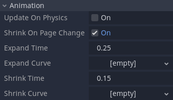
The Update on Physics property allows us to choose when the animation state will be updated. By default it is done through the _process() function. When this flag is enabled then the animation will use _physics_process() instead. Please note that when no animation is taking place no processing will be performed at all, so don't worry about CPU usage in this regard.
Next is the Shrink on Page Change. When this flag is enabled it tells the panel to first shrink then expand again when the user clicks the toggle button to display a page different from the current one. The described behavior is shown in the previous gif. However, when this flag is disabled then the animation will only take place when the state is actually changing. In other words, if the panel is already expanded, clicking a button for a different page will simply toggle the contents shown, without any animation at all.
We have Expand Time and Shrink Time. Those two properties are used to specify how many seconds the corresponding animation should last. If set to 0 then the animation is completely disabled. Note the fact that we can have different values for each, expand or shrink.
Finally we have Expand Curve and Shrink Curve. With those we can use Curve Resources in order to determine how the animation will be played. Basically, we can apply "ease in", "ease out" and so on. One very important thing to note here is is that the X range of the curve should be [0..1], which is the default one when a new Curve resource is created. Anything outside of this range will not be used and the result obviously might not be as expected.
Scripting
Everything related to the editor usage of the expandable panel has been covered. Yet, it does offer a few properties and functions that can be used to manipulate the behavior from scripting. First the list of properties:
| Property | Description |
|---|---|
border | This can be used to change which border the panel is attached to. The expected value is an entry from the ExpandablePanel.AttachTo enumeration, which is either Left, Top, Right or Bottom. |
current_page | Determine which page should be displayed in expanded state. If a negative value is set then the panel will be shrinked. Changing this will trigger animations if those are setup. |
toggle_button_separation | Determine the spacing between the toggle buttons that are generated with each page. |
keep_toggle_button_focus | Tell if the input focus should be kept when a page button is clicked. |
Then we have the functions:
| Function | Description |
|---|---|
get_page_name(index: int) | Returns the name of the page given its index. It does match the corresponding child control that generated the page. |
set_update_on_physics(enable: bool) | This can be used to change how the animation will be updated. If true is given the physics process will be used. Otherwise the "normal process". |
get_update_on_physics() | Returns true if the animation updates are being performed within the physics process, false otherwise. |
set_shrink_on_page_change(enable: bool) | Indicate that changing pages should first shrink the panel. This only works if animation is setup. |
get_shrink_on_page_change() | Returns true if the panel is configured to shrink itself when changing the active page. |
set_expand_animation_time(seconds: float) | Can be used to specify how many seconds the expand animation will last. If 0 or negative is given then the expand animation will be disabled. |
get_expand_animation_time() | Return how many seconds the expand animation lasts. |
set_expand_animation_curve(curve: Curve) | Use this to specify which curve resource should be applied during the expand animation of the panel. |
get_expand_animation_curve() | Retrieve the curve resource assigned to the expand animation. |
set_shrink_animation_time(seconds: float) | Can be used to specify how many seconds the shrink animation will last. If 0 or negative is given then the shrink animation will be disabled. |
get_shrink_animation_time() | Returns how many seconds the shrink animation lasts. |
set_shrink_animation_curve(curve: Curve) | Use this to specify which curve resource should be applied during the shrink animation of the panel. |
get_shrink_animation_curve() | Retrieve the curve resource assigned to the shrink animation. |
set_page_button_expanded_icon(page_index: int, icon: Texture) | Modify the icon assigned to the button corresponding to the given page index when the panel is expanded. Null can be used to revert to the default arrow. |
get_page_button_expanded_icon(page_index: int) | Retrieve the texture icon used with the button corresponding to the given index when the panel is expanded. If null is returned then the default arrow is in use. |
set_page_button_shrinked_icon(page_index: int, icon: Texture) | Modify the icon assigned to the button corresponding to the given page index when the panel is shrinked. Null can be used to revert to the default arrow. |
get_page_button_shrinked_icon(page_index: int) | Retrieve the texture icon used with the button corresponding to the given index when the panel is shrinked. If null is returned then the default arrow is in use. |
set_page_icon_color_modulation(page_index: int, color: Color) | Change the modulation color used to render the icon assigned to the button associated with the given page index. This is used on both shrinked and expanded states of the panel. Set to Color(1, 1, 1, 1) for the default, which does not modify the given icon texture. |
get_page_icon_color_modulation(page_index: int) | Get the modulation color used to render the icon assigned to the button associated with the given page index. |
Signals
The ExpandablePanel will emit a few signals. Reacting to those can be used specially if sounds are desired to be played when the state of the panel is changed. Nevertheless, here is the list of signals and when those are given:
| Signal | Description |
|---|---|
expand_finished(page_index) | This is given when the panel finishes expanding. Even if no animation is setup this will be emitted. The argument is the index of the page that has been shown. |
expand_started(page_index) | This is given when the panel starts expanding and only if animation is setup. The argument is the index of the page that is being revealed. |
page_button_clicked(index) | Whenever the "toggle button" of a page is clicked this event will be emitted. The argument is the index of the corresponding page. |
shrink_finished(page_index) | This is given when the panel finishes shrinking. Even if no animation is setup this will be emitted. The argument is the index of the page that has been hidden. |
shrink_started(page_index) | This is given when the panel starts shrinking and only if animation is setup. The argument is the index of the page that is being hidden. |
The major functionality point of this Control relies on the fact that it attaches itself into a border of the parent widget. To do so it uses the anchor and margin settings to determine part of the sizing. Basically when an instance of the expandable panel is added, it will default to the left border and will perform this attachment through the _check_layout() function.
One important aspect of Godot editor is that any Control node that is selected will make a Layout button visible, allowing the user to change the anchor and margin preset of that node. Unfortunately there is no direct way to determine from scripting that the user requested this action. The only useful thing that happens in this regard is that the resize signal and notification are given. This can somewhat be used in order to react to resize requests and attempt to ensure the control remains attached to one of the four borders.
However there is one problem. When using the control we obviously will want to resize the panel at the very least to specify the desired width or height of the panel when it's expanded. Doing so will also trigger the resize signal or notification. Because of that, within the _notification() function (specifically for the resize) this script first check if the anchors are within the expected values and if in editor. If both cases are true then an internal serialized property (_content_size) is used to store the rect size.
Now note that the _content_size is serialized but not exposed to the inspector. This is done through the _get_property_list() functionality. Speaking of that, this is used to expose several properties within categories and also to expose settings per available page.
A "page" is generated or removed based on children being added into or removed from the expandable panel. A "page" generates internal properties that are serialized. Those depend on the name of those children nodes. Because it's necessary to know when nodes are added, removed or renamed, within the _enter_tree() this script connects functions to the node_added, node_removed and node_renamed signals of the scene tree. This works albeit a few errors are given whenever the script is being updated. This should not be a problem when the control is being used, though.
The animation system relies on an internal queue. This has been done in order to allow the panel to provide "shrink first then expand to a new page" behavior. Basically, whenever there is animation setup and the state of the panel has to be changed, then at least one instance of the inner _AnimationState class is created and added into the mentioned queue. At this point either the _physics_process() or the _process() function is enabled. During this point the queue is tested and the state is updated. When the queue is empty the processing is disabled again.
Hopefully this very brief description helps understand what is behind this control. There are several comments within the script explaining several aspects of its internal working.
SpinSlider
When you expose numerical properties to the Inspector panel, depending on the settings of that property the editor will display a slider instead of the spin buttons. On both cases the input is still box is displayed. Unfortunately that control is not fully exposed to scripting, meaning that we can't use it.
The slider is particularly useful when we have a very well defined value range for a given property. So I decided to implement one such control, which would display spin buttons when the range is not fully defined, while hiding those buttons to show a slider otherwise. The image bellow displays two instances of the SpinSlider Control, one which does not define a range (top) and the other with both minimum and maximum values defined:
One important aspect of the SpinSlider in comparison to the core (EditorSpinSlider) Control (the one used only in the editor) is in how the widget "decides" when to use the spin buttons or the slider. In the EditorSpinSlider, the buttons will be shown whenever the Step property is set to 1. Otherwise the slider is shown. However, in the SpinSlider the buttons will be shown whenever the range is not fully defined. That is, to get the slider to show up, both minimum and maximum values must be defined.
When a new instance of the SpinSlider is added into a scene, selecting it will reveal the available properties:
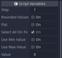
The Step property defines the "delta" applied to the assigned value whenever the spin buttons are clicked or the slider is moved.
If Rounded Values is true then the assigned value will always be rounded to the nearest integer.
The Flat property is mostly to define how the Control will be rendered. If true, then no box will be drawn.
When Select All On focus is enabled then the entire value will be selected whenever input focus is given to the control.
Enabling Use Min Value will reveal a new property named Min Value. This allows the definition of the minimum value.
Enabling Use Max Value will reveal a new property named Max Value. This allows the definition of the maximum value.
Finally, Value is the numerical value "assigned" to the Control.
As mentioned, both minimum and maximum values must be defined in order for the slider to appear. An example of such settings:
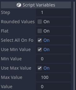
The settings above result in something similar to this:
Regarding scripting, its usage is incredibly similar to the SpinBox control. The SpinSlider emits only one signal, value_changed, which is emitted whenever the value is changed. The signal receives, as argument, the new value.
As mentioned, the SpinSlider is meant to provide features similar to the EditorSpinSlider. The original intention was to basically take all the original C++ code and "translate" into GDScript. However the EditorSpinSlider is derived from Range, which is an abstract class. Unfortunately we can't extend abstract classes through scripting. So the SpinSlider is actually its own control. Because I had to implement it from scratch, I also decided to incorporate some small changes in the behavior of the Control.
As I have been doing recently, the base class is CustomControlBase, as it provides easier means to override theme styling through the Inspector panel.
In order to make things easier to deal with keyboard input, internally the control uses a LineEdit. One difference in here when compared to the SpinBox is the fact that non numerical values will be "ignored". Because the LineEdit control does not provide means to validate what is being typed, internally a copy of the last valid value is kept. When a the value changes within the LineEdit, the new one is verified. If necessary the last valid value is used to restore things. Effectively in practice it seems like invalid characters are blocked.
The min_range and the max_range properties are irrelevant if the use_min and use_max are disabled. In order to reduce the property clutter in the Inspector panel the _get_property_list() has been overridden, conditionally exposing properties. One thing to keep in mind is that the exposed properties have the exact same name of the corresponding variables, meaning that it's not necessary to override _set() and _get().
The use_min and use_max properties are rather important, besides controlling when the min_range and max_range should be displayed within the editor. Those flags determine when the value should be clamped. And in case both flags are enabled, then the spin buttons become hidden while the slider is shown.
The slider itself is just a Control. The idea of having an inner control like this is to help detect mouse events. Another benefit is that drawing also becomes easier. Granted, once the slider is correctly positioned, its drawing becomes as simple as filling a rectangle that corresponds to the control itself. The grabber positioning becomes relative to the slider, which is also yet another bonus.
There isn't much more to it, other than the actual functionality provided by the controls that are internally used.