Part 23 - Polishing and PackagingApril 11, 2019
As of now, the game is fully playable and we have added quite a bit of features meant to improve the overall experience. Yet, we still have a few things to do before packaging the project. Namely, when the game is over, instead of abruptly displaying the menu, we will add some sort of animation while playing an audio. Then we will tackle mobile controls as well as finish the gamepad/keyboard menu navigation. After all of that, we create the binary package!
Game Over "Animation"
As mentioned, instead of immediately displaying the game over menu, we will first play some "animation" that cleans up the grid and at the same time playback an audio. To make this work we obviously have to stop the music before starting the game over audio, otherwise things will not sound very well.
Currently we have one event indicating the game has ended and it's being used to "tell" us when the game over menu should be shown, as well as stopping the music. We want to delay the moment to display the menu, but how long should this delay be? Instead of trying to figure the duration, we can react to an event which will be a lot easier and, of course, giving simpler tweaking later. Because of that we create a new event named OnPostGameOver exactly for this. We can reuse the FOnGameOverDelegate and FOnGameOverMultiDelegate delegate declarations.
As usual, we declare the internal multicast delegate and then provide a public function that allows us binding new functions into it:
...
public:
   ...
   // Binds a new event function that will be called whenever the game over animation ends
   UFUNCTION(BlueprintCallable, Category = "Event Binding")
   void ListenOnPostGameOver(FOnGameOverDelegate OnPostGameOverDelegate) { mOnPostGameOver.Add(OnPostGameOverDelegate); }
   ...
private:
   ...
   UPROPERTY()
   FOnGameOverMultiDelegate mOnPostGameOver;
   ...
For the "animation" we will remove the blocks in a row by row manner and will use the StateGameLost for that. Granted, we have created this state exactly for this kind of thing! After the animation is finished we broadcast the mOnPostGameOver event and then transition into the StateEndGame state function. The StateGameLost is broadcasting the mOnGameOver event, but we have to move this elsewhere, mostly because we will stay a little longer in this state, updating the animation. We will need a few control values/variables. First, the speed in which the blocks will be removed or, rather, the time taken removing each row. Then, a variable controlling which row we are currently removing blocks from. Of course, another one to keep track of the elapsed time when clearing the blocks. Of those mentioned variables we will setup the time limit as a property that can be edited from property editor, allowing us to tweak its duration if necessary.
How about the audio, more specifically which asset? We could easily create a new property in the theme data and specify which asset through that. Indeed that works very well and we already have all the tools to retrieve the necessary information when the playback is necessary. However in this tutorial we will add a property into the AGameModeInGame class because it will give a little simpler access to the necessary information when coding the playback. The consequence of this is that we will only be able to change the game over audio per game mode rather than theme.
All that said, let's declare the mentioned variables, all of then in the private section of the AGameModeInGame class:
// Specify the audio asset that will be played when the game is over
UPROPERTY(EditAnywhere, BlueprintReadOnly, Category = "Gameplay Settings", meta = (DisplayName = "Game Over Audio", AllowPrivateAccess = true))
USoundWave* mGameOverAudio;

// The time spent for each row when clearing the grid after the game is over
UPROPERTY(EditAnywhere, BlueprintReadOnly, Category = "Gameplay Settings", meta = (DisplayName = "Over Clear Time", AllowPrivateAccess = true))
float mGameOverClearTime;

int32 mCurrentClearRow;
float mCurrentClearTime;
We have to initialize those properties so, in the constructor, we do so:
AGameModeInGame::AGameModeInGame()
{
   ...
   mGameOverAudio = nullptr;
   mGameOverClearTime = 0.15f;
   mCurrentClearRow = 0;
   mCurrentClearTime = 0.0f;
   ...
}
We now have to prepare the control variables before entering the game lost state. Most specifically we have to make sure the mCurrentClearTime is at 0 and mCurrentClearRow at the desired initial clearing row, which I have to mention about it now. If we set the value to begin at 0 then we begin from the bottom row and move up. Otherwise, we can set the mCurrentClearRow to be mGridRowCount - 1, which will remove the blocks from top to bottom. As usual, you are free to choose whatever option you prefer. In this tutorial we will go from top to bottom.
We now have two events concerning the game over, one that is meant to be called as soon as the game is over and the other to be called when the game over animation ends. I have mentioned that we have to move the mOnGameOver broadcast from the StateGameLost elsewhere. In the StateSpawning we have the only place in the code where we transition into the StateGameLost, after getting a true return value from the IsGameLost() virtual function. Since this section will be run only once per game, we can take advantage of that and before transitioning into the StateGameLost we broadcast the old mOnGameOver event, which will then "tell" the game has just been over.
You want to see the code, right? It's shown bellow, just the section inside the IsGameLost() = true branch:
AGameModeInGame::StateFunctionProxy AGameModeInGame::StateSpawning(float Seconds)
{
   if (IsGameLost())
   {
      // Ensure the grid clearing control variables are correctly set
      mCurrentClearRow = mGridRowCount - 1;
      mCurrentClearTime = 0.0f;

      mOnGameOver.Broadcast();

      // Game has been lost. We have to transition into the game lost state
      return &AGameModeInGame::StateGameLost;
   }
   ...
}
Finally the StateGameLost state function. The first thing to keep in mind is that we only transition into the StateEndGame state function when we finish removing the last row of blocks from the grid, otherwise we stay at the StateGameLost state, updating the "animation". The logic behind the code is relatively simple. We first update the mCurrentClearTime and if it has reached the threshold value (mGameOverClearTime) then we remove all blocks that are present in the mCurrentClearRow, while also moving to the next row which, in our case, is subtracting 1 from it. After all of that we check if mCurrentClearRow is smaller than 0, which indicates if we have removed all blocks from the grid and, if so, transition into the StateEndGame after broadcasting the mPostGameOver event:
AGameModeInGame::StateFunctionProxy AGameModeInGame::StateGameLost(float Seconds)
{
   mCurrentClearTime += Seconds;

   if (mCurrentClearTime >= mGameOverClearTime)
   {
      int32 clear_index = GetCellIndex(0, mCurrentClearRow);
      for (int32 col = 0; col < mGridColumnCount; col++)
      {
         if (mGridData[clear_index].BlockActor)
         {
            mGridData[clear_index].BlockActor->Destroy();
            mGridData[clear_index].BlockActor = nullptr;
         }
         clear_index++;   // move to next column
      }

      // Reset the timer compensating for any spike in the loop time - IF that happens the "animation" will somewhat
      // "catch up". Often it's visible but in the end the total amount of time may stay relatively consistent
      mCurrentClearTime -= mGameOverClearTime;

      // Move to the next row
      mCurrentClearRow--;

      if (mCurrentClearRow < 0)
      {
         mOnPostGameOver.Broadcast();
         return &AGameModeInGame::StateEndGame;
      }
   }

   return &AGameModeInGame::StateGameLost;
}
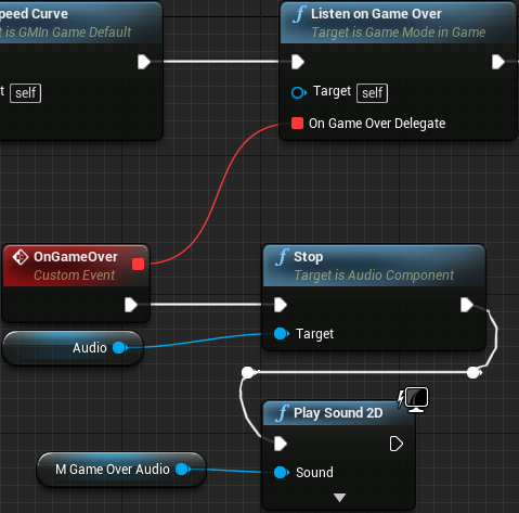
With those changes we now have to perform some small changes in the blueprint and, of course, assign the Game Over Audio property in the property editor. Let's begin by updating the blueprints, BP_GMTraditional and BP_GMTimed. From the OnGameOver event handler, after stopping the music we want to play the new audio. We do this by using the Play Sound 2D node and plugging in the game over audio property that we have created early. Both functions are shown bellow:

At this point we are requesting to play a sound but we didn't assign any asset to it. Actually, we didn't even import the sound file into the project! Let's do it. In LMMS I have created the following:
Loading
0:00.000
/ 0:00.000
Once imported into the project, this specific audio asset is assigned into the SC_Music sound class, meaning that the music volume slider will affect it. After that, click the Class Defaults button within the BP_GMTraditional and BP_GMTimed blueprint assets, so the Game Over Audio property can be set, to the new loosing wave file.
Moving on, we have to control the moment to display the game over menu, which is directly done from within the UI_InGame widget asset. Currently we are listening to the OnGameOver event and setting an internal flag named IsGameOver to true, which is then directly used by the function bound to the menu visibility property. We don't want to change this flag as soon as the game over but when the animation is over. This means we can just substitute the Listen On Game Over function node by Listen on Post Game Over, like this:

Mobile Controls
Now suppose we wanted to play this game on our mobile devices. Currently, we haven't done anything to make that possible. How about we fix that? Now bear in mind that I have no iOS device to test what I'm going to talk now so, please, if it doesn't work properly there, I'm deeply sorry for that. Nevertheless, if we generate a mobile package right now and try to play, we will be able to navigate through the menus and even get into the game. The only problem then is that we can't control anything neither pause the game so we could at least quit it.
Unreal Engine does provide a feature to add mobile controls, the touch interface, but using that we have little control over the ZOrder. The touch interface is placed on the viewport but bellow the viewport widgets, meaning that our UI will cover said interface. The thing is, we are creating and adding our widgets (HUD and Main Menu) using the Add to Viewport node. We could use the Add to Player Screen, which is bellow the viewport, resulting the touch interface being placed on top of our widgets. The problem them comes to the confirmation dialogs. Those are meant to be placed on top of everything and with our current system, if we use Add to Player Screen the touch interface will be placed on top. An option here would be to hide the touch interface when displaying the dialogs, which is a perfectly fine solution. One great thing about the touch interface is the fact that we can directly map the interface areas into the input settings we have added way back in part 9.
A second option is to create a custom widget so we have perfect control over the ZOrder and place it under the DialogContainer but above anything else. The problem here now is the way we are handling the input events, which is directly from C++ in the AGameModeInGame class. We don't have easy means from a blueprint event to request the movement. We need blueprint callable functions that perform the actions that we need, so from the widget blueprint we could obtain the game mode object, cast into the proper type and then call those functions.
Whichever option we choose we will still need to work on some changes. Now before we choose a path, let's deal with something that is probably a little bit more important, which is the actual design of the interface itself. The default touch interface asset provided by Unreal Engine emulates the two analog sticks of a gamepad, placing two virtual buttons on the screen. This means that we automatically get horizontal movement as well as block rotation interaction. With that we end up lacking the "accelerate" and the "pause" buttons. Of course we have the option to create a custom touch interface and incorporate those two action buttons. To be perfectly honest this design does not entirely feel nice for this project, specially because it would somewhat "force" the player to leave his/her finger on top of the virtual sticks almost constantly, covering a lot of the left side of the grid holding the blocks.
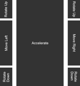
Instead of having virtual sticks we could designate some areas on the screen meant to give this kind of interaction. Namely, touching part of the left area of the screen would move the player piece to the left, while touching the right area would move to the right. Above those areas we could designate to rotate up the blocks, while the area bellow would rotate down the blocks. Now comes the problem. We still don't have the pause or the accelerate. Ideally the pause should be completely outside of the action, perhaps on the top right of the screen. But, how about the accelerate? It would be really nice to set it to be any area in between the side movement, right in the middle. With the touch interface that's really difficult to be done, specially if we consider the fact that the game window can have pretty much any aspect ratio and in this case we only designate screen coordinates. With a custom widget we have much more control over the layout, at the cost of forcing us to do some C++ code alterations.
Now because the layout of the touch interface becomes almost impossible to be done in the described way, we will end up performing the necessary C++ changes and working on a custom widget that will provide us the means to interact with the player piece through a touch screen mobile device. That said, let's first deal with the C++ part. Basically, we want to emulate the input axis and input actions through UMG button events. As far as I know there is no out of the box way of doing this, although the touch interface provided by the engine uses slate and somewhat does this emulation. After a little source code digging, the default touch interface (found at SVirtualJoystick.h/cpp) uses the FSlateApplication struct, which provides several event handling. In this specific case, the slate widget uses OnControllerAnalog() function in order to emulate the gamepad sticks. We can follow similar strategy but rather than implementing an slate widget we give access to the necessary functions through out blueprint library.
There is one thing to note here. The functions we will use, which are part of the mentioned struct, require the key code of a key/button so the proper event can be fired up. Because we didn't provide means to rebind the input keys we would be able to hard code the key codes. But as you probably have seen throughout the tutorial I'm not really fond of hard coded things. So, we will first retrieve from code the bound keys. For that we will use the UInputSettings class (InputSettings.h/cpp), which provides the GetActionMappingByName function. As its name suggests, we provide the name of the action mapping in order to obtain the bound keys. As for the axis mappings, we have the GetAxisMappingByName function.
Let's declare the functions in the blueprint library. We will need a total of 3 functions. Why 3? Well, we use one to emulate the axis mapping input. As documented, the axis input event is called at every frame iteration, even if the axis value is 0. This means we will have to constantly call this function. The other two functions are meant for the action mappings, both the key press and the key release.
// Emulates the specified axis mapping input
UFUNCTION(BlueprintCallable, Category = "Input Emulation")
static void EmulateAxisMapping(const FName InAxisName, float AxisValue);

// Emulates the "press" of a bound key based on the action mapping name
UFUNCTION(BlueprintCallable, Category = "Input Emulation")
static void EmulateActionKeyPress(const FName InActionName);

// Emulates the "release" of a bound key based on the action mapping name
UFUNCTION(BlueprintCallable, Category = "Input Emulation")
static void EmulateActionKeyRelease(const FName InActionName);
In all cases we first have to obtain the corresponding key code(s) and then call the slate application's message handlers. To obtain the bound key we need a valid object of the UInputSettings class, which is relatively easy, UInputSettings::GetInputSettings(). With this object we call either GetAxisMappingByName or GetActionMappingByName. Both functions require the name of the mapping that we want as well as an array that will hold the output, which should contain all of the buttons bound to that axis/action name. With the necessary data in place we then have to call either OnControllerAnalog or OnControllerButtonPressed/OnControllerButtonReleased. On all three cases we need the key name (obtained by the FKey::GetFName(), which is part of the information stored in each entry of the output array) and a controller ID (in our case 0 will be fine, specially because we don't have other players). In the case of the analog input, we need to give the axis value. When emulating the action keys we have to specify if we want to enable repeat or not which, in our case, we don't.
void UColBPLibrary::EmulateAxisMapping(const FName InAxisName, float AxisValue)
{
   // We need the input settings object
   if (UInputSettings* is = UInputSettings::GetInputSettings())
   {
      // Retrieve the keys bound to the specified input name
      TArray<FInputAxisKeyMapping> key_codes;
      is->GetAxisMappingByName(InAxisName, key_codes);

      // And if there is something, manually call the message handler for the analog input control - which corresponds to axis mappings
      if (key_codes.Num() > 0)
      {
         FSlateApplication::Get().OnControllerAnalog(key_codes[0].Key.GetFName(), 0, AxisValue);
      }
   }
}

void UColBPLibrary::EmulateActionKeyPress(const FName InActionName)
{
   // We need the input settings object
   if (UInputSettings* is = UInputSettings::GetInputSettings())
   {
      // Retrieve the keys bound to the specified input name
      TArray<FInputActionKeyMapping> key_codes;
      is->GetActionMappingByName(InActionName, key_codes);

      // And if there is something, manually call the message handler for the key press - which corresponds to action mapping
      if (key_codes.Num() > 0)
      {
         FSlateApplication::Get().OnControllerButtonPressed(key_codes[0].Key.GetFName(), 0, false);
      }
   }
}

void UColBPLibrary::EmulateActionKeyRelease(const FName InActionName)
{
   // We need the input settings object
   if (UInputSettings* is = UInputSettings::GetInputSettings())
   {
      // Retrieve the keys bound to the specified input name
      TArray<FInputActionKeyMapping> key_codes;
      is->GetActionMappingByName(InActionName, key_codes);

      // And if there is something, manually call the message handler for the key release - which corresponds to action mapping
      if (key_codes.Num() > 0)
      {
         FSlateApplication::Get().OnControllerButtonReleased(key_codes[0].Key.GetFName(), 0, false);
      }
   }
}
Next we create a new helper widget named UI_MobileControl which will provide us the necessary interaction through the use of buttons and will be placed on our existing HUD in a way to "respect" the z-ordering that we want. As usual, delete the canvas panel and add a vertical box.
An important thing to mention here is the fact that every button must have the Is Focusable property disabled. If this isn't done there will be problems with the emulation code we have just implemented. The reason is because when we click/touch the button, it will receive focus and then will consume every single event, including the ones we want to emulate. As an alternative we could force this focus from C++ code, by calling SetAllUserFocusToGameViewport() before the OnController...() functions, which is exactly what the internal touch interface system does.
Another thing to mention is that we won't use any of the custom buttons we have created early in the tutorial, albeit one of them in this widget will be an icon. The thing is, those custom buttons are dealing with keyboard focus, which we are deliberately disabling. Of course we will need to work a little with the styling but even those will be different from everything we have done so far within the UI.
We fist add the button that will be used to pause the game and will be placed on the top right corner to the playfield. Name it btPause and set its horizontal alignment to Right (please remember the Is Focusable setting, which much be false/unchecked/disabled). Regarding the style, the pressed sound has been copied from the other buttons, that is, use only the same sound for the Pressed Sound property, ignoring the hovered as it does not happen in a touch device. There is no point in making a distinction between normal/hovered/pressed visual states, so the very same image has been used for all three cases (transparent section painted with black for visibility on this page):

Again, once the targa gets imported into the project, the UI settings must be set within the new asset, Compression Settings = UserInterface2D (RGBA), Mip Gen Settings = NoMipmaps and Texture Group = UI. Anyway, when this texture is assigned to the button, it will become very big. Within the button's style we can then change the Image Size property to 64. Doing so will result in incorrect rendering but it's easy to fix by changing the Draw As property to Image rather than box.
Now we want to place the "main buttons", those that will give us the interaction with the player piece. The idea is to separate the playfield area into sections similar to this image:
This becomes extremely easy if we use the Grid Panel widget because it gives us different sized cells as well as rowspan for the middle section. This widget is under the Panel category in the widget palette. Add one into the vertical box, bellow the btPause. Set Size = Fill, Horizontal Alignment = Fill and Vertical Alignment = Center. Byt doing so we ensure the entire horizontal area of the playfield will be used and the buttons themselves will be placed almost centered (the pause button will slightly shift things down).
With those settings the grid will indeed use the desired space, but the central column must expand, so we have to change its fill settings. In order to do that, locate the Column Fill property of the grid panel, under the Fill Rules section and then add two elements into the array. The value for each entry works as a ratio between them, as long as they are bigger than 0. As an example, if entry at index 0 = 1 and index 1 = 2, then the second element will be twice as big as the first, but always calculating those based on the total available space. If the value is 0 then it will behave as if the setting weren't changed at all. Since we want to expand the central column, set the column index 1 to 1.0, leaving the first element at 0.
Now, add 7 buttons into the grid, renaming them to btRotateUp1, btMoveLeft, btRotateDown1, btAccelerate, btRotateUp2, btMoveRight and btRotateDown2. In this case this is only possible from the hierarchy panel because the buttons are all stacked on column 0 and row 0. From the previous image, it's clear that the accelerate button is occupying 3 rows, select the btAccelerate and set the Row Span = 3. Then, set row and column according to the following table:
| Button | Row | Column |
|---|---|---|
| btRotateUp1 | 0 | 0 |
| btMoveLeft | 1 | 0 |
| btRotateDown1 | 2 | 0 |
| btAccelerate | 0 | 1 |
| btRotateUp2 | 0 | 2 |
| btMoveRight | 1 | 2 |
| btRotateDown2 | 2 | 2 |
Now the buttons are somewhat spread across the grid but they are very small, not to mention all of the same size (the accelerate being the exception). We can enforce the buttons to change sizes by using the Size Box widget (we have already used it, remember?). The great thing here is that we don't have to use it on all buttons, only 3 of them. When we change the widget of the top left button (btRotateUp1), we automatically set the width of the entire column, so both buttons bellow it will also have that horizontal size. And then, when changing the height the entire row will use the same vertical space. Because the central column is different (it spans over the 3 rows), it will behave only to use the new height.
We want both move buttons to have a bigger height than those of the rotate. We will place a size box on either one of them. If we choose to place a size box to change the top left button, then to keep the consistency of the buttons on the bottom section we place the size box on the button of the opposite side in order to ensure the width. Just for reference, I have chosen the following:
btRotateUp1→ Receives a size box thenWidth = 64andHeight = 128.btMoveLeft→ Receives size box thenHeight = 250(leaving the width unchecked).btRotateDown2→ Receives size box thenWidth = 64andHeight = 128.
Now let's give some spacing between those buttons. First select the central button (btAccelerate) and change the Left and Right padding to 32. Then, select both btMoveLeft and btMoveRight, setting their Top and Bottom padding to 32.
For the style of those buttons, all I wanted was a way to just make it clear about the touch areas, so I have created a very simple texture (64x64) with a border while the middle is fully black:

Again, targa texture imported into the project, the usual UI settings (Compression Settings = UserInterface2D (RGBA), Mip Gen Settings = NoMipmaps and Texture Group = UI). The texture image can be directly applied into the image property of the button style, for all 3 states. You may be thinking about the fact that those buttons will make the game unplayable if we don't change the transparency. That's correct, but we will deal with it shortly.
Now, to the blueprint functionality of those buttons. Let's begin with the action mappings (accelerate and pause). For the pause button this is relatively simple, we just handle the Clicked event and call the emulate action key functions, using the Pause name, since it's the one used in the project settings. As for the accelerate, remember that we have implemented this feature in a way that while the button is pressed, the acceleration goes on and when released, it stops. Luckily for us, we do have two separate event handlers for the buttons, one for the Pressed and another for the Released. The first case we call the Emulate Action Key Press and the second case Emulate Action Key Release:

Specifically for the accelerate button, we have to change one of its properties otherwise the OnPressed and OnReleased events wont work as expected when dealing with touch events. The property is the Press Method that is under the Interaction category after expanding it. The default is Down and Up, meaning that we only get the OnPressed after a "click". Notice that we still get the desired behavior on the desktop! Anyway, change this property to Button Press and then things will work under the Android build.
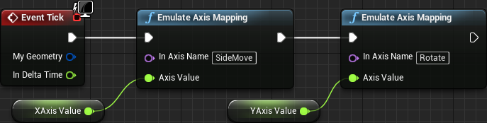
Now to the axis mapping emulation. Again, the axis mapping generates an even call at every single frame update, giving the axis value. If nothing is pressed, this value will be 0.0. Because of that we will have to call the axis mapping emulation functions every frame update, through the Event Tick. Because we will have to give a value, we create two float variables (XAxis and YAxis), one for the "x-axis" (the horizontal movement) and another for the "y-axis" (block rotation). We will use the event handlers of the various buttons to manipulate those variables, but for now let's see how simple the event tick becomes:
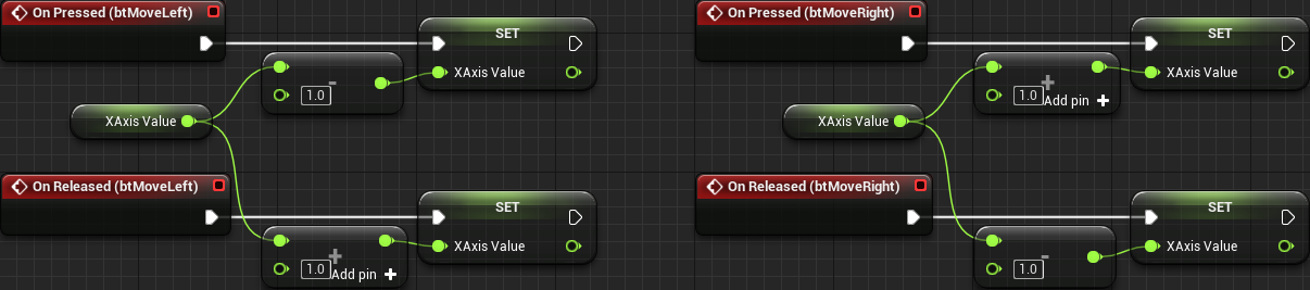
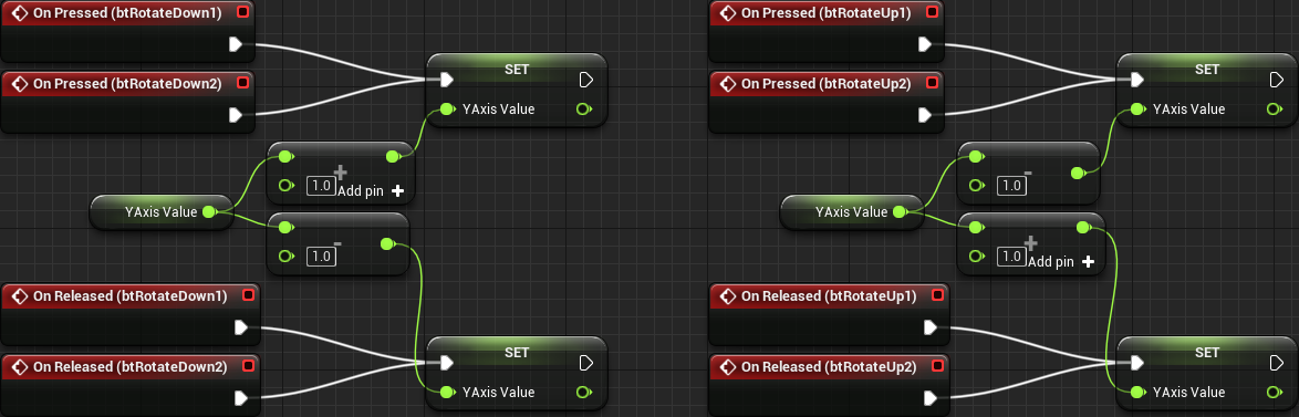
Let's begin working on the move buttons. When we press the "left button" we want the XAxis variable to be a negative (-1.0) value so our movement code moves the player piece to the left. We want to keep this while the button is pressed. When it's released we want to XAxis to go back to 0.0. Now think about the case of both movement buttons pressed at the same time, maybe because the player mistakenly overshot the desired column and want to move back but the finger coordination wasn't too precise and for an slightly short period of time both buttons were pressed. If we just set the axis value to 0 when the button is released then this described case will simply not move the piece at all and the control will feel a bit unresponsive. Instead we have to add and subtract to the axis value so if we have both buttons pressed at the same time, releasing one of them will make the piece move to the other side. In other words, when we press the left button, we subtract 1 from the XAxis and when released, we add 1 to this variable. And this is how it looks in blueprint:
We have to follow the exact same logic for the rotation input mapping, only this time we have two buttons to rotate up and two buttons to rotate down. There is only one detail, however. The value we send for the "y-axis" is inverted, so we have to invert our math in order to get the correct axis value when our input event handler finally gets called!
As mentioned early, the intention is to use this widget as part of the HUD. This means that we have to edit the UI_InGame widget now. In there, add one UI_MobileControl directly into the canvas panel, but make sure to keep it under the DialogContainer and above anything else. This is a simple matter of dragging the mobile control widget to be placed before the DialogContainer in the hierarchy panel. Ok, not exactly. The z-order property overrides the hierarchy ordering, but since we are not directly messing with that property we can rely on the hierarchy:

Now set its visibility to Collapsed so by default it doesn't take any layout space. Then, locate the property named Render Opacity and change it to 0.25 so the buttons become almost transparent. At a later moment, if desired, it's possible to add an option within the settings menu to change the opacity of those buttons. What have to be done then is call the Set Render Opacity node from the UI_MobileControl object. This specific task will be left as an exercise for the reader.
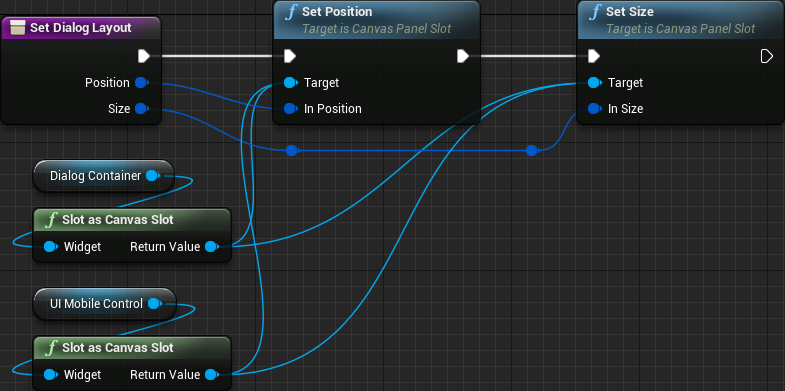
We have to ensure the size and position of the mobile controls are correct inside the game window. We already have a function meant to perform this, the Set Dialog Layout. Let's reuse this function in order to do the same to the UI_MobileControl object:
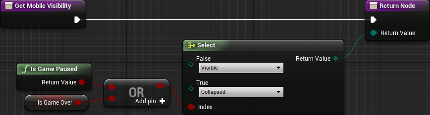
Ok, early I have said to set the visibility of the UI_MobileControl within the UI_InGame to Collapsed, this is just the default value. We will control its visibility through a function binding. The reason for that is that we want this widget to be shown when the game is running but hidden when paused or game over. Notice that this is the opposite of the visibility of the pause/game_over menu! That said, select the mobile control widget within the hierarchy and then create a new binding for the Visibility property.
No Touch Interface on Desktop
Fantastic! We can control the player piece through the buttons in the UI_MobileControl! However, there is one slight problem though. This widget is being displayed even when on a desktop and, of course, we don't want that! We need means to detect which kind of device we are in and incorporate this check into the widget visibility. Again we will have to use C++. This function, however, is very simple. We will rely on some defines that are given by the engine code. That said, let's declare the function in our blueprint library:
// Returns true if the code is running in a mobile device
UFUNCTION(BlueprintPure, Category = "System")
static bool IsMobile();
In its implementation we directly return true if the PLATFORM_IOS or PLATFORM_ANDROID is defined. Otherwise we return false:
bool UColBPLibrary::IsMobile()
{
#if PLATFORM_IOS || PLATFORM_ANDROID
   return true;
#endif
   return false;
}
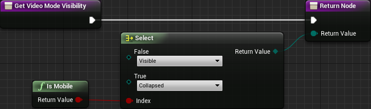
Now we have to update the UI_MobileControl visibility function. In there, if we are not in a mobile then we will never want it to be displayed. Otherwise we follow the old logic in the function. In order to save some nodes we can change a little bit the logic. Let's invert the result of the is game pause OR is game over so when its result is true we show the widget. By following this logic we can then use one AND node with the result of the Is Mobile node that we have just created. Please, pay attention to the fact that I have inverted the Collapsed vs Visible order in the Select node in comparison to the "older version" of this function:
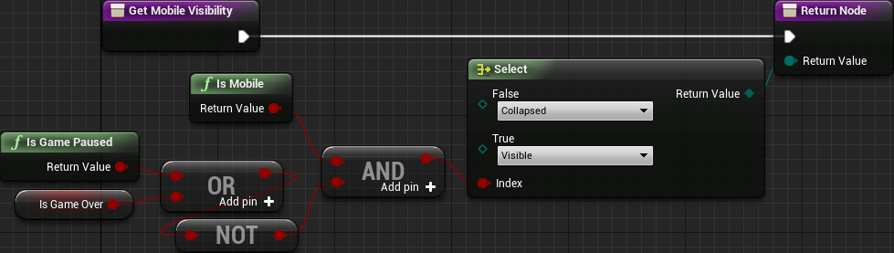
Now on a desktop game build this widget will never be shown!
Mobile Settings Menu
Since we are dealing with mobile specifics, we have to deal with another thing. Our settings menu is providing video mode settings, which is not relevant in a mobile device. We have to hide it! In the UI_Settings we can select the entire border wrapping the window mode setting and add a visibility function binding into it. In this case we can directly use the Is Mobile that we have created! If true, we collapse the border, otherwise, show it:
UI + Gamepad
Right when we start working on the user interface, we did create a few custom controls in order to make things easier to deal with keyboard/gamepad navigation, specially concerning the visual feedback of the selected widget. Yet, navigating through the menus using one of those devices is not fully functional. There are three notable problems with it and two of them were already mentioned:
- The keyboard focus is not automatically given to any control when menu is loaded or "pages" are changed, meaning that we can't navigate through the menu.
- Clicking outside of any button will take away the keyboard focus from any control and this will remove the possibility of further navigating through the menu using keyboard or gamepad.
- A lot of our menus are built through the use of smaller "helper" widgets. Currently, when a control within one of those widgets has focus, the only way to move outside of the helper and into one of the icon buttons bellow them is through the use of the TAB key on the keyboard (I haven't found a way to do that with the gamepad).
Regarding problem 1, when the menu is shown, no control has focus. And when we change into sub-menus, focus is also lost. Going back to the main page, again, we can't navigate. We have to ensure something get focused whenever we change menu pages and when it's first shown.
As for problem 2, if we track which control was last focused, re-focusing it should not be a problem through an event we have already used early, the On Removed From Focus Path. Unfortunately we don't have easy means to track the focused control. In order to solve this we would have to completely take over the entire navigation system of the engine. While possible it's not exactly an easy/simple task and would probably require an extra part specifically for it. Because of that we will go with an easier route of giving focus to the first control of the selected page.
Now, for the problem 3, whenever a widget is selected in the design panel, a section within the property editor named Navigation is provided, which gives some options regarding how the navigation through the UI should occur. One interesting thing here is that we can specify functions that will be called based on the various navigation events. While this tool can provide means to entirely "take over" the UI navigation, not only it suffers from a lack of documentation, it seems to be incredible inconsistent if controls on multiple levels of the same hierarchy path use this system (at least on all of my testings).
As you can see, the Navigation system provided by Unreal Engine could allow us to completely take over the navigation behavior. But, because of its inconsistency we can't entirely rely on it, specially if we wanted to track the focused control in oder to "fully solve" problem 2. Still, we will use it to solve problem 3.
The Main Menu
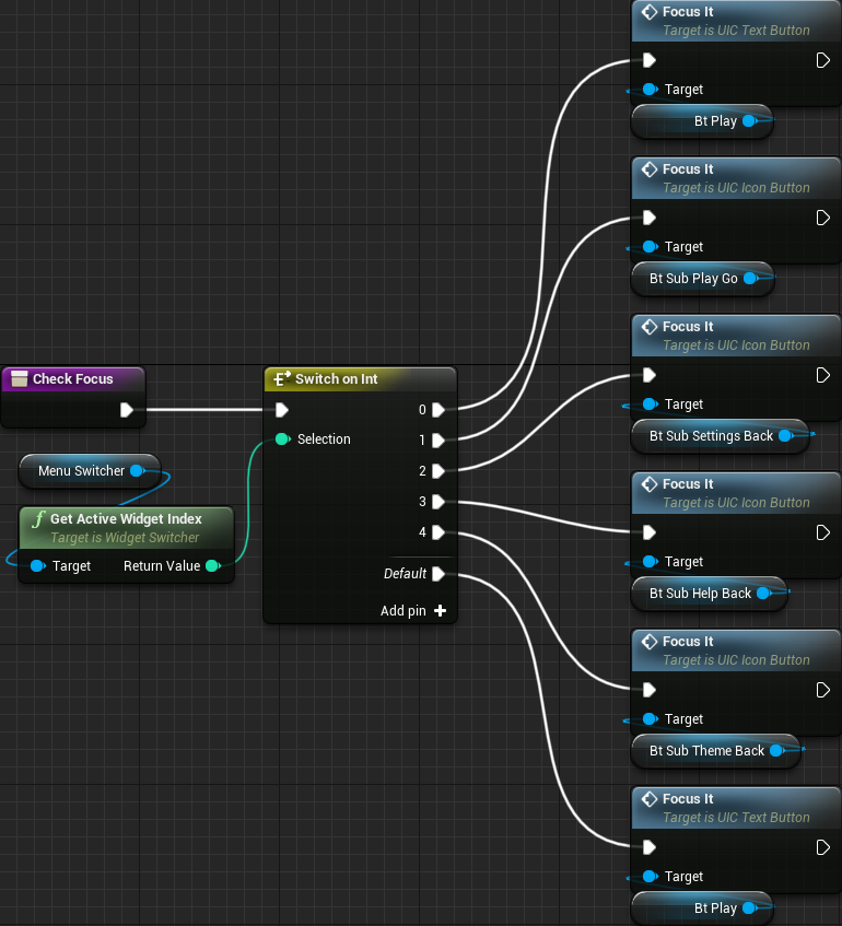
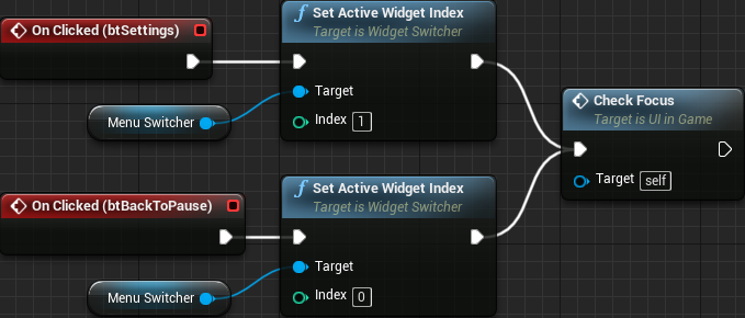
Let's begin by the UI_MainMenu changes. We first create a new function named CheckFocus that we will use to give focus back to a relevant control based on the selected widget index page, which is retrieved from the Switcher. With this function we can solve 1 and 2! The logic behind this function is rather simple. We first retrieve from the MenuSwitcher the active widget index and from it a Switch on Int node, which allows us to run logic based on the value of the returned index. In this case we can follow something similar to the table bellow:
| Index Value | Corresponds | Widget to Focus |
|---|---|---|
| 0 | Main Page | btPlay |
| 1 | Mode Selector | btSubPlayGo |
| 2 | Settings Page | btSubSettingsBack |
| 3 | Help Page | btSubHelpBack |
| 4 | Theme Selector | btSubThemeBack |
The blueprint becomes like this:
Now we have to call this from a bunch of places. First we want to ensure that we have some control with focus when the menu is first shown. At first we would probably want to do that from the spawn code in the game controller. Because we are dealing with window resize event and such at that time, we end up with no control focused! So, we have to do that from the UI_MainMenu itself. If we use the Event Construct we end up exactly with the same problem. However, if we use the OnResize event, and call the CheckFocus as the last task, then we will have the btPlay button automatically focused when the game is launched! The blueprint:

But now, after we change page into a sub-menu, no control will be selected. Granted, we have to call CheckFocus every time we change the active widget index. From the clicked event of the four buttons in the main page:
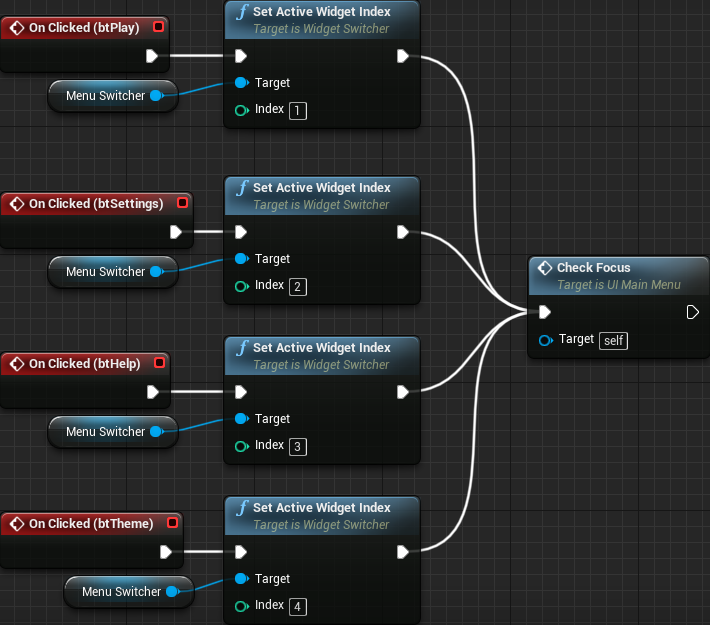
And then, from the four "back" buttons within the sub-menus:

At this point, we can almost navigate entirely with keyboard or gamepad. Entering the sub-menus will give focus to the specified buttons within the CheckFocus function, but we can't exactly navigate. That is the problem 3 described early. We will come to that shortly. First, we solve problem 2, which is the fact that we loose focus whenever we click outside of any control. As mentioned, we will use the On Removed from Focus Path event. All we do from it is call the CheckFocus function and that is it:

We still have a problem related to "automatic focus". When we click the quit button, when the confirmation dialog is displayed no button has focus. And, when we close the dialog again, by choosing the no answer, no button in the main menu will be focused. Behavior becomes more confusing if you pay extra attention to the fact that focus remain on the btQuit when the confirmation dialog is shown and we can in fact "navigate" to one of the dialog's buttons!
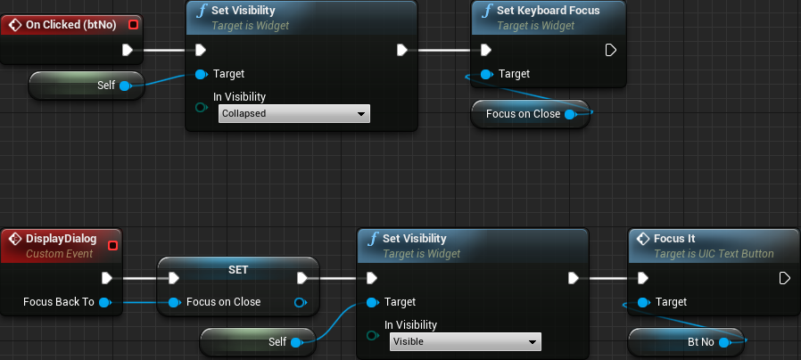
Now, to fix that we have to plan ahead. When the dialog is shown, we have to give focus to either the btYes or btNo. Obviously we don't have to do anything else if the yes button is activated because the game will be closed. Nevertheless, when the no button is used we want to give focus back to the main menu, maybe the btQuit. Remember that we are dealing with the "ok, actually quit the game" or hiding it directly from the dialog widget itself. Because of that, we somewhat have to deal with the "give focus back to the main menu page when closed" from the dialog blueprint. Alternatively, we could create an event system but that will somewhat lead to a bunch of extra blueprint nodes on multiple places. Rather, we edit the UI_ConfirmQuit and add into it a new event function that will require one widget reference as input. This function will internally cache this input, un-hide the dialog and focus the btNo button. From the no clicked event we then give focus to the cached widget reference.
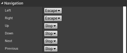
Now that we are at the confirm quit let's fix that "navigation" issue between the dialog and the buttons bellow it. We want to restrict things to be confined only within the dialog widget, the yes and no buttons. For that we will use that Navigation system that I have mentioned early. That said, select the btYes and scroll the property panel until you find the Navigation section. There should be 6 properties there, Left/Right/Up/Down//Next/Previous. From the dropdown we can specify the behavior for each of the directional navigation events. Next and Previous are mostly achieved by Tab/Shift+Tab combinations and they allow further navigation through the menus. We want to disable Up, Down, Next and Previous navigation, which is done by selecting the Stop option on those properties.
Do exactly the same with the btNo button. At this point the navigation is locked to those two buttons. Maybe you will want the possibility of "left" on the btYes giving focus to the btNo button, much like wrapping around. Because we only have two buttons I don't think it is a good idea because it may give some confusion related to which button is actually selected. Still, if you want to pursue this behavior, from the btYes you can select Custom option for the Left property and specify the name of one event function (which doesn't receive any input). From that function just call the FocusIt from the btNo. Of course, from the Right property of the btNo you call another event function that focus the btYes button.
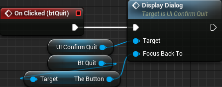
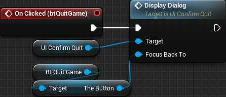
Ok, now we have to update the UI_MainMenu to call the DisplayDialog function instead of directly changing the visibility of the dialog widget. From the clicked event of the btQuit remove the Set Visibility node and replace with one Display Dialog. This new node requires one widget as input. We can't directly give the btQuit because we handle focus internally. Rather, we have to give the theButton that is inside btQuit:
We are not done yet with the "auto-focus". Well, we finished the ask before quit, but there is another dialog that will give the exact same issue! That is the dialog asking to confirm the video mode selection. So, open the UI_ConfirmVMode widget. First add the event function that will cache the input widget, un-hide the dialog and give focus to the btNo button. The blueprint is exactly the same so I won't show any screenshot of it. From both yes and no answers we are closing the dialog but we do want a button from the main menu (but different page) to be focused. After we reposition the game window we then give focus to the cached widget reference:

And then, we have to update the UI_Settings widget so it doesn't directly change the visibility of the confirmation dialog, rather call the DisplayDialog function. Remember that we are doing that from the Change Video Mode function, which is rather busy! Bellow just the section of the blueprint that is relevant:

Notice that we could have set the DisplayDialog function to automatically open the timer gate which would eliminate the call to Start Timer from the Change Video Mode function. I will leave this as an exercise to the reader, specially because it's extremely simple to be done and I believe there is no need to dump the steps in here.
Yet, we have an issue here. When the video mode confirmation dialog is displayed, it will have focus until the window resizing finishes. At that moment, the main widget will call CheckFocus which will take focus away from the dialog. To fix that we have to update the CheckFocus function (in the UI_MainMenu) and verify if the dialog is shown or not. In this case, we only change focus if the dialog is not shown:

Now we can finally fix problem 3! Let's do that page by page, beginning from page 0, which holds MainMenuBox. In it there is only one behavior that we might want to change. When the quit button is selected, pressing down will not do anything. Conversely, if the play button is selected, pressing up will also do nothing. Perhaps we want to warp around. To do that, select the inner vertical box that is directly holding the buttons:
With that selected, change the Up and Down properties, under the Navigation section, to Wrap. That's it. Navigating through the main menu will wrap around!
Now for the page 1 which corresponds to the game mode selection. At this point, when we enter this sub-menu "go play" button is selected and we can only move into the "back" and the previous/next buttons. We can't select the difficulty level. The fix here is a bit more involved, albeit not complicated. The thing is that UI_ModeSelector creates dynamically create instances of specific widgets while the UI_MainMenu holds an instance of the mode selector itself. You probably have noticed that we mostly have problems when going to the "inner most" widgets. In this case, from the mode selector to the specific ones.
From the mode selector we will want to give focus to one of the difficulty toggle buttons. We could probably thing about selecting the first or the last in the list based on the navigation direction. But what if we give focus to the selected difficulty? Seems interesting, right? But, how? The problem here is that each game mode specific widget will have its own set of internal toggle buttons, or none at all! We can do that through a function. But, wait, the difficulty selection widgets are of different types, we can't exactly predict them in order to cast and call that function. Well, we can use the blueprint interface feature given by Unreal Engine.
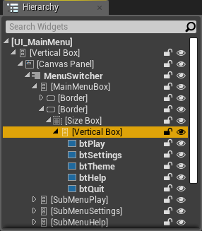
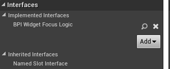
Basically we create this new interface (it's under the Blueprints category in the popup menu) named BPI_WidgetFocusLogic, under the Blueprints directory. In this interface we add a function named FocusControl. No input or output are needed. Then we set the game mode specific widgets, which are UIGM_Traditional and UIGM_Timed to implement this new interface. That is done by moving into the Graph tab then clicking Class Settings. From the Details panel it's possible to add interfaces into it:
Because the function in question does not have output we will find it from the Event Graph tab. In other words, add a new Event Focus Control node. In the UIGM_Traditional implementation we retrieve the toggle button corresponding to the selected difficulty, which is done by using the CurveToToggleMap variable with the SpeedCurve as key. From there we just call the FocusIt function:

As for the UIGM_Timed we use the TimeToToggleMap with TimeLimit as key:

Now, in the UI_ModeSelector we can change the navigation to move from the previous/next buttons into the difficulty toggle button. To do that we first need a custom event function, named FocusDifficulty, which will be called from the relevant event. In this function we first obtain the currently active widget (not the index) from the ModeSwitcher. With that object we check if implements the BPI_WidgetFocusLogic interface and, if so, call the FocusControl function:

From both the btPrevious and btNext buttons we will want to call this new function. To do that, select the horizontal box holding those buttons and then change the Up property under the Navigation section to Custom. A new text box will appear. In there, enter the name of the function:

Testing now we indeed can select the difficulty level coming from the other buttons. However, we can't go back! The problem now is a bit more complicated. The thing is that we want to move the focus from a widget that is dynamically spawned, so we can't just select it from the design panel and set the navigation properties. We will certainly want to modify, again, both UIGM_Traditional and UIGM_Timed widgets. But exactly what? At first glance we could think about adding into each one of them a reference to the "parent widget" (in this case UI_ModeSelector) and then directly call (or set focus) based on the events. Problem is, we are dynamically spawning widgets based on a property that tells which class to use. In other words, we don't initially know the type that will be spawned, so there is no way to know for sure that we will have that reference.
What we will do is create two new functions in the BPI_WidgetFocusLogic that are meant to be used as "set this widget to be focused when navigating". Then, when the navigation event occurs we use that widget. With that, from the mode selector widget, when the dynamic spawning occurs we setup the relevant widgets using the interface. There is one more detail. From the difficulty toggle buttons we can either "navigate up" or "navigate down" in order to move into the other button groupings. Moving down should be simple because the mode selector widget contains the buttons we may want to select. However, moving up we either block navigation or warp around to the last row, which, in this case, contains two buttons. In this tutorial we will warp around but know that the solution will involve some sort of hack.
All that said, create two new functions in the BPI_WidgetFocusLogic, one called BoundaryNavDown and the other BoundaryNavUp. Both should receive one widget as input. After that, on both UIGM_Traditional and UIGM_Timed, implement those two functions just promoting the input values to variables:
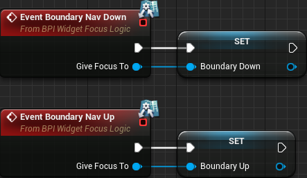
Next create two new custom events named NavingDown and NavingUp, respectively. From each one we simply check if the stored variable (BoundaryDown/BoundaryUp) is valid and, if so, give keyboard focus to the widget (again, this is done on both UIGM_Traditional and UIGM_Timed):

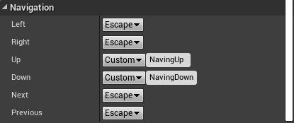
We have to call those functions. In the UIGM_Traditional, select the horizontal box holding the three difficulty toggle buttons. Then set the Up and Down navigation properties to Custom and then the names of those new functions:
Then, in the UIGM_Timed we have two horizontal boxes. One that will only contain the Up navigation property set to Custom and the other the other with the Down property. To be more specific, the top horizontal box will have its Up property set to Custom and call the function NavingUp. I believe you already know how to setup that and an screenshot is not necessary, right?
We are almost done with page 1 of the main menu. We have to setup the correct widgets from the mode selector, right after the game mode specific widgets are spawned. Directly from it we can set the widget that will be selected through the navigation down event. We can choose either the btPrevious or btNext. For this tutorial I will choose btNext (although ideally we should check whichever is visually closest to the currently selected toggle button). But, from the mode selector widget we don't have access to the buttons that are placed bellow them, because they are placed in the UI_MainMenu. Now comes the "hack" I mentioned. We will add a new instance editable widget property into the UI_ModeSelector that will be used to setup the navigation up. From the UI_MainMenu we select the mode selector instance and set this property.
All that said, open the UI_ModeSelector and add one UIC_IconButton variable named BoundaryUpWidget, setting its Instance Editable to True. We choose UIC_IconButton as variable type because we will have to access its internal theButton widget. Now, we update the construct script, where we are dynamically spawning widgets. For each one created we check if the blueprint interface (BPI_WidgetFocus) is implemented and, if so, we call the BoundaryNavDown and BoundaryNavUp functions (when searching for them, select the ones containing Message in their name):

Lastly (for page 1), we go back to the UI_MainMenu and select the UI_ModeSelector instance that is placed on the second page of the menu switcher. Once that is done, in the property editor we can set the BoundaryUpWidget to any control within the main menu widget. Of course it makes sense to select a button that is on the same active page, either the btSubPlayBack or btSubPlayGo. For consistency we select btSubPlayGo.

Ok, now we have full menu navigation capabilities on the second page of the main menu. Now to the next page (2), which corresponds to the settings sub-menu. When we first get to it when navigating through the menu, the back button is selected. Pressing down we will probably want to select the first toggle button from the video mode selection. And pressing up we want to select the last audio volume slider. And here comes one of the problems I have mentioned with the navigation system. In this case the "inner-most" control is the instance of the UI_Settings and we can't move into it from the back button, not without changing the navigation properties.
In here we will somewhat "hard-code" things, mostly because the other way requires a lot of work and will not improve things. So, first create three new custom event functions in the UI_MainMenu, named SettingsBackNavUp, SettingsBackNavDown and SettingsToBack. The first two functions will be called from the navigation events setup in the btSubSettingsBack. The last one will be called to select the btSubSettingsBack button again, when navigating away from the sliders or the toggle buttons. That said, the hard coded part here comes from the fact that we will directly retrieve the relevant widgets from blueprints:

Now, select the btSubSettingsBack button and change both the Up and Down navigation properties to custom. Set the Up function name to SettingsBackNavUp and the Down function name to SettingsBackNavDown. Now select the UI_Settings instance and change the Up and Down navigation properties to CustomBoundary. With this, the event will be fired only when navigating in that direction from a "boundary" widget. Set the function name on both properties to SettingsToBack. Now we have full navigation capabilities within the third page of the main menu!
The fourth page (index 3) corresponds to the Help sub-menu. In here things are a bit strange! Again, inconsistencies in the navigation system of the engine! For some reason we can navigate from the back button into the previous/next buttons, but can't go back. And then, from the previous/next we can focus the last text of the help widget! Let's fix that. We create a single new custom event in the UI_MainMenu widget named HelpToBack, where we give focus to the btSubHelpBack:

And then, we select the UI_Help instance within the UI_MainMenu and change the Up and Down navigation properties to Custom. On both cases we set the name of the function to HelpToBack. And then, we have correct menu navigation within the fourth page of the main menu!
Finally to the fifth and last page of the main menu, which is the theme selector. Another inconsistency here! From the back button we can select the previous button and then go back only with the down navigation. Up will not work. However, if we select the next button, we can't use either up or down to select again the back button! To keep consistent behavior, we will fix this page much like the help page. We first create a new custom event function named ThemeSelToBack that will be used to give focus to the btSubThemeBack:

And then, we select the UI_ThemeSelector widget instance within the UI_MainMenu and change the Up and Down properties to Custom, changing the function name to ThemeSelToBack.
The Pause Menu
Well, yes, we have the main menu with full gamepad/keyboard navigation capabilities. But, how about the pause/game over menu (UI_InGame)? That's yet another set of changes that we have to perform! We first follow similar logic to the main menu, by creating a function named CheckFocus. Although we have only two pages, if we decide to add more, then we have a "central" place to perform the overall "automatic focusing":

This time things are a bit different. We don't have to call this function when finishing the initialization. Granted, the menu isn't even shown! Rather, we want to call it when the game is over or when it's paused. For the game over case, it's rather simple, really. All we do is call this function after setting the GameOver flag:
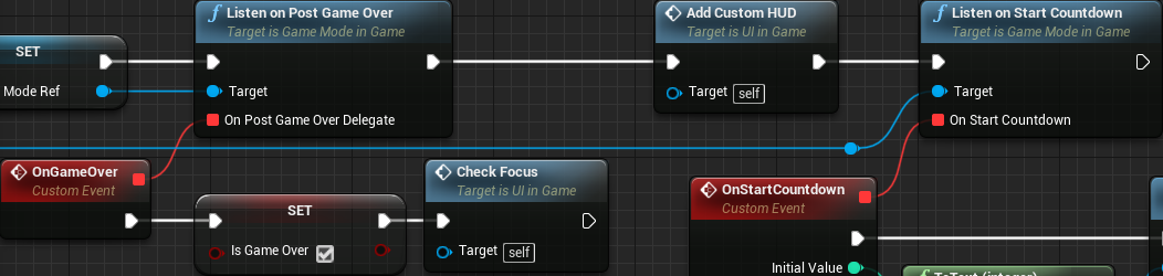
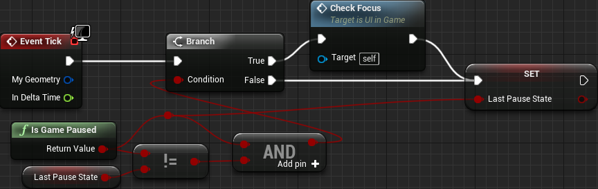
We have to call it only once when the game is paused. The easiest way would be to do that from the input event handler, which is in the BP_PCInGameDefault. Problem is, if we do that, we call the CheckFocus before the menu is displayed, which will result in no control being focused at all. We could create a delay and check the focus after an specified amount of time. But, how much time? We need consistent behavior while not feeling unresponsive, which will probably not be that easy to achieve with a delay! What we will do, however, uses the event tick. In there we will track the pause state over the duration of the game. This means we need to create a new boolean variable (in the UI_InGame) named LastPauseState. The logic here consists in calling the CheckFocus whenever we detect the game is paused and the value of the LastPauseState is different from the IsGamePaused node. After that, regardless of the current state we set it into the LastPauseState. With this, we are somewhat one game iteration behind when we call the CheckFocus. This is good because we ensure the menu is visible and giving focus to something will work. Besides that, one frame behind will not feel unresponsive! Anyway, the blueprint looks like this:
Next we call the CheckFocus whenever we change the active widget in the switcher:
Still with the "automatic focus" thing, we have to fix the confirmation dialogs. First we deal with the ask before quit dialog because we have already dealt something similar. Basically, all we have to do is change the event handler for the btQuitGame and instead of directly changing the visibility of the widget we call DisplayDialog function, giving the theButton within btQuitGame as input to focus when closing the dialog:
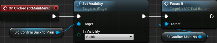
For the next dialog, the one that asks before returning to the main menu, things will be a little different since we have implemented the dialog within the UI_InGame itself. The first thing we do is give focus to the btConfirmMainNo button after making the dialog visible:
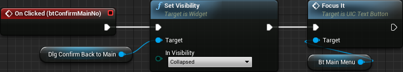
Then, when the no button is clicked, after hiding the dialog we give focus to the btMainMenu button:
Lastly, we have to prevent focus from leaving the dialog buttons. For that, select the horizontal box holding the btConfirmMainYes and btConfirmMainNo buttons. In there, change the Up and Down navigation properties to Stop.
Now, we have to fix the navigation itself. First we allow wrapping around the buttons in the first page. For that we select the inner vertical box holding the four buttons and set the Up and Down navigation properties to Wrap. Lastly, the second page, which holds the settings sub-menu. Similarly to what we have done in the main menu, we will hard code the focused widgets within the blueprint. So, create 3 new custom events named SettingsNavUp, SettingsNavDown and SettingsToBack. The first two will look exactly the same in comparison to the nodes in the UI_MainMenu, so I won't show them. The only visual difference for the SettingsToBack blueprint is the button widget:

Then, with the btBackToPause button selected, change the Up property to Custom setting the function name to SettingsNavUp. And the Down property to Custom with name set to SettingsNavDown. Finally, the UI_Settings instance object selected, change the Up and Down properties to CustomBoundary setting the function name to SettingsToBack on both cases.
End-User Settings Data
This is a quick setting that I want to mention. If you open the Project Settings and go to the End-User Settings under the Engine category, you will see some settings concerning user privacy*. I will not tell exactly which setting you should set because really, it's up to you. In the same window you can see that Epic does request you to keep this enable by default. Nevertheless, this is something that I do consider important to be known by anyone working with Unreal Engine, specially because some end users may complain about unwanted data being sent and unaware developers may not even know about this option.
* Ok, as of UE 4.20 this setting seems to have been dropped. I don't even find any mention to it in the source code. Nevertheless, if you are using 4.19 (or bellow), then check it out.
Packaging
It's now time to package the game! That is, generate the distribution binaries! I do recommend a read on all topics of this deployment documentation, as there are a lot of useful information. The great thing is that once everything is correctly setup, the entire building process is handled by the editor itself.
Splash and Icon
In the Project Settings, under the Platforms category there are a few platform specific settings that we can perform. The most important ones that we are concerned with are the Game Icon and the Game Splash properties. Selecting one of the platforms and hovering the mouse over the Game Splash gives the dimensions of the image that we have to create for that purpose. For any of the desktop systems (Linux, Mac and Windows), the image must be 600 x 200. On Android and iOS we instead have the Launch Images. For the Android case we only have two images, portrait and landscape, not to mention the fact that we can completely disable it by unchecking the Show launch image property. As for the iOS, well... you have to set several images, both portrait and landscape, and you can't disable the "feature".
As I have mentioned, I don't own any iOS device to test any of those settings so I will just show the desktop and the Android images that I have created.
Desktop splash:

Android splash, portrait:

And the icon, which were scaled to the various necessary sizes:
Just a warning here for the Windows platform. You will have to create an .ico file containing various sizes within it, more specifically 16x16, 32x32, 64x64 and 128x128 besides the 256x256.
Settings Settings
Still in the Project Settings, under the Project category, there is the Packaging settings. Click the down arrow bellow the Packaging category so it displays the setting that I want to comment, Create compressed cooked packages and Exclude editor content when cooking. If you hover the mouse over the check boxes a tooltip will be displayed giving a hint over what those properties do. While the compressed packages will increase the building time, it will also help reduce the package size, which is very important, specially for mobile devices. As for the editor content, we are not using any, so we are safe to exclude it from the final package.
Now, under the Project category there are a few interesting settings. One of them is the Staging Directory, which is where the built packages will temporarily be placed at (the final place will be set through a dialog shown once the target platform is chosen). I believe you will want to set that up, right? The Build Configuration allows us to specify the default packaging configuration. By default it's the Development, which includes a lot of debugging information that we don't want for the distribution package, but may be necessary when developing the game. We can change which configuration to use when packaging but only before calling the package command, not as dialog option. So I do recommend you change this setting to something that you feel comfortable with. In my case, I have changed it to Shipping. Checking the For Distribution checkbox will effectively use the Shipping build configuration.
Those are the settings I wanted to mention specifically for this project. I do recommend you take a look into the other options as some project may require more advanced settings in there.
Desktop Package
And now is the moment of truth! Back to the main editor window, if you click the File menu, there is this option, Package Project:
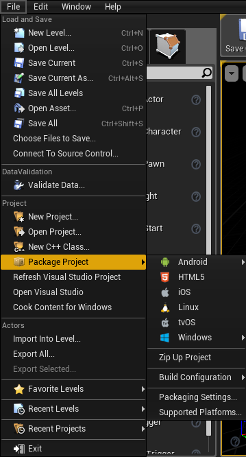
Please note that if you opt to build a Windows package you can choose between 32-bit or 64-bit builds. Now choose your desired operating system and, if relevant, the byte size. Then.... wait. If a full build, wait quite a bit of time! Hopefully everything goes alright and you will get binary files at the chosen directory! In this regard, I recommend you click the Show Output Log (which is provided in the alert window) so you can see some information during the building process.
Once the build is (successfuly) built, you should have a subdirectory named [project_name]noEditor at the chosen directory. Within it you will find the executable for your newly packaged game!
If you want to target the Linux platform, this may be of help.
Android Package
As for Android, there is quite a bit of previous setup that must be done. For that, I recommend reading the Android Setup documentation and/or the Android Reference. The second link provides some information regarding the various texture formats that you are presented with when choosing to generate a package for this platform. For reference and compatibility sake I have chosen the ETC1 texture format. By the way, I did try the multi option and for some reason it didn't work, textures simply didn't show at all!
I had to change one of the project settings, Platforms - Android. Namely, I had to disable the Enable Gradle instead of Ant. Every try here, Gradle fails after agonizing long building times!
Once you click to generate the package, be very patient because it takes a lot of time!
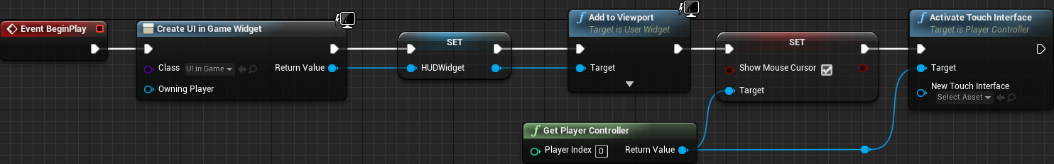
And then... after that realy long packaging time, you get the .apk file, move into your device and open the game to test it. And, some virtual joysticks are shown. Yep, we have to disable that, which must be done through blueprints! So, open the BP_PCMainMenu and the BP_PCInGameDefault player controller blueprints. In the constructor, right after we set the SHow Mouse Cursor flag to true, we call the Activate Touch Interface function and don't give any input for its New Touch Interface. The target is a player controller. The main menu controller:

And the in game controller:
Conclusion
In this tutorial we have covered a lot of material, from (almost) all aspects of game development. Yes, there is a lot of room for improvement on several parts of the project, like providing an slider to control the mobile controls opacity or changing the help menu according to the controls being used or [you_name_it]. Not to mention the C++ code structure to the audio and overall visual of the game. Since this is just a tutorial, meant to show the process (or at least part of it), I do consider everything in there to be acceptable.
The currently implemented system leaves the game in a way that is fairly simple to expand, by adding new themes or game modes. Of course, if we want to "bend the rules" then we have to make several other changes in the core code. Still, there is some flexibility over the system we have implemented and that means one of the goals of the project has been achieved.
Yet, the main objective of the project is to show the game development process, from the start to "finish", including problems caused by poorly chosen strategies during the development. And indeed we have seen some. Granted, we are on a very small scale project here and often problems are a lot bigger and may even require code refactoring in order to solve.
Now, the most important thing is that I sincerely hope you found this tutorial useful and you were able to beat my crappy english grammar!
Well, that's it! The project is fully built and running without the editor, in a package that is ready to be distributed! Are we done yet? Well, that depends entirely on you!
All I can say now is, happy forging!
External links and extra reading
Widget Draw Order forum post. Some information regarding the drawing order of the widgets.
Linux Cross Compiling contains information and links to generate linux packages.
Input Mapping documentation.
Android Setup Guide to install codeworks.
Android Reference Some information regarding Android development.
Android apk Size contains some information that may help reduce the size of the generated .pak file.
Codeworks. nVIDIA's CodeWorks home page.
Unreal Engine Branding. Guidelines to branding UE within a product.
Unreal Engine Deployment documentation.
Community Led Training Video by Celeste about navigating user interfaces with gamepad. This is a different approach than the one shown in this tutorial.