Part 14 - Widget PositioningApril 11, 2019
Up to this point we have a playable game, albeit still lacking some challenge, like increasing the falling speed of the player piece, for example. Moreover, although we are tracking the player score, we don't have means to properly display it on screen. That will be done through the usage of UMG widgets, however we need some data so we can correctly position the widgets. Namely, we will want to align the widgets with the background and not cover the grid. Of course we could use the "black space" surrounding the background image but we won't do that. Why? Remember at the beginning of the tutorial when I mentioned about the possibility of porting the game for mobile devices? The background image, in a way, is meant to be fully displayed on the device screen, meaning that our widgets will have to use the same area.
In this part we will first create a few "custom control" widgets that will greatly help us dealing with keyboard and gamepad menu navigation. While Unreal Engine does provide means to do this kind of interaction, visual feedback over which widget is "selected" requires quite a bit of extra blueprint graph if we use the widgets as they are given, out of the box. Because of that, we will create some user widgets that are meant to give us the necessary functionality of the "original ones" plus the logic that will change the appearance of the controls.
After that we will create the main widget assets, or at least the initial design. We begin from the main menus, meaning that we have to load the MainMenu level map. The choice to begin there is because it requires a bit less work. Only then we go back to the in game to work on the HUD where we will still use some logic from the main menu widget and some more.
Custom Controls
When we use the keyboard or gamepad to navigate through the menus we are effectively changing which widget has the keyboard focus. That means, when we press the activation key (space bar, enter, A button on the gamepad), that input information is sent to the widget containing the focus. As an example, if we press the activation key when a button widget has the keyboard focus, then the OnClicked event will be fired up. The main problem here is that we don't have clear visual feedback over which widget has the keyboard focus. We can change a setting in the project settings that will create a "focus rule" around the widget, but when we come to the styling of the UI it will most certainly not look the way we want. Thus, we have to manually keep track over the focus state and directly change the style of the widget.
A common technique in this case is to use the Event Tick and check the conditions at every loop iteration, assigning the relevant style to the widget. Of course it raises a few efficiency concerns. Then, to try to reduce the impact some may create a looped timer that will perform this style updating. The problem here is that even if the frequency is set to be very close to the tick some flickering will happen when using the mouse cursor over the widgets. And then, if the frequency is very low the menu will feel a bit unresponsive.
In here we will handle some events in order to change the widget style. To be more specific, when widget gain input focus we want to set an style that will highlight the widget. And then, when it looses focus we will want to return the style to a "normal" state. Now when we look at the overridable function list in the widget blueprint we see On Focus Received and On Focus Lost. Those seem perfect, right? The problem is that they never seem to be called (at least that was the case on all of my tests). Hopes are not lost, however! We do have the On Added to Focus Path and On Removed from Focus Path events. Quoting the description of the On Added to Focus Path found in the source code:
If focus is gained on on this widget or on a child widget and this widget is added to the focus path, and wasn't previously part of it, this event is called.
This is fantastic as it's precisely what we want! So, the basic idea is to hold an internal style variable that will be used to highlight the widget when it gains focus and then the "normal" style that will be used when it does not have or lose the focus. But then, what if the mouse hovers over the widget? The easiest here is to forcefully give focus to the widget when we detect the mouse over it.
There is one "hidden" advantage of this "custom control" that we are going to do. Currently Unreal Engine does not support any means to reuse widget styles. In other words, if we finish styling a button (or any other UI element), we have to copy the style property and paste it over all of the other buttons. Now suppose all the widgets have been styled and there is the need to tweak a little? Of course this is not ideal! One very beneficial impact of this custom control system is that we are holding internal style variables and if we ensure they are not set to be instance editable then changing them will result in all instances of the control having the updated style. In other words, we wont have to deal with setting an style and applying it all over the place!
If you are using the same directory structure I have presented back in part 1, the custom controls we will create in this section are meant to be placed at the UI/Controls subdirectory.
Here we will implement two different common button types, text button and icon button. This will certainly lead to duplication of the style blueprint. The reason this will be done is that we will get a much simpler widget hierarchy to work with when designing the menus, not to mention the fact that we will also have "pre-made" styled buttons to work with. This also means we will have less work when adding buttons into the menus.
One last thing to mention. Every time we instance a user widget within another one, there is a big chance of getting this error message when compiling the blueprint:
Fast CreateWidget Warning! This class can not be created using the fast path, because the property SourceObject on Property Binding references [some_property]. Please add the
Instancedflag to this property.
The confusing part is that often the mentioned property is already set to Instanced, yet we can't compile the parent blueprint widget. Well, open the custom control, the one containing the [some_property] mentioned in the message and re-compile it. Then come back into the parent widget and it should compile without any errors.
Text Button
The text button is just a button with a text label inside of it. That said, create a new Widget Blueprint asset (remember, under the UI/Controls directory) and name it UIC_TextButton. Once the asset is open for editing, remove the default Canvas Panel from it and then drag in a Button widget into it. Rename this button to theButton (or something like that). Ensure the Is Variable property is enabled (by default it is) as we will reference it from blueprint. Then add a Text Widget into the button, so we have the label, and rename it to lblLabel. We will also reference this text widget from blueprint, so make sure it is set to be a variable (by default it is not). Now move into the graph panel so we can work on the blueprint logic.
First add a new variable of Text type, named Label. We will use it to manipulate the label of the button. Because we will want to change its value from the property editor in the designer panel of the other widgets using instancing this button, set this variable to Instance Editable and then enable the Expose on Spawn (this one is probably not necessary, since chances are very low that we will dynamically spawn this button). Go back into the Designer tab so we can select the lblLabel widget and bind the Label variable into its Text property. By doing so, if we change the value of the Label variable, the text widget will reflect that change in game. Back into the Graph tab, we can use the Event Pre Construct to assign the value of the Label text into the lblLabel widget. This is not exactly necessary but by doing so we will be able to preview the changes within the design editor window. Also, we only change the label if we are in design time, so we don't override the property binding when playing the game:
If you want to, set a default value for the Label variable. Having a huge stroke of creativity I have set it to Label... errr, yeah!
Next we have to deal with the style, which has already been explained how it will work. The important thing to note here is that we will need two style variables, one for the normal state and the other for the selected state. That said, add two variables, setting the type to Button Style and naming them stlNormal and stlSelected. Shortly we will set them with temporary default values.
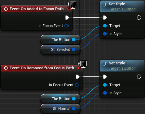
Add the two event handlers, Event On Added to Focus Path and Event On Removed from Focus Path. What must be done here is very simple. From the On Added to Focus Path we take the theButton and use its Set Style node, giving stlSelected as input. And then, from the On Removed from Focus Path we also use the Set Style but providing the stlNormal variable into its input:
The next piece of logic that we will do is just something to make things a lot easier for us. Think about it as a "shortcut" that we will use to give keyboard input focus to the theButton. The thing is, when we want to focus the button we have to somewhat ensure it's done to the theButton object. From a parent widget we may forget about it and try to set focus directly into the UIC_TextButton instance, which obviously will not give the expected result. That said, add a custom event and named it FocusIt. Its graph just takes the button widget and call the SetKeyboardFocus:

Then we have to handle the mouse hover over the button. The first thing we do is to call the FocusIt custom event whenever we detect the mouse has entered the widget. The next thing is... wait, there isn't a second thing to do when the mouse enters the widget! Nevertheless, to answer to this event, override the on Mouse Enter:
If we leave things as they are now, when we move the mouse cursor over a button it will receive focus. Leaving the mouse there and then using the gamepad or keyboard to navigate the menu will take focus away from the button. We can sort of "lock" the focus to the button hovered by the mouse if desired. You can skip this if you don't want this behavior. Anyway, the idea is that when the focus is lost we branch over the result of the Is Hovered node, which tells exactly if the mouse is over the widget or not. From the true pin, which means the mouse is over the button, will call the FocusIt node. Otherwise we proceed with our previous logic of applying the stlNormal style upon the theButton:
When we instance a button in a parent widget, like a main menu, selecting it gives us, in the property editor, a giant green button with a + label that will automatically add a handler to the clicked event in the blueprint graph. However if we instance one UIC_TextButton we will get something that looks exactly like a common button but we won't have that green button allowing us to handle the clicked event. Worse, if we want to handle the clicked event of the theButton we would have some very "busy" graph nodes in the parent widget. Luckily if we create an event dispatcher we will get that + button! That said, add one event dispatcher and name it onClicked. Then select the theButton, add and event handler to the OnClicked and from it just call the event dispatcher:
The last thing we have to do now is set the two style variables. First, go into the property editor and copy the Style property from the theButton widget. Now, in the graph panel we can set the Default Value of both style variables. Paste the style that has just been copied into both variables. Now, select the stlNormal and copy the Normal section of the style into both the Hovered and the Pressed states. Finally, select the stlSelected and change the Normal tint to a different color, maybe light blue (RGB = 0.2, 0.2, 1.0). Copy this into the Hovered style.
With those changes to the styles we are essentially telling that an unselected button will always have the default button look, while the selected button will look blue and then go into the default look when it's pressed (hold the mouse button or any of the activation keys/gamepad button). Those are temporary values that are meant to help testing the functionality and when we come to the UI styling we will change those variables.
Icon Button
As mentioned early, we will also need icon buttons in our menus. Those are meant to represent things like "go back" or "next" or "previous" and so on. Rather than having a text widget to display a label, we will use an image widget on top of the button. Because of the nature, those buttons will be a lot less wide than the text buttons and we will probably need to control their size differently, which we will come to that shortly. Nevertheless, if desired duplicate the UIC_TextButton and rename the asset to UIC_IconButton or create a completely new asset and repeat most of the steps used to create the text button. The important thing here is that we don't have the text widget nor the Label text variable. We will still use the Event Pre Construct node, but with something different.
As I mentioned we will probably need to enforce the size of the icon buttons, so add one Size Box widget into the theButton. Set its Horizontal and Vertical alignment to Fill, within the Slot (Button Slot) category. And set the padding to 0 too. Now, set the Width Override and Height Override to some default value, maybe 32. Note that we will most certainly have to edit this later, probably to something a bit bigger, but for now it's enough to help with our testings.
Now, we add an image widget inside of the size box. This image will hold the icon itself which, of course, we will setup a bit later in the tutorial. Rename the image to something like imgIcon. Make sure it's set to be a variable (by default it is) as we will change it from blueprint.
Similarly to the text variable named label in the text button we will need a variable to hold the icon. To do this we create a new variable named Image of type Slate Brush. To give us the same flexibility of changing from the property editor within the design window, we set the Image variable to be Instance Editable and Expose on Spawn. Once that is done, select bind the Brush property of the imgIcon widget to the Image variable.
The initial design setup is done, now we move to the blueprint logic. First we use the pre-construct event to change the icon if we are in design time. Again, we do this so we can preview the icons from within the design window.
The rest of the logic is exactly the same as the UIC_TextButton so there is absolutely no need to dump any more screenshots.
Toggle Button
The toggle button is meant to serve much like a checkbox, that is, we "click" it and it will stay "pressed". Depending on how we do things here, they can also work as radio buttons, that is, if one button is pressed all the others in the "same group" will be deselected. That is precisely how we will use the toggle button, but still, we have to implement it similarly to the UIC_TextButton and UIC_IconButton so keyboard and gamepad navigation will highlight the selected buttons. Create a new widget blueprint asset and name it UIC_ToggleButton. Remove the default Canvas Panel and add one Check Box widget, renaming it to theButton.
You may be asking why a Check Box widget. Well, in its style there is an specific field, Check Box Type that can be either Check Box or Toggle Button! We will deal with this detail shortly. Now add a text widget into the theButton, naming it lblLabel and ensuring it's set to be a variable since we will use it from blueprint.
Much like the UIC_TextButton, add a text variable naming it Label, assign its value to the text of the lblLabel in the Event Pre Construct (graph is identical to the one in the UIC_TextButton), binding the variable to the text in the property editor and setting the variable to be Instance Editable as well as Expose on Spawn.
As with the other two custom control widgets we will use two styles, one for the "normal" state (stlNormal) and the other for the "selected" state (stlSelected). This time, though, the type must be Check Box Style. Shortly we will set the temporary default styles that will allow us to test later. And so, because we have named the objects exactly the same, the Event Tick graph will be visually identical to the ones in the UIC_TextButton and UIC_IconButton. Don't copy the graph from those buttons however, because the types of the styles and buttons are different. Well, Ok, there is one slight difference in the Set Style node visual representation but it's not enough to require another blueprint screenshot here.
Next, add the FocusIt custom event, which is identical to the other widgets we have already done.
Now add an event dispatcher named OnCheckStateChanged and add one boolean input into its signature, naming it Is Checked. This is precisely the signature of this event from the Check Box widget. After that, add the event handler and call the event dispatcher:
We are not done yet! We have to deal with the checked state of the button itself. To easily change things we will create a variable, CheckedState, of the type ECheck Box State and binding it into the Checked State property of the theButton, which is under the Appearance category in the property editor. This enumeration contains 3 possible values, Checked, Unchecked and Undetermined. For our purposes we can ignore the Undetermined value but because of this we will need "shortcut" to manipulate the checked state from elsewhere in the project. That said, add a new custom event named SetChecked and add one boolean input, named Checked. The graph is very simple, we branch over the Checked input value and from the true execution we directly set the CheckedState variable to Checked. You probably guessed the other branch:
Let's create some temporary styles here, just so when we add those toggle buttons to the UI we will have some approximate representation of them. First let's directly edit the Style property of the theButton. The already mentioned Check Box Type should be set to Toggle Button. If you have given a default value to the Label variable, then it should be displayed inside the button rather than on the left side of a little box. Now just copy the button style into the two style variables (stlNormal and stlSelected). Once that is done, change the tint within the stlSelected to RGB = 1.0, 0.9, 0.0 (yellow). Again, this is meant just to give some testing grounds and is temporary. We will deal with image textures later in the tutorial.
Slider
Much later in the tutorial we will use the slider to control the audio volume but, again, we need means to give visual feedback in case the user prefers to navigate through the menus using a gamepad or a keyboard. So, create a new widget blueprint asset and name it UIC_Slider. Remove the canvas panel and place one Slider widget, naming it theSlider (the names I choose for the variables are very creative, aren't they?). Remove the three default event handlers (Pre Construct, Construct and Tick) as we wont need any of them in this control widget. Add the two Slider Style variables, naming them stlNormal and stlSelected. From now on, the rest follows the exact same logic of the other controls. Because of that I will not place any blueprint screenshot, just some reminders of what must be done:
- On Added to Focus Path → Set the
theSliderstyle tostlSelected - Custom event named
FocusIt→ Use thetheSliderwidget and callSet Keyboard Focusnode - On Removed from Focus Path → Branch over
Is Hovered. From true callFocusItand from false settheSliderstyle tostlNormal - On Mouse Enter → Call
FocusIt. - Add Event Dispatcher → Name it
onValueChangedwith one float input namedValue. Call it from theOnValueChangedevent of thetheSlider, connecting the twoValueoutput ↔ input.
We will also benefit a lot from a shortcut that will allow us to change the value of the slider. For that, add a new custom event named SetValue, with one float input named NewValue. In it just call the SetValue node from the theSlider:
Remember to copy the preview style from the theSlider into the two internal variables so at the relevant moment we will be able to test the widget.
The Main Menu Widget
If you are using the same directory structure I have presented back in part 1, create a new Widget Blueprint asset in the UI/Main directory and name it UI_MainMenu. The default Canvas Panel is excellent for our needs since it allows us to directly position and size the children widgets. However, if we resize the game window the canvas size is not updated. In order to make the canvas always fill the entire viewport we have to wrap it in a different container. In my case I have chosen the Vertical Box. In the hierarchy you can just right lick the canvas panel and then Wrap With → Vertical Box. The result should look like this:
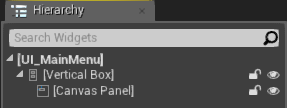
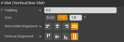
The Canvas Panel should already be selected, but if not, select it so we can change one important property. Now that it's a child of a container, we can set the size and alignment inside the vertical box slot. Since we want the canvas to occupy the entire game window, we set the Size to Fill and both horizontal and vertical alignment to also fill:
Having the canvas panel fill the entire game window gives us the opportunity to move and size any of its children widgets according to our needs. Now, however, we need something in there so we can actually test if our code will give us the desired results. So, let's add a temporary widget as a child of the canvas panel. So, add a border widget into the canvas naming it tmpBorder. Its position is not important. By default this widget is filled with white byt if you want to change that for better visibility, edit the Brush Color property, maybe to fully red. Then ensure this widget is set to be a variable (enable the Is Variable property) as we will need it to change it from blueprint during our tests.
We have to spawn the UI_MainMenu widget we have just created. This is typically done from the player controller class and that's precisely what we will do. At this point we do have two blueprint controller classes BP_PCMainMenu and BP_PCInGameDefault, the first associated with the main menu game mode and the second with the "default in game mode". Since we are beginning the implementation of the main menu, we will edit the BP_PCMainMenu blueprint class and, from the Event BeginPlay node we will add a node that will create the widget, take the return value, add into the viewport and set a flag that will make the mouse cursor to be visible.
The blueprint node used to spawn the widget is named Create Widget and once it's added you can click the Class dropdown menu and select UI_MainMenu, which will look like this:

All of the other nodes are straightforward to be added and the full blueprint should look like this:
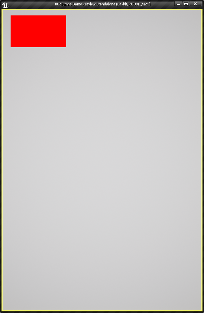
The result of this should look like this:
Set Position
Our first goal is create code that will allow us to place that red rectangle aligned with the top left of the background image. The first step to achieve that goal is create a blueprint function inside the UI_MainMenu widget. This new function will be used to set the position and the size of the menu that will be a child widget of the Canvas Panel. For testing purposes we will use that Border widget (the red rectangle) to represent the menu. With that said, open the UI_MainMenu widget asset and switch from the Designer tab into the Graph tab. In there you should have, by default, a docked window named My Blueprint with several categories such as Graphs, Functions, Macros and so on. Clicking on the + sign that is right besides the Functions category will add a new function and allow us to name it. So, do that and name it SetPositionAndSize (or any name that you prefer).
The blueprint graph should already be open with this new function and, if not, you can just double click its name on the list in the My Blueprint window. In the Details window of this function we want two inputs, one that will be used to specify the position and the other to specify the size of the main menu widget. In here we are dealing with a 2D position and for the size, we need width and height. This means that each of those inputs should be changed into Vector2D type:

In the graph we have to take the border variable tmpBorder and obtain its slot as a canvas slot, which will allow us to set the position and size, using the Set Position and Set Size nodes respectively. In the My Blueprint window, under the Variables section there should be a single one, tmpBorder. Drag it into the graph editor and select Get tmpBorder (as a shortcut you can hold the Ctrl when dropping the variable, which will automatically pick the "Get" option - holding the Alt key picks the "Set" option instead). From the variable node, search for the slot as canvas slot node and add it. From this last node we can add the Set Position node. For now we won't deal with the size, so ignore it. Connect the execution pin from the function into the Set Position node and then the Position input into the In Position of the Set Position node:
With this blueprint we can now set the position of that red rectangle. If you want to test it, you can either call it from the Event Construct in the widget blueprint or use the return value of the Create Widget node we have added in the player controller blueprint class.
Now we have to obtain the correct coordinates to set the position of the border to. We will obtain the necessary values from C++ and make them available to blueprints. Remember back in part 3 when the scene was setup in a way to make the camera always point into the exact center of the background image? Throughout the tutorial we have been able to do some assumptions and even simplified some of the code based on this fact. We can use that again to our advantage. The camera pointing to the center of the image also means that the very center of the game window corresponds to the image center. Why is this useful? Well, if you take half of the image's width then we know how much we have to move to the left to reach the image's border. And because we have placed the center of the image to correspond with the origin of the scene we can even make some more assumptions. All of the other coordinates follow the exact same logic and once we see the code hopefully things become more clear.
Based on this discussion, we will need to obtain the dimensions of the background image, which in turn we can retrieve from the theme data pointer. There is one detail however. With that calculations we are getting world space coordinates, but UMG requires screen space values. For that we can use the UGameplayStatics::ProjectWorldToScreen() function which requires a player controller pointer, the world space coordinates and a reference to a 2D vector where the output will be stored at. The last piece of detail is ProjectWorldToScreen() applies a viewport scale which we have to "remove" from the computed screen coordinates, otherwise the widgets will not be correctly positioned.
Ok, now we can think about how we are going to provide this information to blueprints. Since the ProjectWorldToScreen() function requires a player controller pointer we could think about adding a function in there meant to calculate the desired values. That's a perfectly valid option! There is another option, which is adding said function into the blueprint library. There is no wrong option here, really. The major difference here is the fact that the second option will probably result on cleaner blueprint graphs. Why? Well, if we come to call this function from the widget blueprint and this function is inside the controller class, we will have to obtain the player controller, cast it and then call the function. However, if the function is in the blueprint library all of those steps will already be implemented in native code and all we will have to do is use the node corresponding to the function. Because of that, I will opt for the blueprint library. With that said, let's declare the function:
// Obtain the gameplay area limits, top-left and bottom-right, in screen coordinates
UFUNCTION(BlueprintPure, meta = (WorldContext = "WorldContextObject"))
static void GetAreaLimits(const UObject* WorldContextObject, float ViewportScale, FVector2D& OutTopLeft, FVector2D& OutBottomRight);
In order to implement that, we will need to use the PaperSprite pointer property of the theme data, meaning that we have to update the include list of the .cpp file to include both the theme and the paper sprite:
#include "ColBPLibrary.h"
#include "Engine.h"
#include "ColGameInstance.h"
#include "ColPlayerController.h"
#include "ThemeData.h"
#include "PaperSprite.h"
Now to implement the function we first have to obtain a pointer to the theme data and another to the player controller since we will need both. Considering both are valid, we access the background image pointer in the theme data and extract the image dimensions. Right after, the calculation of the locations corresponding to the borders of the image, in world space. Then we use those values to build the vectors used with the ProjectWorldToScreen() function. In there we have to remember that, according to our setup, the Y coordinate moves away/towards the camera and is somewhat irrelevant for our case. Lastly we set the output 2D vectors to hold the screen space coordinates removing the viewport scale factor:
void UColBPLibrary::GetAreaLimits(const UObject* WorldContextObject, float ViewportScale, FVector2D& OutTopLeft, FVector2D& OutBottomRight)
{
   UThemeData* theme = GetGameTheme(WorldContextObject);
   AColPlayerController* pc = GetColPlayerController(WorldContextObject);

   if (theme && pc)
   {
      // First extract the backgroud image dimensions
      FVector2D back_size = FVector2D(720, 1080);         // default background image size
      if (theme->BackgroundSprite)
      {
         UTexture2D* tex = theme->BackgroundSprite->GetBakedTexture();
         if (tex)
         {
            back_size.X = tex->GetSizeX();
            back_size.Y = tex->GetSizeY();
         }
      }

      // Calculate world space coordinates corresponding to the four borders of the image
      const float right = back_size.X / 2.0f;
      const float left = -right;
      const float top = back_size.Y / 2.0f;
      const float bottom = -top;

      // Obtain the scaled top-left and bottom-right corners of the image
      FVector2D top_left, bottom_right;
      UGameplayStatics::ProjectWorldToScreen(pc, FVector(left, 0.0f, top), top_left);
      UGameplayStatics::ProjectWorldToScreen(pc, FVector(right, 0.0f, bottom), bottom_right);

      // "Remove" the viewport scale from the coordinates we have just obtained
      OutTopLeft = top_left / ViewportScale;
      OutBottomRight = bottom_right / ViewportScale;
   }
}
Now we can call the blueprint function we created early, Set Position and Size, meant to set the position and size of the widget. We can take the OutTopLeft output from the GetAreaLimits() function and plug into the Position input of the Set Position and Size. To make things a little simpler we will create a custom event that will gather all the necessary data and call the blueprint function.
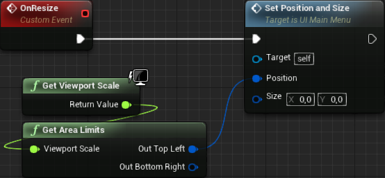
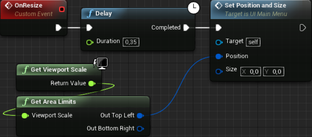
So, in the Event Graph panel of the UI_MainMenu widget, add a custom event and name it OnResize (or whatever name you prefer, really). This event does not require any inputs. From the event node's execution pin just add the Set Position and Size node and then in its Position input connect to the OutTopLeft pint of the Get Area Limits node. Finally, add a Get Viewport Scale node and connect it into the Viewport Scale input of the Get Area Limits, like this:
By default the event graph should already have a node called Event Construct. If it's not there you can add it. From its execution pin, just call the OnResize event we have created. Compile this blueprint and test. That red rectangle is not even being displayed anymore! What's going on? As it turns out, the result we are obtaining from the GetAreaLimits() is not correct at the moment we are calling the function. If we add a delay right before calling Set Position and Size we will be able to get the correct values. The problem here is, how long should we wait? During all my tests, 0.35 did work consistently. So, let's update the OnResize event by adding a delay of 0.35:
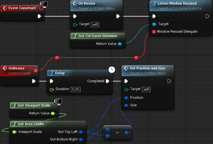
After testing this, although the red rectangle gets to the correct position, we can see it "jumping" from the wrong position into the correct one. This happens exactly because of the Delay node. While reducing the delay time would somewhat almost solve the "jumping" problem, we also get the inconsistency of not always correctly positioning the widget. Soon we will work on a way to at least get a less distracting effect. Let's first finish the size and position system. We are already correctly setting the position, now we need to resize the widget. GetAreaLimits() is returning the screen coordinates of two corners of our background image, top-left and bottom-right. Obtaining the size is extremely easy in this case, we just get the different between bottom-right and top-left points! This means, from the Bottom Right output of the GetAreaLimits() node, we add a subtract (Vector2D) node and connect the Top Left output into the second input node of the subtraction. Then, the result goes into the Size input of the Set Position and Size node, like this:
Of course, now we have to use the Size input inside the Set Position and Size blueprint function. Remember, we "ignored" it early! Open the function tab in order to update it and, from the Slot as Canvas Slot node output drag a new connection in order to create the Set Size node. Connect its In Size input into the function's Size input and then connect the execution from the Set Position into the Set Size, like this:
Now, test it. As you can see, the red rectangle is now fully covering the entire background image, which is exactly what we wanted. However, if the game window is resized, the widget will not be in the correct position and size anymore. Indeed, we have to call the OnResize custom event when the game window is resized. Fixing that is pretty simple, really. We already have all of the foundation code done! From the Event Construct, right after we call the OnResize custom event, we will want to add a new "listener" to our window resized event multi cast delegate system. We already have added one listener through C++, which consisted in obtaining a pointer to the ColGameInstance object and call its ListenWindowResized() function. As it turns out, that function was declared in a way that we can use it from blueprints. Moreover, we have a "shortcut function" that we have added into the blueprint function library that will give us the game instance pointer already casted to ColGameInstance. So, basically, we can add a new node, Get ColGameInstance, from its output we drag to create the Listen Window Resized, then connect the execution so it's called during the construction of the widget and finally we connect the OnResize event into the Listen Window Resized. Like this:
If you test it right now, you will see that it's now possible to resize the game window and keep the widget in the correct size and position, albeit with some effect that doesn't seem very nice, that is, the delayed "warping". Soon we will fix that.
Menu Buttons
Now that we have the position and size being correctly set, we can get rid of the red rectangle and start working on the menu layout. We will want a couple of buttons, one to lead to the actual game, which we can label it Play. One button to open the settings menu, another for displaying some help (basic playing instructions) and another one to quit the game. When the Play button is clicked, we will open a sub-menu presenting the available game modes. Similarly, when clicking the Settings, we will want to open a sub-menu containing the available options. Rather than changing into different game levels, one for each sub-menu, we will stuff everything into one specific widget named Widget Switcher. This widget allows us to create "tab-like" layouts and we switch widget display by just changing an index value.
With all that said, from the widgets pallette, locate the Widget Switcher (it's under the Panel category) and add one into the design. It should occupy the very same hierarchy of the tmpBorder we have been messing with, that is, it should be a direct child of the Canvas Panel. Change the name of the switcher to MenuSwitcher and make sure the Is Variable checkbox is checked (by default it should be). The next step is update the Set Position and Size blueprint function. In there we are changing the tmpBorder but we actually want to perform the changes to the MenuSwitcher. So, drag in a Get MenuSwitcher node, connect it into the Slot as Canvas Slot and delete the tmpBorder node.
Position the switcher anywhere you want and resize it so you will be able to work with the overall layout design. Again, neither the actual position or size will matter since both will be automatically calculated by the blueprint we have added. Nevertheless let's start adding the initial layout and work with the functionality later. Begin by adding a Vertical Box (also under the Panel category) as a child of the MenuSwitcher. This box will serve to place all of our buttons, one bellow the other, while helping us keeping the correct widget size/position within the MenuSwitcher. If you want to bring some organization, rename this box to MainMenuBox. We don't need to access this widget from blueprint, so don't check the Is Variable. Ensure the horizontal and vertical alignment properties of the MainMenuBox are set to Fill (by default they are).
Now add a Text widget and 4 text buttons (UIC_TextButton) directly into the MainMenuBox. The text will be used to display the title of the game. Ideally we should place an art of the game title but, as already said, I'm no artist! Let's rename all of the 5 new widgets. You don't have to follow my naming convention, but I usually prefix the visual widgets indicating what they are doing. As an example, the text is working as a "label", so I usually prefix that with lbl. Similarly, the buttons I prefix with bt. With that said, I have named the widgets as shown in the table bellow:
| Widget | Name |
|---|---|
| Text | lblGameTitle |
| Button1 | btPlay |
| Button2 | btSettings |
| Button3 | btHelp |
| Button4 | btQuit |
By default all buttons should be stretching out through the entire width of the MainMenuBox which, in turn, is fully occupying MenuSwitcher. Moreover, all of the buttons are very close one to another. We will deal with the actual layout design at a later moment. For now, let's temporarily make the Play button change the level into the InGameTraditional so we can start working with the positioning of the widgets while playing the game. To do that, select the button btPlay and click the giant green '+' button that is under the Events category, on the same row of OnClicked label. This will create a new OnClicked event node and automatically change into the graph editor. From there, just add a new node, OpenLevel and in its text box type InGameTraditional. If you named your map level differently, please use that name instead. Testing the game now, from the main menu if the Play button is pressed, we will directly transition into the InGame map. While we will want a somewhat different behavior later, this is enough for our initial tests.
In Game Widget
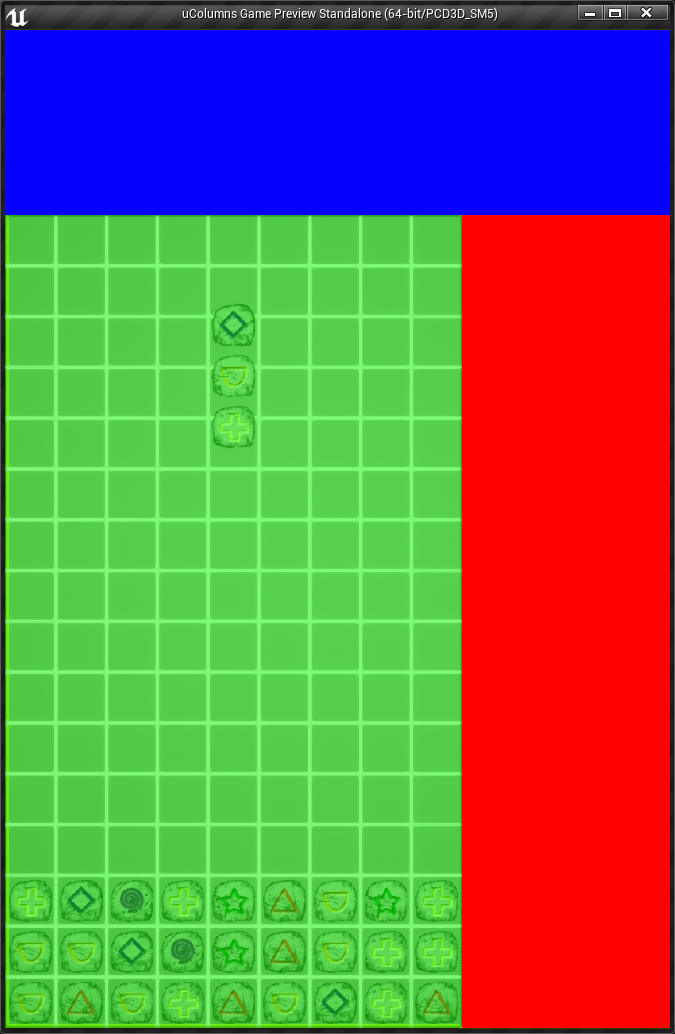
The widget used with the In Game map level is a bit different. We will somewhat divide the available area in 3, Top Area, Grid Area and Extra Area. The Top Area should occupy the entire width of the background image but its height should only fill the are not used by the grid. Then we have the Grid Area where we will place the menu that should be displayed when the game is lost or paused. Finally, the Extra Area uses the remaining space, which sits on the right side of the grid. Instead of stuffing everything inside a single panel/container and messing with properties in order to obtain the desired layout, we will actually add in 3 different boxes, one for each of the described areas.
In the same directory of the UI_MainMenu, create yet another Widget Blueprint asset, naming it UI_InGame. Similarly to what was done in the UI_MainMenu, wrap the Canvas Panel in a Vertical Box and set the Canvas Panel properties to fill (size and alignment). The 3 mentioned boxes should be direct children of the Canvas Panel.
With that said let's slowly add our boxes. First, we add one for the Top Area, Horizontal Box. In this case we use this widget because we will have different widgets that will be spread across the width of the area. Name it TopBox and make sure the IsVariable check box is checked. Just to test our layout code, add a Border into the TopBox and set its brush to any color different from black so it becomes different from the space surrounding the background image. Also set the properties to Fill (size and alignment).
The second box will be the Grid Area. Since we will display a few widgets, one bellow the other, the Vertical Box becomes the perfect candidate in this case. So add one and name it GridBox, making sure its IsVariable property is checked. Similarly, add a temporary Border widget into the GridBox, setting its brush color to something different from black and the other border. If you want, add in some transparency since it's meant to be on top of the grid. Remember to set the Fill properties.
Finally, the last box should hold a few widgets one bellow the other. The thing is, there isn't much horizontal space left, so the Vertical Box becomes the choice. Add one and name it ExtraBox, checking the IsVariable check box. Again, add into the box a temporary border setting its brush to a third color that isn't black and don't forget to set the fill properties.
The reason for the 3 different color borders were added is just so we can properly visualize if our code to distribute the boxes is working correctly. Speaking of that, we need some C++ code to provide us with extra data. Namely, we need information regarding the coordinates of the grid itself. Granted, TopBox and ExtraBox have to "surround" the grid, while GridBox must be placed on top of the grid itself. Remember, the position and size of those boxes inside the design area are not important, just make sure you can somewhat preview the overall layout.
Similarly to our GetAreaLimits() function, we can create another one to give us the grid limits. In order to obtain the necessary values, we have to access the PlayField object. Back in part 6 we used Actor Iterator in order to initialize PlayField objects. We will use the Actor iterator now in order to obtain the pointer to the object and setup the output arguments with the relevant values. We are not going to "iterate" (through the use of ++ operator) and we don't have to, since we are not adding multiple PlayField objects into the scene.
We will break calculation into two functions, one in the PlayField class that will return the world space coordinates of the grid limits and the other function will be added into the blueprint function library, which will take the world coordinates and convert into screen coordinates. Let's begin by declaring the public function in the PlayField class:
void GetWorldGridLimits(FVector2D& OutTopLeft, FVector2D& OutBottomRight) const;
We can easily calculate the bottom-left corner of the grid. Remember, we aligned that with the same corner of the background image. And we already know how to calculate the world coordinates of the four borders of the background image. We even have direct access to an internal property that holds the dimensions of the image, so we can use that. In order to calculate the top and right border coordinates of the grid we only need to use the total size of it, which can be easily calculated by taking the individual cell size and multiplying by the number of columns (width) and rows (height). Just remember that we have to take the mMapScale into account. With that said, let's implement GetWorldGridLimits():
void APlayField::GetWorldGridLimits(FVector2D& OutTopLeft, FVector2D& OutBottomRight) const
{
   const float grid_width = (float)(mTileSpriteSize * mColumnCount) * mMapScale;
   const float grid_height = (float)(mTileSpriteSize * mRowCount) * mMapScale;

   const float left = -mBackgroundSize.X / 2.0f;
   const float bottom = -mBackgroundSize.Y / 2.0f;

   const float right = left + grid_width;
   const float top = bottom + grid_height;

   OutTopLeft = FVector2D(left, top);
   OutBottomRight = FVector2D(right, bottom);
}
Next we declare the blueprint function, in our library:
// Obtain the screen space grid limits, top-left and bottom-right
UFUNCTION(BlueprintPure, meta = (WorldContext = "WorldContextObject"))
static void GetGridLimits(const UObject* WorldContextObject, float ViewportScale, FVector2D& OutTopLeft, FVector2D& OutBottomRight);
The implementation of this function will require access to the APlayField class, meaning that we will need to include its header:
#include "ColBPLibrary.h"
#include "Engine.h"
#include "ColGameInstance.h"
#include "ColPlayerController.h"
#include "ThemeData.h"
#include "PaperSprite.h"
#include "PlayField.h"
Back to the GetGridLimits, first we have to obtain the PlayField object pointer as well as the player controller. Provided both are valid, we basically repeat the same logic of the GetAreaLimits function, in which we get the world coordinates of the relevant corners and then use ProjectWorldToScreen function to convert into screen coordinates:
void UColBPLibrary::GetGridLimits(const UObject* WorldContextObject, float ViewportScale, FVector2D& OutTopLeft, FVector2D& OutBottomRight)
{
   TActorIterator<APlayField> it(GEngine->GetWorldFromContextObjectChecked(WorldContextObject));
   APlayField* pf = it ? *it : nullptr;
   AColPlayerController* pc = GetColPlayerController(WorldContextObject);

   if (pf && pc)
   {
      FVector2D wtop_left, wbottom_right;

      pf->GetWorldGridLimits(wtop_left, wbottom_right);

      FVector2D stop_left, sbottom_right;
      UGameplayStatics::ProjectWorldToScreen(pc, FVector(wtop_left.X, 0.0f, wtop_left.Y), stop_left);
      UGameplayStatics::ProjectWorldToScreen(pc, FVector(wbottom_right.X, 0.0f, wbottom_right.Y), sbottom_right);

      OutTopLeft = stop_left / ViewportScale;
      OutBottomRight = sbottom_right / ViewportScale;
   }
}
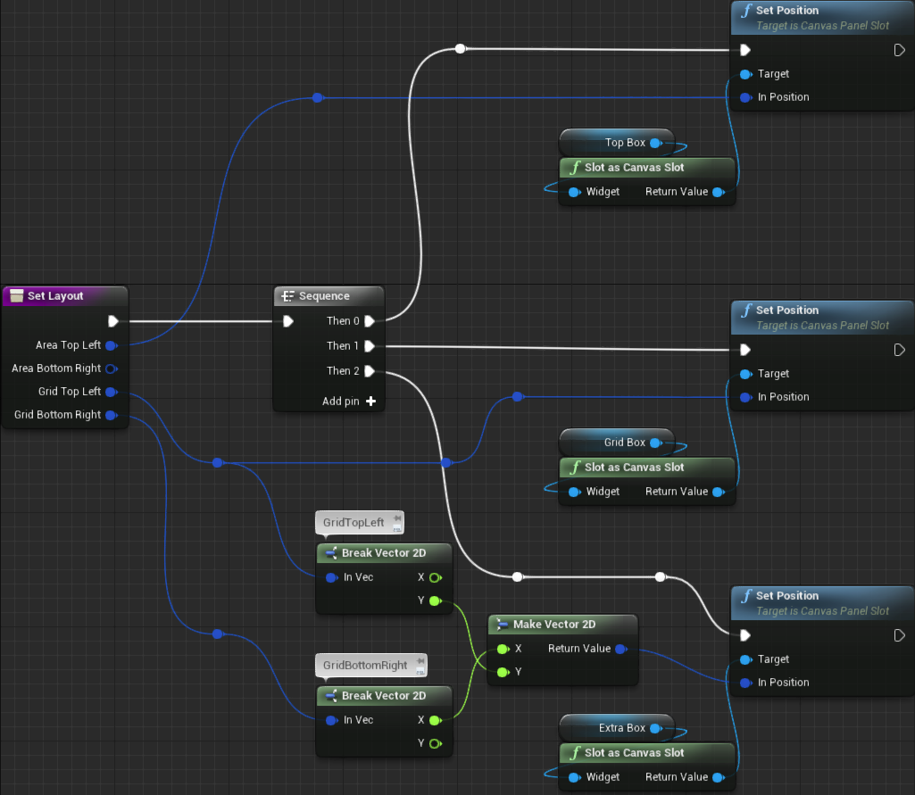
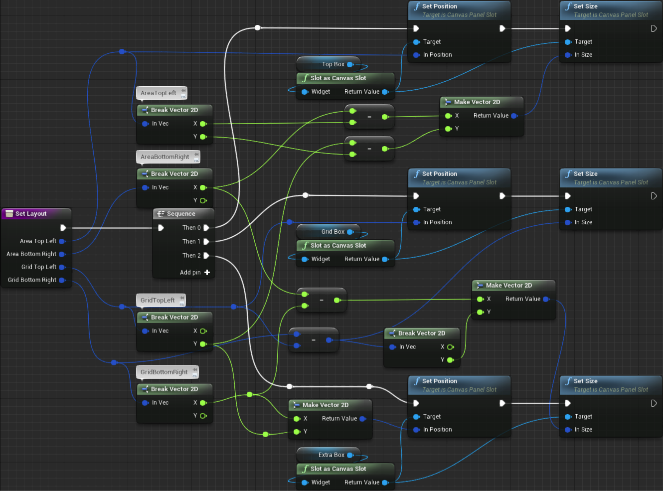
We can now go back into the widget blueprint. We will begin by creating a blueprint function that will be used to set the entire layout of the widget (UI_InGame). Let's name this new function SetLayout and add 4 inputs, all of them Vector2D type. Name those inputs as AreaTopLeft, AreaBottomRight, GridTopLeft and GridBottomRight, respectively. We will have to perform some calculations inside this blueprint function. In order to help with the graph organization, we will begin by adding a Sequence node with 3 pins, one for each area that we will setup.
Similarly to the way we implemented the SetPositionAndSize blueprint function of the UI_MainMenu widget, we will begin by setting the positions of the boxes and then we work with the sizes. The position of the TopBox is easy since its top-left must align with the top-left of the background image. In this case, the AreaTopLeft input is meant to hold this information. With that said, we bring a Get TopBox node and from it Slot as Canvas Slot node. From this last node, we add the Set Position node and in its In Position input we directly connect AreaTopLeft input from the function.
Next we add the Get GridBox -> Slot as Canvas Slot -> Set Position. We have the top-left screen coordinate of the grid, GridTopLeft function input. So, just connect that directly into the In Position of the Set Position node.
Then we have the Get ExtraBox -> Slot as Canvas Slot -> Set Position. What we want here is the coordinate of the grid's top-right position. As it turns out, it's just a combination of GridTopLeft.Y (which gives the "top") and GridBottomRight.X (which gives the "right"). To get the individual components of each vector we have to "break" them, using the Break node. If you drag from the GridTopLeft input pin, you will be able to search for Break Vector 2D. Do the same thing in order to break the GridBottomRight. This node outputs the individual components of the input vector. Just to make things easier to track, I have right clicked each of those Break nodes and added a comment indicating which vector it's breaking. From the X output of the GridBottomRight break node, create a Make Vector 2D node, which will combine two input floats into and create a new vector 2D. Then take the Y output of the GridTopLeft break node and connect into the Y input of this new Make Vector 2D node. From this new vector, connect it into the In Position input of the Set Position node.
The last thing is to connect each of the 3 execution pins of the Sequence node into each of the Set Position nodes and, of course, the execution pin of the function into the Sequence:
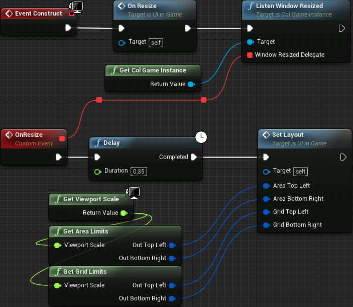
Now, in the event graph, let's create the custom event, OnResize, much like in the same way we did in the UI_MainMenu. In its execution we directly add the delay, set to 0.35 and call the SetLayout function we have just created. Then, we have to add both GetAreaLimits and GetGridLimits nodes. With a single GetViewportScale we can connect into both of these nodes. From the Event Construct we call this new custom event, as well as obtain the ColGameInstance to call its ListenWindowResized, while connecting its WindowResizedDelegate input to the custom event OnResize:
Now, you click Play, enter the InGameTraditional level and, "only" the game shows, no widgets are displayed! Yes, we didn't add any blueprint to spawn the UI_MainMenu! Let's fix that. Open the BP_PCInGameDefault player controller and follow the same idea of the BP_PCMainMenu:
You may have noticed that I enabled the mouse cursor within the game. Ideally we should disable it and only enable when the pause/game_over menu is shown. I will not show exactly how to do this behavior because it's really trivial! Moreover, keeping it on helps a bit with testing specially with the resizing aspect of the game window.
Now the UI_MainMenu should be displayed and the rectangles should be in the correct positions, including the update after the game window is resized. Still, we have to change the sizes so the widgets occupy the areas accordingly. Jump back into the SetLayout blueprint function so we can perform the necessary calculations. Don't worry, they are relatively easy, just a bit busy in the graph! We begin with the TopBox size. As mentioned, the Top Area is meant to use the entire width while fully occupying what height is left above the grid. To calculate the width we just obtain the difference between AreaBottomRight.X and AreaTopLeft.X which, in other words, is just calculating right - left. The available height we have to take the top coordinate of the grid, GridTopLeft.Y and calculate the difference between it and the top coordinate of the background image AreaTopLeft.Y.
To calculate the size of the GridBox all we have to do is obtain the difference between GridBottomRight and GridTopLeft. In short, this operation calculates grid_right - grid_left, which calculates the width, and grid_bottom - grid_top, obtaining the grid height.
Finally, the ExtraBox size. Its width is the remaining space on the right side of the grid. We can obtain this by calculating the difference between the Area Limits Right (AreaBottomRight.X) and Grid Limits Right (GridBottomRight.X). The height is the available space left bellow the top area which is the exact same one of the grid! The height of the grid is already being calculated, albeit we will have to break the vector and take only the Y component.
As you can see, the computations involve only subtractions but, even though those are easy, the resulting graph is a bit chaotic (of course, that can be greatly amplified by the fact that I'm terrible at organizing the layout of blueprint nodes).
Hopefully my explanation is enough for you to understand the necessary operations and come up with a much better organized graph layout than mine! And, the result should look something like this:
Reposition Hiding
Currently, when the game is first initialized, the widgets will be out of position and then once the delay expires the size and position take place to correct the widget layout. This can be somewhat very distracting and although we can't fully remove this "warping" of the widgets (because of the delay), we can at least reduce the negative impact of seeing the widgets in the wrong position by simply hiding them and once the size and positions are set, we un-hide them. Let's begin by performing those actions from the main menu widget and then we do something similar to the in game widget.
First, we add a new blueprint function, SetVisible with a single boolean input named Visibility. In this function, if the input's value is true, we set the overall widget to be shown and if it's false, we hide everything. In the case of the main menu widget, all we have to deal with is the visibility of the MenuSwitcher widget, since everything in the main menu is added as children of the switcher. So, add a Get MenuSwitcher node and from it add the Set Visibility node. From this new node's In Visibility input pin, drag in to create a new node, Select. This new Select node should contain Option 0, Option 1 and Index - Wildcard input pins. Directly connect the function's boolean input, Visibility, into the Index. After doing this Option 0 should be changed into False while Option 1 changes into True. What this means is, if the Index input is false, it will take whatever we have selected in the drop down bellow the False option and if it's true, the selection of the True input. With that said, we want to hide the widget if the Visibility input is false, so in the Select node, under the False input, select Hidden. Don't forget the execution pin, going from the function into the Set Visibility node:
Now, in the event graph, we edit the OnResize custom event. Before starting the delay, we call Set Visible with the input set to false. Then, after Set Position and Size we call this function yet again, but with the input set to true:
That's it. Now, when the game initializes we don't see that distracting widget warping from the wrong positing into the correct one. Moreover, when the user begins to resize the window, the widgets are immediately hidden and will only reappear when they are set to the correct size and position!
We have to repeat the same visibility thing with the UI_InGame widget. In this case, however, we have to change the visibility of 3 container boxes instead of a single one. Because all three of the boxes are of the same type we can hook them into a single Set Visibility node. The SetVisible function will look something like this:
Of course, we have to update the OnResize event in order to hide and then un-hide the widgets:
In this part we have created the base "main" widgets, that is, the ones that will be spawned and will control the overall layout of what is displayed. However, none of them contain any final functionality, besides the correct computation of the position and size of the various children widgets. In the next part we begin working on the functionality of the HUD, that is, the in game widget.

