Part 20 - Second PolishingApril 11, 2019
We now have two "complete" game modes, with their unique rules. Music and sound effects are in place. And we have a particle effect that is spawned when the blocks are removed from the grid. We are still lacking quite a few things, like the settings menu, where we can set the audio volume and screen resolution. We are also lacking extra themes, as well as means to select those. In this part we will work on those aspects of the project right after an small improvement to the particle system.
Particle Effect - Revisited
Back in part 18 we created the particle system meant to be spawned when the blocks are removed from the grid. However, after playing a bit, it lacks some color. We can add a third emitter meant to do so, based on the destroyed blocks. The way we will specify the color will be through an additional property in FBlockData struct meaning that we will be able to define each block's color when editing the theme data. That said, add the property:
// The "dominant" color that will be used when spawning particle effects
UPROPERTY(EditAnywhere, BlueprintReadWrite)
FLinearColor ParticlesColor;
And then, we initialize it with a default white value, in the constructor:
FBlockData()
   : ProbabilityWeight(1.0f)
   , BlockClass(ABlock::StaticClass())
   , Material(nullptr)
   , ParticlesColor(FLinearColor(1.0f, 1.0f, 1.0f, 1.0f))
{}
Next we need easy means to obtain that property from blueprints. As usual, we add a new function in our blueprint library:
// Get the particles color property from the theme data, given the block reference
UFUNCTION(BlueprintPure, meta = (WorldContext = "WorldContextObject"))
static FLinearColor GetParticlesColor(const class ABlock* Block, const UObject* WorldContextObject);
The implementation follows the same logic of many other functions we have added into this library. That is, we obtain the theme data and if it's valid we retrieve the desired value from it. We also return white in case it fails to get a valid theme data pointer:
FLinearColor UColBPLibrary::GetParticlesColor(const class ABlock* Block, const UObject* WorldContextObject)
{
   FLinearColor retval = FLinearColor(1.0f, 1.0f, 1.0f, 1.0f);
   if (UThemeData* theme = GetGameTheme(WorldContextObject))
   {
      const int32 block_id = Block->GetTypeID();
      if (block_id < theme->BlockCollection.Num())
      {
         retval = theme->BlockCollection[block_id].ParticlesColor;
      }
   }
   return retval;
}
Once the project is built again, we can edit the theme data in order to set the color property in each block definition:

Next we have to edit the PS_Shatter particle system so we can specify a color through parameter. In there we add a third emitter to it, called ColorSparkles. Since it's mostly a copy of the Sparkles emitter (right click Sparkles then Emitter → Duplicate Emitter), it's easier to just duplicate it and then perform a few changes. The major difference is an additional module, Scale Color / Life. The cards bellow are only for the modules with different settings (in comparison to the Sparkles emitter) as well as the extra module:
Module: Spawn
Change Count from 100 to 60 and Count Low from 40 to 20.
Module: Initial Size
Instead of the range 4..5, set to 5..9, that is, Max = (9.0, 9.0, 9.0) and Min = (5.0, 5.0, 5.0)
Module: Color Over Life
The Constant color, instead of setting 0.85 for all components, we set to 1.0.
Module: Scale Color / Life (Color → Scale Color / Life)
This module will be used as a parameter so we can change the color from outside.
Module: Scale Color / Life (Color → Scale Color / Life)
This module will be used as a parameter so we can change the color from outside.
Color Scale Over Life -> Distribution should be set to Distribution Vector Particle Parameter, which will effectively make this as a parameter. After doing that, it's possible to change the Parameter Name. In this case, set to SparklesColorScale, which is how we will access this from outside the system.
Then, change the Max Input (and Max Output) to RGB = (5.0, 5.0, 5.0), which will allow us to increase the values beyond 1.0, effectively making the colors slightly brighter.
The preview from the particle system editor everything will look almost the same of the previous, just with some extra "dust", so there is no point in showcasing an animation here. Nevertheless, all that is left to do now is set the parameter as soon as the particle system is spawned. That said, open the BP_Block and in there we update the OnBeingDestroyed event, calling the Set Color Parameter from the return value of the Spawn Emitter at Location. When setting the parameter we need two inputs, one being the name of the parameter itself, which we have set to SparklesColorScale. The other input is the color itself, which we can obtain from the GetParticlesColor function that we have defined in our blueprint library:

And now, the spawned particles will have some color. If you want the colored "dust" to be brighter, just multiply the return value from Get Particles Color before plugging into the Set Color Parameter. Note that I did want them to be very subtle and not dominant in the particle effect.
Game Settings
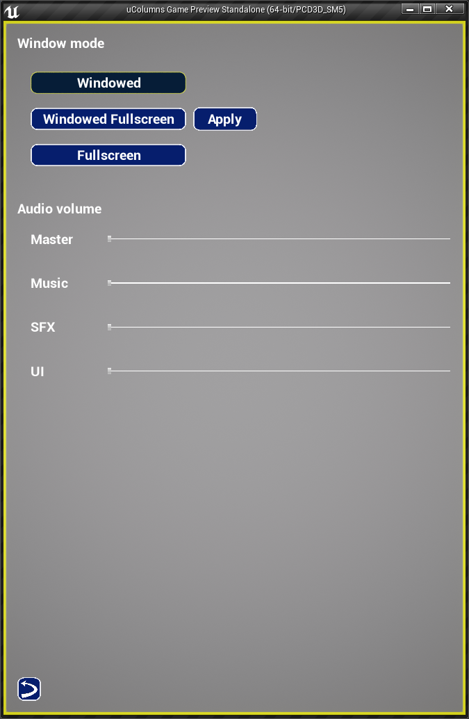
In this project we will provide options for the player to change the audio volume, each "channel" independently, and the game window mode (full screen, full screen windowed and windowed). Of course we could add extra video settings but they are not really necessary for this project. We will begin by working on the UMG widget that will allow us to change the settings. For that, open the helper widget UI_Settings and delete the default Canvas Panel and place one Vertical Box in its place.
First we add means to choose the video mode, between windowed, windowed fullscreen and fullscreen. A possibility here is to use a combo widget for this task, however this bug renders this less than ideal for us, since we do want keyboard/gamepad navigation within our widgets! Because of that we will have to rely on a different strategy, that is, radio buttons. Well, sort of! We will use the toggle buttons we have implemented early!
So, let's first add a text widget to serve as a label, which can set the text to Window mode. Bellow this label we add the toggle buttons and a text button meant to apply the video mode change. The idea is to have each toggle button one bellow the other, while having the Apply text button to the right of this "column" of buttons. To do that, add one horizontal box and, inside of it, another vertical box. Within this inner vertical box, add 3 toggle buttons, naming them chkWindowed, chkWindowedFScreen and chkFScreen, respectively. Then, set their Label property to correspond to those options, Windowed, Windowed Fullscreen and Fullscreen. Then add the text button within the horizontal box but after its inner vertical box. Name this button btApply and set its label accordingly to Apply. In order to keep this button's height constrained to our layout, set its vertical alignment to Center.
There is one problem now. The labels of the toggle buttons are way too big and the width = 150 that we are somewhat "enforcing" is not enough. Luckily we have means to ignore that! Wrap the inner vertical box with a size box and override the width setting it to something like 380. That now allows the labels to fit the buttons, but they are too close one to another. So, select the toggle buttons and change the padding to 16.
The btApply is also not handling its width consistently, so wrap it with yet another size box and override just the width, setting to 150.
We will deal with the functionality of all those buttons shortly but, for now, let's move to the audio "rows". Because it's a different category of settings, let's add some space between the first audio "row" and the window mode selection by placing one Spacer widget (under the Primitive category) in the vertical box. In the spacer we can edit the Y size (there is no need to change the X size) to 32. Next add, directly into the vertical box, a text to work as a label, which should be set to Audio volume. After that we want 4 rows, one to control the master volume, another for the music, then one more for the sound effects and, finally, one for the user interface sounds. We will control the volume through the custom slider widget (UIC_Slider) and each one of them will by linked to one of our sound classes. That said, add four horizontal boxes and in each one:
- Text to work as label (Master, Music, SFX and UI, respectively).
- UIC_Slider widget, which will be used to control the sound class volume setting, renaming to
slMaster,slMusic,slSFXandslUI, respectively. - Select the horizontal box and set its left padding to
32. - Set the
Sizeproperty of all sliders toFill.
Once step "4" is completed on all rows, you may have noticed the fact that our sliders are now of different sizes, not to mention they are way too close to the label. There are numerous ways to layout this, but I found the most straightforward way is to set the Min Desired width of each label to 180 (or something enough for the biggest text). By doing so, every text label will occupy the exact same width, provided the value is enough for the biggest text.
Testing the menu right now will indeed show the settings, however everything is way to close to the borders because there is no padding. Let's change that. First select both main text widgets (the Window mode and Audio volume) and set their padding to 32. Then select the horizontal box holding the toggle buttons and change the padding to 32 but the Left to 64 so we give some kind of "indentation". Then, set the Top padding to 0 so it isn't so far away from the category text.
After setting the padding within the horizontal box, the distance between the two categories become even bigger. We can either further change the padding or remove the spacer widget. I decided to remove the spacer simply because it's easier and gives a cleaner widget hierarchy.
Next, select each of the horizontal boxes holding the sliders and set their padding to 32. Just to keep this indentation logic, change the Left padding to 64. Now, the distance between the tex (Audio volume) and the first slider became too big. Select just the first row and change the Top padding to 0. Testing the menu right now should be a lot better in regards to this spacing, however there is an inconsistency between the indentation of the toggle buttons and the volume settings. In this case, the toggle buttons are slightly shifted to the right in comparison to the volume rows. To fix that, select each of the toggle buttons and change the Left padding to 0.
This is re result so far:
Window Mode
Before working with the window mode setting, I have to mention the fact that this cannot be tested with the Play In Editor but it will sort of work on Stand Alone mode. However, save/load will not (click the arrowhead next to the play button to access the menu):

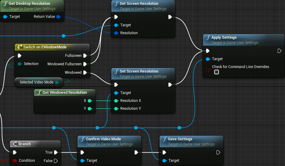
Ok, back to the settings widget. When the menu is open in game and we click the btApply button we will want to change the video mode according to the checked toggled button. This will be somewhat easy through the use of an internal variable of the type EWindow Mode named SelectedVideoMode, which is an enumeration provided by Unreal Engine, so create this variable. Later we will properly set it up. If desired, set its default value although it will be overwritten once we retrieve values from the game settings.
Then we add a new function, ChangeVideoMode, that will be used to effectively change the window mode and, based on an input flag, save the changes or not. Since this function will perform changes, we can't set it to Pure. Anyway, add one boolean input, named SaveChanges. The graph logic in here is easy but quite busy, meaning that it's also easy to mess things up. The thing is, most of what we will do here depends on the object reference returned by the Get Game User Settings node. The problem here is that we can't promote the return value to a variable and this node does require an execution pin. What this means is that we will have quite a bit of connections coming out of this node all over the place. Anyway, the logic will be performed over a switch on EWindow Mode, more specifically the returned value stored in the SelectedVideoMode variable. This switch will generate three output execution pins, one for each possible window mode.
From the game user settings object we can call the Set Fullscreen Mode, which requires the window mode as input and we can directly input there the SelectedVideoMode variable. For both Fullscreen and Windowed Fullscreen we will want to set the resolution to match the desktop resolution. We do that by using Get Desktop Resolution and Set Screen Resolution nodes, both are also obtained from the game user settings object. For the windowed mode we will have to specify some resolution that must be smaller than the desktop resolution. Once the screen mode and resolution are set, we have to call the Apply Settings node, which is also from the game user settings object. Lastly, if the Save Settings input flag is true, we have to confirm and save the settings, using the Confirm Video Mode and Save Settings nodes and you may have guessed right, both of those functions also come from the game user settings object. For the moment we will hard code the windowed resolution and at a later moment we will properly calculate it. For now let's see this "beast function" (in order to have the two resolution input pins within the Set Screen Resolution node, right click the Resolution input and then Split Struct Pin):

There is a warning here, however: ideally we should not directly confirm/save the settings as they might not work! This will, of course, result in saved settings that will lead to something that will not work and restarting the game will probably not fix the problem. Later in the tutorial we will deal with that.
Let's now incorporate functionality into the toggle buttons. We have already dealt (twice) with the logic that we will use here. First crate a function named VModeRadio that will be used to uncheck all of the video mode toggle buttons and then check the function's input:
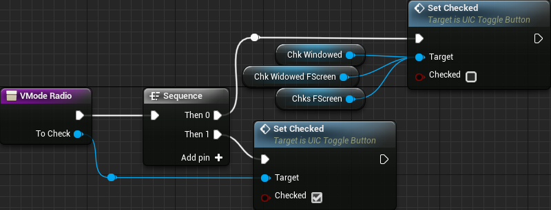
Next we handle the OnCheckStateChanged of all three toggle buttons. We basically call the VModeRadio function, providing the relevant object as well as set the SelectedVideoMode variable:

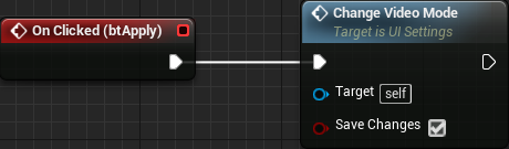
All we do from the btApply OnClicked event is call the ChangeVideoMode node, enabling the Save Changes input:
If you test now you may notice that when you select "Windowed" mode and apply it, the interface will become really small, specially when comparing to the two full screen modes. That's because of the DPI scaling. We can mitigate the inconsistency here by changing the DPI Scale Rule from Shortest Side to Vertical and setting Application Scale = 0.9. Doing so will reduce the inconsistency, yes, but now, when the game is first launched (in stand alone mode - windowed), the widgets will be very small until any of the three modes gets applied. Once that is done indeed we get the scaling to happen. Shortly we will fix that, when we add the blueprint graph to load and apply saved settings.
There is another problem here (well, two actually) related to the window resizing. Although it's a bit (ok, very) hard to place the mouse at the correct place and resize the window, it's possible to do so but the aspect ratio is locked. And then, after applying the windowed mode, if you drag the window to the top of the screen so it gets maximized, the widgets will disappear. Quite frankly, I was unable to find why that happens, but if minimize and maximize are disabled dragging the window will not do anything to its size if moved to the top of the screen. And the nice thing is that in the very same place we disable minimize and maximize we can also unlock the aspect ratio of the window. That said, open the project settings and under the Project -> Description category, there is the Settings section. In there disable Should Window Preserve Aspect Ratio in order to allow us to resize the window and then, disable Allow Maximize and Allow Minimize so resizing can only be done by dragging from its borders.

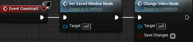
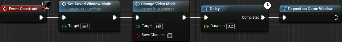
Ok, we can now work on the blueprint graph to load the settings and apply them. When the widget gets constructed we obtain game user settings objects and, from it, request to load the settings and then call the Change Video Mode function we have created. Now, however, that function requires the SelectedVideoMode variable to be holding the correct value in order for it to work. For that we create a new function meant to set the variable based on the loaded value. That said, create a new function named SetSavedWindowMode. There is no need for input or output and since we are going to modify internal data we can't set it to Pure. Anyway, in this function we get the game user settings, request to load the settings and then obtain the saved window mode through GetFullscreen Mode directly plugging the return value into the SelectedVideoMode variable. Right after that we ensure the correct toggle button get checked.

And then, from the construct event node we call this function and right after it, the Change Video Mode function, but this time we don't save the changes (keep the Save Changes unchecked):
As I have already mentioned, we can't test the save/load from PIE or even stand alone window but still, launching the game now should apply the windowed full screen mode. There's another thing that I want to mention. If you switch between full screen and windowed through the Alt+Enter keyboard shortcut, the combo box will not be correct. There is more, doing so even brings back the widget sizing inconsistency caused by the DPI scaling. Although we could easily update the combo box after the switch by just listening to the window resize event, I couldn't find anything to fix the widget scaling. So, the next thing is to actually disable the Alt+Enter shortcut. This can be done by opening the Project Settings and under Engine->Input expand the Bindings section by clicking the arrowhead in there. This will reveal a lot of mouse settings as well as two keyboard shortcut keys that toggles full screen mode. Disable both options and then we will only be able to switch window mode through the settings menu:

Finally, we have to calculate the correct window resolution for the windowed mode. Unreal Engine provides one function called Get Convenient Windowed Resolutions, which returns an array of resolutions that can be set when in windowed mode. The problem is that most likely none of the provided resolutions is useful for us. Instead we have to calculate one that can use the entire height of the screen and the keep the aspect ratio to hold our background image. The hard coded values I have entered hold this ratio for the project setup described throughout this tutorial. You may have noticed the fact that the ratio is quite different from that of the image. This happens because the resolution we provide includes the window borders and decorations. Nevertheless, we want the desktop height minus task bar height and, as far as I know, we don't have means to directly obtain this value from blueprints. Since we will have to deal with C++ for this task, the perfect place will be in our blueprint library. The goal of this function is to calculate the desired window resolution, so declare it as follows:
// Calculate the window resolution for windowed mode, so the result uses the entire height of the desktop, minus the taskbar
UFUNCTION(BlueprintPure)
static void GetWindowedResolution(int32& X, int32& Y);
To implement this function we will use the Display Metrics object. Conveniently it provides us PrimaryDisplayWorkAreaRect. Quoting from its description in the documentation:
Area of the primary display not covered by task bars or other docked widgets
That's precisely what we want! With this rectangle we calculate the height and apply the aspect ratio in order to calculate the window width. Considering the hard coded resolution I have used, 665x1000, the aspect ratio becomes 0.665, meaning that we can simply calculate width = work area height * 0.665.
Now there are a few details that we have to take into account. When we call Set Screen Resolution we are requesting the window contents to be of that resolution, meaning that in windowed mode we will get something slightly bigger because of the title bar and the borders. We can obtain the border sizes as well as the title bar size through GetWindowBorderSize() and GetWindowTitleBarSize() functions, which are part of the FGeneric class. In turn, this object can be obtained from the game window objects, which is of type SWindow and, this one, we get from the game viewport, which is retrieved from the game engine object (phew!). The next detail I have to mention is the fact that adding top and bottom borders together seems to give an slightly bigger value (as if doubled) than what we want (at least this happened on all my tests). Because of that, in the code, only the bottom section of the retrieved margin is used. Finally, some of the returned values will be different if the game window is not in windowed mode. This means we have to make sure the window is in the necessary mode (windowed) before performing the queries. If we make sure to only call this function when setting the window mode (as we are doing form the ChangeVideoMode function), there will be no problem related to the C++ code:
void UColBPLibrary::GetWindowedResolution(int32& X, int32& Y)
{
   FDisplayMetrics dmetrics;
   FDisplayMetrics::GetDisplayMetrics(dmetrics);

   // Calculate the available height
   Y = dmetrics.PrimaryDisplayWorkAreaRect.Bottom - dmetrics.PrimaryDisplayWorkAreaRect.Top;
   // Subtract the window title bar height from the returned Y value
   if (GEngine && GEngine->GameViewport)
   {
      TSharedPtr<SWindow> game_window = GEngine->GameViewport->GetWindow();
      game_window->SetWindowMode(EWindowMode::Windowed);

      FMargin margin = game_window->GetNativeWindow()->GetWindowBorderSize();

      Y -= (margin.Bottom + game_window->GetNativeWindow()->GetWindowTitleBarSize());
   }
   // Apply the aspect ratio to calculate width
   X = Y * 0.665f;
}
Now, however, in order to build the project it's necessary to update the module dependency list in the [project_name].Build.cs file. More specifically we add ApplicationCore to the private dependency list, so it becomes this:
PrivateDependencyModuleNames.AddRange(new string[] { "UMG", "Slate", "SlateCore", "ApplicationCore" });
Once the project is built we can use the function to provide us the desired resolution. In other words, within that ChangeVideoMode function we use this calculation and directly plug in the Set Screen Resolution node, the one coming from the Windowed execution pin of the Switch node (showing only the relevant part of the blueprint graph):
Oook. There is still one thing we have to deal with. Did you notice the fact that when we apply the windowed mode, the resulting window gets a bit out of place, slightly above the top of the screen (title bar partially cut)? For some reason the vertical position computed by the engine (which defaults to center) is giving this offset. We will have to get the window object and call its MoveWindowTo() function. Again, we will need an extra C++ function to perform the tasks we need and in this case it will be called RepositionGameWindow():
// Reposition the game window so it's vertical coordinate keeps the whole window (including title bar) visible
UFUNCTION(BlueprintCallable)
static void RepositionGameWindow();
In this function, once we get the game window object, SWindow, we can call the MoveWindowTo() function, which requires the X and Y coordinates, provided through FVector2D. Once again, this function seems to ignore the title bar so, if we are in windowed mode and set the Y position to 0, then the title bar will be completely above the work area. This means we have to take the title bar and the border margin into account and offset (adding) from the work are top value. Anyway, in the function we first make sure the window mode is the expected one (windowed) and, if not, we bail from the function. Then, we query the relevant objects, as was already shown:
void UColBPLibrary::RepositionGameWindow()
{
   TSharedPtr<SWindow> game_window = GEngine->GameViewport->GetWindow();
   if (game_window->GetWindowMode() != EWindowMode::Windowed)
      return;

   if (GEngine && GEngine->GameViewport)
   {
      FDisplayMetrics dmetrics;
      FDisplayMetrics::GetDisplayMetrics(dmetrics);

      // We want the horizontal position to remain the same and change only the vertical one.
      FVector2D npos = game_window->GetPositionInScreen();
      const FMargin margin(game_window->GetNativeWindow()->GetWindowBorderSize());
      npos.Y = dmetrics.PrimaryDisplayWorkAreaRect.Top + game_window->GetNativeWindow()->GetWindowTitleBarSize() + margin.Top;
      game_window->MoveWindowTo(npos);
   }
}
Lastly, we have to call this new function from our blueprint graph. In the Change Video Mode, after performing every other task, we call this function. The easiest way in this case is to add a new execution pin to the Sequence node and, in the last one call RepositionGameWindow:

Testing the game right now should indeed give the (almost) correct behavior of positioning and sizing the game window when in windowed mode. Still, when the stand alone game is first launched and the windowed mode set, the window will not be in the correct position. Entering the settings menu and applying the windowed mode will correctly position the window. But, we can still get the desired position when it's launched! For some reason, during the initialization our computations seems to be failing. Yet, when we forcefully call the reposition function through the Apply button we do get the desired result. For that case, from the Event Construct, if we add a delay right before calling the reposition function yet again, we will get the window to be placed in the correct location:
And we are done with the video settings. Remember that what we are doing is not exactly the ideal. As mentioned, when we mess with the vide mode settings we have to first get a confirmation from the player that everything is correctly being displayed. Through a countdown we should revert the changes if a "yes, everything is OK" button is not clicked. Later in the tutorial we will deal with this.
Audio Volume
From all that confusion we had with the video settings you may be thinking that we will have another set of problems to change the audio volume settings. Well, not really! Actually, this will be quite easy and simple! And the interesting thing, we won't even have to deal with saving and loading as that will be automatically done for us! Remember that we won't be able to test the saving/loading system from play in editor or even stand alone test. The first thing we have to do is to make the sliders hold the value corresponding to the audio volume. First we create a function that will be called from the construct script. This function, CheckVolumeSliders, will ensure that each of our sliders are set to hold the return value of the Get Sound Class Volume that we have added into our blueprint library.

Ok, next we have to bind the OnValueChanged event to each one of the sliders. Remember, when you select the slider itself you can click a big + (green) button corresponding to the desired event, which will automatically create the event node and move into the blueprint graph tab. Nevertheless, this event gives the new value that is set when the slider is moved. We call the function (that we have created in the previous part) ChangeSoundClassVolume, selecting the relevant sound class asset from the drop down menu in the input pint and give the value provided by the event:
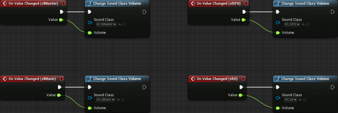
The last thing, update the construct event to call the CheckVolumeSliders, which we do before the Delay node:

That's it! See? I told it would be easy and simple! Of course, the slider widgets are a bit off in regards to the styling. We will deal with that later. Besides that, you may have noticed that the temporary styling may not be working. Well, the problem is that, for some reason, UMG seems to ignore the Tint that is set within the style variables. If you want to temporarily test menu navigation through color changing you will have to add some extra nodes after applying the stlNormal or stlSelected. Namely, theSlider -> Set Slider Handle Color and theSlider -> Set Slider Bar Color.
Themes
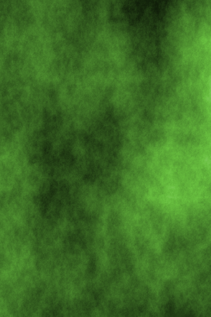
Up to this point my sample project has been using a placeholder background image, meaning that not even the one theme in the project is completed! The thing is, the next thing I want to tackle is the theme selector screen and, for that, we need at least one additional theme. The asset requirements have already been described very early in the tutorial. Nevertheless, I have replaced the placeholder background (that grey with yellow border) image with this one:
Then I have created another two themes, Alien and Modernity. For the Alien theme, the blocks and background:

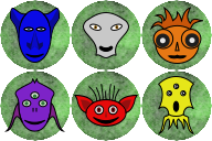
And for the modernity theme:


Once the targa images get imported into the project, the block textures have to be correctly setup, more specifically the texture group, which should be set to 2D Pixels (unfiltered). After that, three sprite assets must be created, one for each of the background images, SP_BackGeometric, SP_BackAlien SP_BackModernity. Another two sprites must be created, one for each of the empty blocks, SP_BlockAlien and SP_BlockModernity. Then the material instance for each of the new blocks. Since there isn't anything special to be done for any of the new assets, the instances can be based on the M_BlockGeometric material. Once the twelve new material instances are created, we can finally create the two new data assets, based on the theme data class, one for each new theme, ThemeAlien and ThemeModernity.
For the Block Sprite and Background Sprite just setup the newly created corresponding sprites. For the Grid Tile Set, we can just reuse TS_Grid or, if desired, create new theme specific grid tile sets. As for the sound effects, those are the new ones:
Alien, shatter and landing, respectively:
Loading
0:00.000
/ 0:00.000
Loading
0:00.000
/ 0:00.000
And the modernity, shatter and landing, respectively:
Loading
0:00.000
/ 0:00.000
Loading
0:00.000
/ 0:00.000
Then add 6 entries in each block collection. Remember to change the Bock Class to BP_Block so the particle effects are spawned when the blocks are removed from the play field. Or, if desired, create a new block class in order to create specialized behavior. Nevertheless, assign the material instance for each entry and the color that will be used when spawning the particle effect.
The last change is, of course, update the ThemeGeometric so its Background Sprite now points to SP_BackGeometric instead of the placeholder sprite. Change the two game modes (BP_GMTraditional and BP_GMTimed), specifically the Background Sprite property to use one of the new background sprites instead of the placeholder. The main menu... we will fix that shortly.
Theme Selection
With the three themes ready to be used, we can now create means to select them from within the game. That will be done through yet another helper widget, UI_ThemeSelector. The overall idea of this follows the same logic we have used with the game mode selector, that is, with two arrow buttons we "scroll" through the available themes, holding a theme counter bellow the theme information. All we will show in each theme "page" will be the name as well as a preview of the blocks that are part of the selected theme. The background image should also reflect the selected theme. Another feature is the fact that we will probably want to "remember" the last selected theme, meaning, we have to deal with save/load features.
We have quite a bit to be done but before we get into the widget editing. Let's talk a little bit about the strategy we will use. Back when we created the mode selector widget, we have used the Widget Switcher in order to switch between the game mode specific widgets. This design forces us to create a new widget for each game mode that will be spawned by the mode selector widget. We did that so we could create mode specific settings. For the theme selector we don't need all that since all we want to do is display the sprites of the blocks composing the block collection corresponding to the selected theme. There won't be any specialization associated with any theme. Instead we will have an area meant to hold the images. And, to control this image displaying we will take advantage of one helper widget that we have already created early, the UI_BlockImage.
Ok, now comes something related to how we will use the older helper widget. We can surely add six instances of this widget into the theme selector widget (we will create it very shortly, don't worry) and set the TypeID property of each one so all six images of the selected theme are displayed. But what if we create a theme with a different number of blocks in the collection? In this case, we have to work on something a little dynamic. One easy strategy would be to create a hard limit on how many blocks will be displayed by the theme selector and if the selected theme has less blocks, hide some of the image widgets. Or we can just dynamically spawn the widgets as necessary, which is exactly what we will do in this tutorial.
Time to create the new UI_ThemeSelected helper widget. As usual, delete the Canvas Panel from it and add the vertical box. The first "row" is meant to be a single text label to display the name of the theme, so add a text widget into the vertical box. Set the padding of the text to 32 and its font size to 36 so it matches what we have previously done.
Next we add one Uniform Grid Panel that will be used to hold the spawned block images. Rename this widget to GridPanel and make sure the Is Variable is checked (by default it's not). We are marking this as a variable because we will need to access it from blueprint graph in order to add the spawned block images into it. Set its left, right and bottom padding to 32 as well as its Size property to Fill.
Lastly, we add the "row" containing the two arrow buttons that will be used to "scroll" through the available themes. It is a lot easier to just copy the horizontal box from the UI_ModeSelector rather than manually adding the widgets and setting them up.
Now, before we functionality functionality, we need means to access this widget from the menu so we can iteratively test how the widget is working (or failing). So, open UI_MainMenu in order to add a new page into the widget switcher, that is, add a new vertical box into the MenuSwitcher and rename the box to SubMenuTheme. Inside this new box add one UI_ThemeSelector ans set its Size = Fill. Then copy, from another sub-menu page, the structure Horizontal Box + Icon Button in order to create the back to main menu button. Select the created button and rename it to btSubThemeBack.
At this point we do have the page containing the theme selector, but now way to access it. Let's add a button to do that. The idea is to place it between the Settings and the Help buttons in the main menu. The easiest here is to drag one UIC_TextButton into the hierarchy, between the btSettings and btHelp. Then, rename this new button to btTheme.
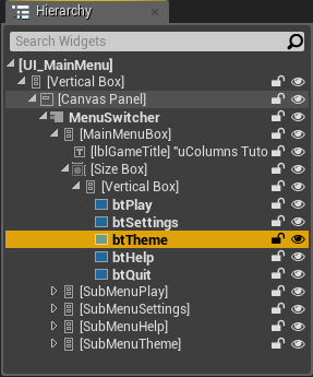
Change the top and bottom padding of the btTheme to 24 and set its label to Theme.
Now we add the functionality around the new widget page. The OnClicked event for the btTheme button should change the active widget index of the MenuSwitcher to 4:

Finally, the btSubThemeBack should have its OnClicked event connected with all the other back buttons:

We now have access to the theme selector but it doesn't have any functionality yet. So let's jump back into the UI_ThemeSelector and work on it. First let's create a binding to the text block so it displays the name of the selected theme. In our theme data we have an string property, ThemeName, that holds the name we want to display, so what we need in this function is the game theme object and then retrieve the property from it. We have already added a function in our blueprint library to obtain the theme, which is named GetGameTheme:

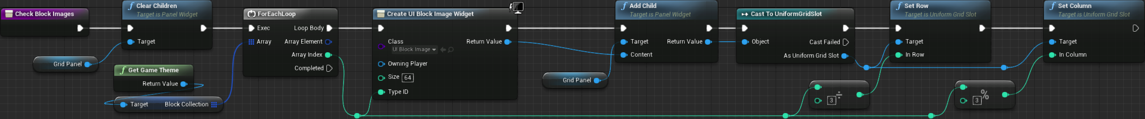
Next we have to populate the uniform grid panel with the UI_BlockImage widgets. We will do this through a new function named CheckBlockImages. In this function, the first thing that must be done is clear the contents of the grid panel. Then, we retrieve the game theme so we can access the block collection and iterate over it. At each loop iteration we create a new block image widget, add it into the panel and set the row and column within the grid.
Before showing the resulting graph, let's talk a little bit about some of its details. Because of the way we have created the UI_BlockImage widget, when we spawn it from the graph we can specify the size and the type id of the block it should display. We will set the size to 64 and the type ID will correspond to the current index of the block collection loop. Once we add the spawned widget into the grid panel we get a generic slot as a return value but we need to cast it to UniformGridSlot in order to properly set the row and column of the widget within the panel itself. Speaking of that, the idea is to "spread" the images in a "3 per row" layout. That said, in order to calculate the row we just divide the loop index by 3 and the column is computed by taking the rest of this division, which can be done using the modulus (%) operator:
Next we need means to track the available themes so we can scroll through them using the arrow buttons. First create a new array variable, of Theme Data object reference type, and name it ThemeCollection. The problem now comes to how we will populate this array. If we manually add entries into it, then it means we will have to edit UI_ThemeSelector every time we create a new theme for the project. The alternative is to query all data assets of the Theme Data type. The problem is that we don't have direct means to do that from blueprints. In other words, we will need a new C++ function, in our blueprint library, meant to output an array of theme data assets. That said, let's declare it:
// Retrive an array of ThemeData assets
UFUNCTION(BlueprintPure)
static void GetThemeCollection(TArray<class UThemeData*>& OutThemeCollection);
To implement it we will have to use the object library system. With it we can, among other things, obtain a list of assets of an specific class. Some more information regarding the object library can be found at the asynchronous asset loading documentation page. The implementation of our new function first make sure the output array is empty, by calling its Empty() function. Then we create an object library using StaticClass() from the theme data class. Since this function is meant to be called only at run time, there is no need to set the last argument of CreateLibrary() to anything different than false, although if desired it can be set to GIsEditor, as shown in the documentation. Later we request to load asset data from an specified directory, which we will give the game's root (/Game). By default the object library will search recursively. Then we have to obtain the list of assets, storing in a temporary array. With it we can finally iterate through each one, casting to UThemeData and storing the result into the output array:
void UColBPLibrary::GetThemeCollection(TArray<class UThemeData*>& OutThemeCollection)
{
   // Ensure the output gets only what is processed by this function
   OutThemeCollection.Empty();

   UObjectLibrary* theme_library = UObjectLibrary::CreateLibrary(UThemeData::StaticClass(), false, false);
   if (theme_library)
   {
      // Query the assets
      theme_library->LoadAssetDataFromPath("/Game");

      // Obtain the asset array
      TArray<FAssetData> asset_data;
      theme_library->GetAssetDataList(asset_data);

      // And cast to theme data, adding into the output array
      for (FAssetData& data : asset_data)
      {
         if (UThemeData* theme = Cast<UThemeData>(data.GetAsset()))
         {
            OutThemeCollection.Add(theme);
         }
      }
   }
}
Back to our UI_ThemeSelector blueprint we need means to map between the selected theme and the contents of the ThemeCollection array. We will do this through the usage of an integer variable, that will work as an index to access entries in the array variable. That said, create a new integer variable named SelectedThemeIndex. Then we create a new function, CheckSelectedTheme, that will be used to iterate through the entries of the array and set the SelectedThemeIndex accordingly. Basically, if the array entry is equal to the selected theme, then we set the variable to the iteration index value:

Ok, now we can initialize the theme collection array, the block image widgets as well as the selected theme index, from the Event Construct of our widget. When adding the Get Theme Collection, make sure to select the function from the blueprint library and not the blueprint variable:
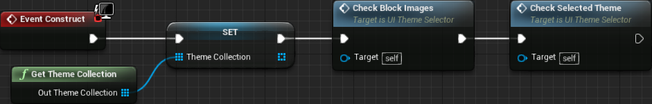
Testing the theme selector in game now will reveal the blocks corresponding to the default selected theme, but there are a few problems here. First, the visibility of the blocks may be very poor because of the background. The other problem is the spacing as well as the distribution of the block images throughout the available area. Let's first fix the background issue because it will somewhat affect the properties we have to change in order to fix the other problem. Right click the grid panel (in the Hierarchy panel) and wrap it with a border widget. We will set this border brush color to black with some transparency (alpha = 0.6) so we can still see the background image. Then zero out the top padding and set the rest to 32. Finally, Size = Fill, setting horizontal and vertical alignment to Fill. Finally we edit the grid panel itself, setting the horizontal and vertical alignment to Center, which will effectively position all images centered on the available area. This will also place all of them very close one to another, so we set the Slot Padding to 32.
Next we create a binding to the text meant to show the index of the selected theme. I have called the new function GetThemeLabelIndex. We have seem something very similar to this in the UI_ModeSelector. We will use the Format Text node with the {Selected} / {Total} text, which will effectively add two new input pins, Selected and Total respectively. In the Selected we get the value from SelectedThemeIndex and add 1 to it (remember, the indexing is zero based). As for the Total we get the number of elements in the ThemeCollection array:

Next we create a new function that we will use to update the theme display, named UpdateTheme. In it we will use a function we have created way back in part 6, SetGameTheme! This function requires an actual asset reference, which we have in our ThemeCollection array variable. The index to the correct object is the value in our SelectedThemeIndex. Once that is done we rebuild the block image widgets, otherwise the displayed images will not reflect the new theme selection:

We can now work on the arrow buttons. The logic behind them is exactly the same we have used in the UI_ModeSelector widget, which has been described back in part16. Because of that I'm not going to describe them, just show the graph:

If we test the game now, we will be able to select the theme, the selector will correctly display the theme's blocks and if we enter the game itself we will have the new blocks and background image. However, while in the main menu, switching themes will not update the background image. Indeed, we didn't add anything to update that while in the main menu. In fact, the main menu level is still holding the original placeholder sprite actor we have added at the very beginning of the tutorial! Still, we did create a background actor specifically to hold the background image so we could easily update the displayed sprite.
So, the first thing we have to do is delete the sprite actor from the main menu level and add a BackgroundActor in its place (remember that you can find it from the object pallette when the All Classes category is selected). The background preview from the main menu level will be a little bit more limited than the other maps unless we add extra code specifically for that, which we will not do in this tutorial. Nevertheless, you can still select the actor itself and set the Source Sprite property to any one of the background sprites. Make sure the actor's location is set to (0, 0, 0).
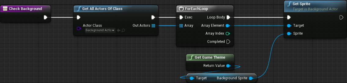
Continuing, next we need a new function in the UI_ThemeSelector that will be used to update the background actor. Name this function CheckBackground. In it we query all actors of class BackgroundActor and call the SetSprite function on each one, providing the background image specified in the selected theme.
In the Event Construct add a call to this function, after calling the Check Selected Theme. By doing so, when the game is launched this script will be called and the background image will be set:
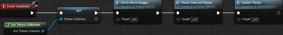
Finally, we have to update the Update Theme function, in order to call Check Background so we actually update the background image.

Save/Load Theme Preference
Now we can select the theme and have the background image reflect the change from within the main menu. However, there is still one problem here, that is, when we change the theme, the next time the game is launched we will be with the default theme and not with the last selection. We will take advantage of the BP_SaveData in order to perform this saving/loading, meaning that we have to add a new variable to this blueprint. Name this variable GameTheme and set its type to ThemeData object reference. Once the blueprint is compiled, it's possible to select the default value for this variable. In my case, I just selected ThemeGeometric.
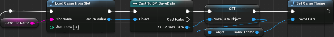
Since we are handling the save object from the game instance, BP_GameInstance, we will add the next part of the blueprint graph in there. From its Event Init, going to the True branch, when the save slot is loaded we then retrieve the saved theme (with Get Game Theme) and then apply it into the game instance using the blueprint library Set Game Theme (make sure you are using the function and not the variable within the save data object). In the image bellow only the relevant branch is shown:
In the same way we have created custom event functions to save the other variables in the slot file we will create one to save the theme. The operations are exactly the same, that is, we set the variable in the save data object and then use the Save Game to Slot function in order to write to the file. The input type of this function must be set to Theme Data object reference. The graph looks like this:

The next thing is to call this event function when the theme selection changes, that is, after we update the theme within the previous and next arrow buttons in the UI_ThemeSelector. We can, and will, update the Update Theme function in order to do this task. Still, we have to observe two things:
- We are calling
UpdateThemefrom 3 different places in the widget blueprint,Event Construct,btPrevious ClickedandbtNext Clicked. The construct event is called when the widget is built or, in other words, when the game is launching or going back to the main menu. We don't want to save (write) to the file in this situation, meaning that we need a flag in the function input. - Analyzing the
UpdateThemefunction, we are calling theSetGameThemefunction, which we are also doing from the game instance initialization. We only need to call this function if we are changing the theme, not when loading. This means, we need an input flag specifying if we are meant to set the game theme or not.
Both tests are actually the same, meaning that we can use a single flag, IsChanging. In other words, open the Update Theme function and add one boolean input named IsChanging. In the function itself, we branch from this flag and if it's false then we know the main menu level is loading and we don't have to set the game theme nor save the theme selection to the file. We will "break" the graph through the usage of the Sequence node. From its first execution pin we perform the conditional operations and then from the other pin we call the two functions, Check Block Images and Check Background which are meant to update the widget contents and must be done regardless:

After this function is updated, looking at the graph, all 3 places we are calling it should default leave the IsChanging as false (unchecked). From the construct graph we want it to remain this way, since we are not changing anything, just loading data. However, when we click the btPrevious or btNext, we will want to save the change, meaning that we have to check the IsChanging flag:

In this part we have continued with some polishing, beginning by revisiting the particle effect and adding a little bit of color to them.
We have added sound and video mode settings into the game, although we can't test the save/load just yet.
The placeholder background image has finally been replaced. I know it's not top notch art but hey, it's better than that flat grey with yellow borders!
Then, two new themes were developed and added into the game, with one widget allowing us to select the desired one. The game even remembers the last selected theme! The saving/loading system that has been used work even in the play in editor mode.
Yet, there are quite a bit of things we still have to work on. Perhaps the most notable problem right now is the readability of the text on top of the background images. In the next part we will continue focusing on even more polishing, which includes the readability of the text.