Part 16 - More User InterfaceApril 11, 2019
Although we are still missing one feature of the traditional game mode, increase the falling speed of the player piece, we can at least have some fun with the game at its current state. In this part we will continue working with the UI, which includes adding some functionality to the main menu, making the overall thing less generic looking and design a system that will allow us to display some game mode specific elements within the HUD.
Back to Main Menu
In part 14 when we started working with the user interface, we have added a very rudimentary main menu with a temporary graph for the Play button, which just transitioned into the InGameDefault level map. It's time to work a little more with this menu. It will be a lot easier if you load the MainMenu map in order to test things.
Let's begin with the game title, lblGameTitle. We first center it and set the Text property to uColumns Tutorial. It looks a bit small, so expand the Font property under the Appearance category and increase the size to, say, 36. It's also a bit too close to the top border and the button bellow it. To fix that, we can add some padding. It doesn't matter if you edit only the Top and Bottom or all for sections of the padding. In my case I have just set to 32 in all sections. With this we have a horizontally centered game title with some spacing between it and the top border as well as the first button bellow it.
Now let's work with the button layout. First let's restrict the width of the buttons. We could set a padding value in then but that will be very difficult to achieve consistent sizes across different available areas. For an example, we have more width within the main menu than in the pause menu. The easiest here is to add a size box, inside of it another vertical box and then move the buttons into this inner box. With that, we can select the size box and override the width, maybe width = 300. After setting this, it will not make any different unless we also change the size box Horizontal Fill property to be Center.
At later moment we will also change the height of the buttons, increasing a little. For now let's add some spacing between the buttons as they are way too close one to another. Let's change the Top and Bottom padding on all buttons. First set to 24 and then, to further increase the spacing between the btQuit and btHelp, select the btQuit and set its Top to 72.
Sub-menus
We have designed the main menu on top of the Widget Switcher so we can add completely different sets of widgets inside the same space, much like multiple tabs. Soon in this part there will create some blueprint graph used to change between each sub-menu. For now, let's start actually working with those additional "pages". Add 3 Vertical Box widgets, directly onto the MenuSwitcher. It's easier if you drag&drop in the Hierarchy panel. Rename each box, so it becomes easier to reference them throughout the tutorial (and to easily locate them in during the project development), to SubMenuPlay, SubMenuSettings and SubMenuHelp, respectively. Since we won't directly access those boxes, there is no need to enable the IsVariable checkbox for any of them. Notice that when you click each of those new boxes, the designer tab will update the preview and will temporarily set the active widget in the MenuSwitcher. This will allow us to easily work with each sub-menu.
In the SubMenuPlay we will want to provide a mode selector and possibly some difficulty settings. And of course, a button to bring us back into the main page. It will be much easier if we create a helper widget to select the game mode and instance it within the main menu. The settings sub-menu is meant to provide some options like audio volume and window mode. Again, it will be much easier through a helper widget. And, of course, we have the help sub menu, which will be done through a helper widget. With all that said, create three widget blueprint assets named UI_ModeSelector, UI_Settings and UI_Help. For the moment leave those empty.
Now, within the UI_MainMenu, add one UI_ModeSelector into the SubMenuPlay box, one UI_Settings into the SubMenuSettings box and one UI_Help into the SubMenuHelp box. For each of those three new widgets, set the Size property to Fill so they take the entire available area. Bellow each of those widgets we will want a "row" that will contain the back to main menu icon button and, if necessary, some other buttons.
That said, add one horizontal box into each of the sub-menu boxes, SubMenuPlay, SubMenuSettings and SubMenuHelp. Set the padding of each of those new boxes to 32, in all directions. Add one icon button (UIC_IconButton) into each of these new horizontal boxes. Rename those buttons to btSubPlayBack, btSubSettingsBack and btSubHelpBack, respectively. Those names were chosen to tell from which sub-menu they are coming back to the main page.
One last change is that we will want one extra icon button within the SubMenuPlay -> HorizontalBox that will be used to perform the transition into the relevant level, based on the selected game mode. That said, add another icon button into that box and name it btSubPlayGo. With it select, change its Size property to Fill and then the Horizontal Alignment to Right, so the button is placed at the right side of the "row".
Menu Navigation
We now have all of the navigation buttons of the main menu in place, they just don't do anything yet. Let's fix that now, one by one. In all cases we should add the OnClicked event (again, it's a green "+" button which appear near the end of the Details panel when the widget is selected in the Hierarchy panel).
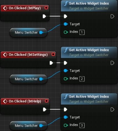
Let's first add the graph for btPlay, btSettings and btHelp which are in the MenuSwitcher. The graph is pretty simple, all we have to do is Get Menu Switcher and from it, Set Active Widget Index. With this we are effectively "asking" the switcher to display the specified widget. The indices are 1, 2 and 3, for Play, Settings and Help sub-menus, respectively. Now remember that btPlay already has temporary graph, so just remove it (the Open Level node).
For the btQuit, just add the Quit Game node and that's it! I will not show the graph because we already have seen one that looks exactly like this in the previous part when we started working on the pause menu.
Finally, the bt*Back buttons. All of them are meant to bring us back into the main page of the main menu, which is index 0 of the MenuSwitcher. Interestingly we can condense all execution pins into a single Set Active Widget Index node:

While we can test if the navigation is working we have no means to distinguish between the Settings and Help sub-menus. As soon as we start working in the helper widgets then we will be able to properly test the menu navigation. Or, if you are impatient, you can perform some minor temporary layout changes and/or extra widgets just to help with that. We won't do so in this tutorial, though.
UI Images
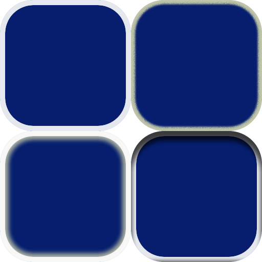
Before we start working on the helper widgets, let's add the UI image textures and start styling our user interface. Albeit a little bit outdated, the documentation provides some interesting information regarding asset creation for UI. I do recommend a read there as much of the setup I present here is based on the recommendations from the documentation. Nevertheless, I have create 4 512x512 images to serve as the base of the button, representing normal (top-left), selected (top-right), hovered (bottom-left) and pressed (bottom-right) states:
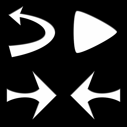
Those 4 images will be used to render the common states of all of our buttons. Shortly we will see how. And then, we have the icon buttons, the Back, Previous, Next and Go (or, play). For that, I have created the four icons, each 512x512 with fully transparent surroundings (in the image bellow I have painted the transparent areas with black so the images become visible in the page):
Once the 8 targa image files get imported into the project, under Textures/UI directory, select all of them, right click and then Asset Actions → Bulk Edit Via Property Matrix. From there, change the Texture Group from World to UI (under Level of Detail category), Mip Gen Settings to NoMipmaps (also under Level of Detail) and Compression Settings to UserInterface2D (RGBA) (under Compression category). Those are the flag settings recommended to keep the images "crisp and without compression artifacts" (according to the already linked documentation). Save (CTRL+S) and then close the property matrix editor.
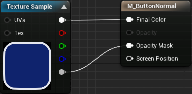
I have found out that if we directly apply the texture images within the button style settings, we have little control over the margins of the images. If we use materials instead, then we get full control over the mentioned property. That said, let's create 4 materials, one for each button state, M_ButtonNormal, M_ButtonSelected, M_ButtonHovered and M_ButtonPressed. It doesn't matter which order the materials are edited, all of them will need the exact same setup:
- Click the output node so the material settings can be changed.
- Change
Material DomainfromSurfacetoUser Interface. - Change
Blend ModetoMasked, so the "transparent" areas of the textures remain transparent. - Add a texture sample and connect its first output pin into the
Final Colorof the material output. Then take theAlphaoutput pin of the texture into theOpacity Maskof the material node. - Click the texture sample node and select the corresponding texture image.
Bellow is the material graph for the M_ButtonNormal:
The only change from material to material is the texture selection within the texture sample node. We could have created a master material and used material instances for this purpose, however separating the materials in this way gives the opportunity to create some different effects for each button state. While we won't do anything of that in this tutorial, it's nice to know about this possibility!
Ok, now it's time to apply those images into our buttons in the UI. Open the UIC_TextButton and select the theButton. We will first directly edit its style so we will be able to preview it in the designer panels when instancing the UIC_TextButton. Expand the Style property and then the 3 states, Normal, Hovered and Pressed. Within each of those states there is an Image property. Set them to M_ButtonNormal, M_ButtonHovered and M_ButtonPressed, respectively. Yes, M_ButtonSelected will be used later. Once the materials are assigned to the button, the white border seems a little bit too small (in the preview). We can fix this by increasing the Image Size property from 32x32 to 64x64 under each of the 3 states of the Style property.
After compiling this widget blueprint, every instance of the text button should be updated to this new styling. However, it's only in the preview, the game will not reflect it yet because we have to edit the internal variables. Before we do so, let's restrict the height of the button. In order to do so, wrap the text widget (txtLabel) with a Size Box. Set its padding to 0 and only enable the Height Override. In there, after a bit of experimentation I have found that 52 looks good (again, experiment if you don't like the result). Effectively we are restricting the menu text buttons to be 300x52. There is one last detail, the text is not vertically centered. We can fix this by changing the text's vertical alignment to Center rather than Fill.
Now we can edit the stlNormal and stlSelected variables. Copy the entire style we have directly set in the theButton into the stlNormal and stlSelected. There is no need to change the stlNormal, however we set the stlSelected to use the "selected material". For that, change the Normal section of the style to use the M_ButtonSelected material instead. If you test it now, the selected button is barely different from the others. So, in the stlSelected, normal state, besides selecting the M_ButtonSelected material we also change the tint to something like Yellow (RGB = 1.0, 0.95, 0.25). After this change, hovering over the button and then taking the cursor away may not look very consistent. So, apply the same tint color to the Hovered state of the stlSelected. Compiling the blueprint and testing again should give a much more consistent look and behavior.
Hey, you said it's working but nothing happened, the buttons still look like the un-styled ones when in-game!. Ok, don't panic! The problem is that we have added our style variables with default temporary values and instanced the buttons within the menu and the pause menu. When that happened, Unreal Engine serialized the values and never used the new ones. We can easily fix this, by first selecting the stlNormal variable and, near the end of the variable settings, there is an arrow pointing down to expand into advanced settings. This will reveal the Transient property which, if enabled, will disable the serialization and will load the default values we have set. Perform this property change within the stlSelected variable. Compile the widget again and test. It should work now!
There is one detail to note here. At first the keyboard and gamepad navigation will not work unless we give keyboard focus to one of the buttons. Later in the tutorial we will automatically give focus to one of the buttons when the menu is displayed. Another problem happens when one of the buttons has focus and we click outside of any button, focus will be removed from any of our buttons and keyboard/gamepad navigation will not be possible again unless we restore the keyboard focus. We will also deal with this at a later moment in the tutorial.
Now let's style the icon buttons (UIC_IconButton). Simply copy the style settings from the text button into the icon button. Remember to set the stlNormal and stlSelected variables to be Transient otherwise the styling might not work because of the serialization. Anyway, you probably have noticed that we can't properly preview the style in the designer panel from within the UIC_IconButton. That happens because the Image widget fully covers the button and it's white. An easy fix for that is to select the Image brush variable and set its tint to be fully transparent. The problem with this is that when we instance the icon button we will also have to edit the tint to remove the transparency. A more robust, and optional, solution involves editing the construct blueprint graph and testing if the Image property is holding a valid image. If valid, we directly set the brush like before, otherwise we apply a brush that is fully transparent:

Applying the Icons
Open again the UI_MainMenu and let's apply the icons into the icon buttons. In this case we don't need any material, just select the button in the designer panel and change the Image -> Image property. Select the btSubPlayBack and apply the back icon into the mentioned property. Do the same with the other 2 "back buttons". Then select the btSubPlayGo button and apply the play icon into the image property.
Testing now will indeed show the icons but those buttons seem a bit too small, not to mention their height seem inconsistent with the other buttons. Let's fix this. Open the UIC_IconButton again (if it's not open already) and then change the width and height override values within the size box that is already in place. Previously we have set them to 32x32. To keep consistency with the height of the text buttons, let's change those to 52x52.
Remember the stlNormal and stlSelected in the UIC_TextButton transient setting? Do the same here otherwise we will have the same problem described early. The styles from the UIC_TextButton can be directly copied here. Once that is done and the widget blueprint is compiled we can set the icons within the UI_MainMenu. Select the btSubPlayBack then locate the Image property. Expanding it will allow editing of the Image. Select the image icon used for the back. Nothing shows, right? That's because the default alpha of 0.0 is set by default. Change it to 1.0 and the icon will appear. If you prefer to have that white box in the preview but never have to change the alpha then you can revert the Image variable in the UIC_IconButton to have its Tint.Alpha = 1.0.
After testing the current layout I do consider the icon buttons to be a bit too small. Let's make their height match the height of the other buttons, while keeping them "square". So, open the UIC_IconButton, select the size box widget and change the Width and Height override to 52.0 instead of the 32 we had set before. Now apply the icon image to the rest of the buttons we have in the UI_MainMenu, which are btSubPlayGo, btSubSettingsBack, btSubHelpBack and btSubThemeBack.
The main menu now should be looking like this:

You probably noticed that some texture details seems to be missing. That's because of the auto exposure setting which gives eye adaptation effects to the rendering. At a later moment we will deal with this. And yes, we will also deal with the readability of the text, which seems pretty bad from this screenshot.
Mode Selector
We can navigate through the main menu but the sub-menus are empty. From the main menu, the play sub-menu is meant to provide a game mode selection, as well as mode specific settings. And them, from this sub-menu, pressing the Go button should finally load the relevant in game level map. Currently we only have a single game mode, meaning that we will have limited testing capabilities here. Now notice the mode specific settings. This, in other words, means we will most certainly need one widget for each different game mode.
The sub-menu is using the empty helper widget we have created early in this part, UI_ModeSelector. We will create a system where this helper widget will hold a list of the available game modes and will give means to select the desired one. Adding a new game mode into this system will be as simple as creating the mode's widget and then updating a helper asset that we will create soon.
Each game mode will need some information associated with, like its name, the level map name and widget holding the specific settings. We will use the mode name so it will be displayed on screen. The level map is necessary so when we click the Go button we know which map has to be opened. The widget will be dynamically created so we can "easily" create/remove game modes.
The first approach that comes to mind is the creation of an array inside the UI_ModeSelector and whenever we add a new game mode we have to update the contents of this array. I want a somewhat simpler method, in the sense of having less blueprint nodes to deal with. Instead, the goal is to edit a separated asset and the helper widget will "automatically" deal with that. We create one (C++) struct, FGameModeData containing the necessary data (name, level, widget asset) and a data asset containing an array of FGameModeData. By doing this, we populate the array through the data asset editor and that's it, provided we implement the UI_ModeSelector to correctly use that data asset.
All that said, let's create a new file to hold our data asset, GameModeData.h. As with the ThemeData, we won't need a .cpp file. First we begin with the include list:
#pragma once

#include "CoreMinimal.h"
#include "Block.h"
#include "Engine/DataAsset.h"
#include "GameModeData.generated.h"
Then we add the struct that will hold the actual needed data. Hopefully the code is self explanatory enough:
USTRUCT(BlueprintType)
struct FGameModeData
{
   GENERATED_USTRUCT_BODY()
public:
   FGameModeData()
      : SettingsWidget(nullptr)
   {}

   // This is the name that will be displayed in the game mode selector UI
   UPROPERTY(EditAnywhere, BlueprintReadWrite)
   FText ModeName;

   // Specifies the class of this block. It can be overridden if creating special blocks
   UPROPERTY(EditAnywhere, BlueprintReadWrite)
   TSubclassOf<class UUserWidget> SettingsWidget;

   // Name of the map level associated with this game mode
   UPROPERTY(EditAnywhere, BlueprintReadWrite)
   FName MapLevelName;
};
Finally, the data asset itself, holding an array of FGameModeData. We will directly deal with an instance of this class in order to control the list of game modes within the game:
UCLASS(BlueprintType)
class UCOLUMNSTUTORIAL_API UGameModeCollectionData : public UDataAsset
{
   GENERATED_BODY()
public:
   UGameModeCollectionData()
   {}

   // Game mode collection
   UPROPERTY(EditAnywhere, BlueprintReadWrite)
   TArray<FGameModeData> ModeCollection;
};
Trying to compile the project now will probably result in linking error. The thing is, we have to add UMG into the dependency list. We have previously changed the building file, uColumnsTutorial.Build.cs so the project could use Slate code. More specifically, we un-commented the line:
PrivateDependencyModuleNames.AddRange(new string[] { "Slate", "SlateCore" });
This line should also contain UMG, so it now looks like this:
PrivateDependencyModuleNames.AddRange(new string[] { "UMG", "Slate", "SlateCore" });
Building now should work correctly and we can add the new data asset:
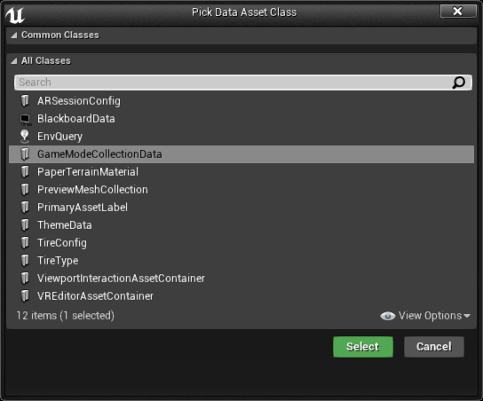
I have added this asset directly in the Blueprints directory and named it GameModeList. Editing this asset should allow us to add elements into the ModeCollection array. Because we only have one actual game mode we will need some other means to test our collection system. So, we first add 4 temporary "dummy game modes", with different names:

We will want to access this collection from the UI_ModeSelector helper widget. So, for that, open the graph tab in its editor so a variable can be added. Name it ModeCollection and set its type to Game Mode Collection Data. Once that is done it's necessary to compile the widget so the default value can be set, in this case, the GameModeList asset.
UI_ModeSelector now contains a variable which directly points into our new data asset. Let's work in the widget itself. The idea is to have one text displaying the game mode name, two arrow buttons to navigate through the available game modes and an area to hold the widget specified in the GameMode struct. As we have done with the previous helper widgets, delete the default canvas panel, since it's not needed, then add a vertical box.
As mentioned, we want to display the name of the game mode, so we use one text widget. Next we increase the font size, something like 36 (the same value of the title). In order to create some spacing between the text and borders, as well as the widget that will come bellow, we add some padding, 32 (again, the same we have used in the title). In a moment we will bind to its text property.
Next the area meant to hold the game mode specific widget. We will do this through the widget switcher, so add one into the box and name it ModeSwitcher. By default it's set to be a variable and it's correct, since we will need to access this object. We want the switcher to occupy the entire available space, so set its Size property to Fill instead of Auto. We will probably want to create some spacing between the widget and the borders, so set the Left and Right padding values to 32.
Lastly, we want the two icon buttons used to change the game mode, with a "text" in between. This text will mostly be used to display the number of available game modes as well as the "index" of the currently selected one. So, add one horizontal box and, into it, icon button, text and another icon button. Name the first button btPrevious and the other btNext. Set the image brush of both buttons accordingly. Select the text in the middle and set it's Size property to Fill so it expands and take the btNext button to placed at the right side of the row. To center the text, set it's vertical alignment to Center and then either it's Horizontal Alignment to center or Justification = Center. Just for previewing purposes, change the text to 0/0 (we will bind to it shortly).
The play sub-menu should look something like this (it's not pretty but it works):

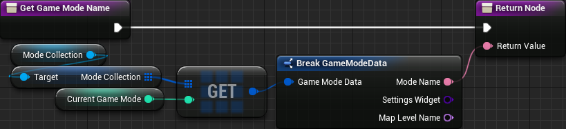
We need means to track the currently selected game mode (within the UI_ModeSelector), which should be a simple integer value. Indeed, it's just an index that points into the game mode collection as well as the mode switcher widget. That said, add a new integer variable and name it CurrentGameMode.
Now, let's bind to the game mode's name text. In this function we want to retrieve the ModeName property from the mode collection's array, which is referenced by our ModeCollection variable. We get an specific element from this array using the CurrentGameMode index, breaking the struct and plugging the field into the output of the function:
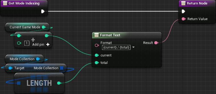
Next we create the binding to the indexing text. In there, in order to make things easier, we use the Format Text node which create input pins for each section of the input text that is surrounded by {}. In this case, we want something in the format {current} / {total}. Now remember that CurrentGameMode is a 0-based index, so we add 1 to the output value:
The play sub-menu should now look like this:

Let's add functionality into the previous and next buttons. If wanted, we could disable the previous button if in the first game mode and do something similar with the next button if the currently selected mode is the last one. Instead of that we will allow the buttons to "warp around", that is, if in the first game mode, clicking the previous button will select the last game mode.
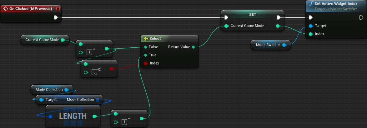
First add the event handler for the btPrevious. In there we subtract 1 from the CurrentGameMode and if the result is smaller than 0 then we set the result to the last index of the mode collection, which is its size - 1:

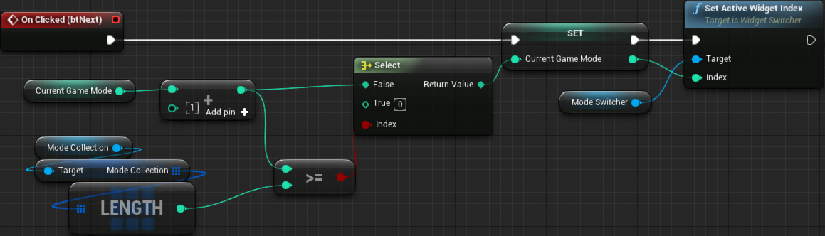
For the btNext the logic is very similar. We add 1 to the CurrentGameMode and if the result is bigger than the last index of the mode collection, then we reset the variable to 0. In this case, if the resulting value of this addition is equal to the Length of the collection, then it's already bigger than the last index, so we use the >= comparison:

Generic Game Mode Settings
We can now use the buttons to select the desired game mode. However, you may have noticed that we didn't change the Active Widget Index in the ModeSwitcher widget. The first reason for that is that we didn't add blueprint graph to populate the switcher itself. Basically, we want to dynamically spawn a new widget class, based on the Settings Widget property within the game mode data collection. But what if this property is empty (set to None) like all 4 of them are at the moment? If we don't add anything into the switcher on those cases we completely break our indexing. We could create some kind of mapping but, really, it will be a lot easier to just create some "generic" widget that will be used if nothing is associated within the game mode data.
All that said, create a new helper widget named UIGM_Generic (game mode settings - generic). Remove its canvas and add a text, setting it to Generic game mode settings.
Just so we can test the blueprint logic, create yet another helper widget, this time UIGM_Traditional (game mode settings - Traditional). Remove the canvas panel. While we will work on it later, add a temporary text widget and set it do display Traditional game mode settings.
Now edit the GameModeList asset and change only the first entry's Settings Widget property to UIGM_Traditional. Change the name of this entry to Traditional:

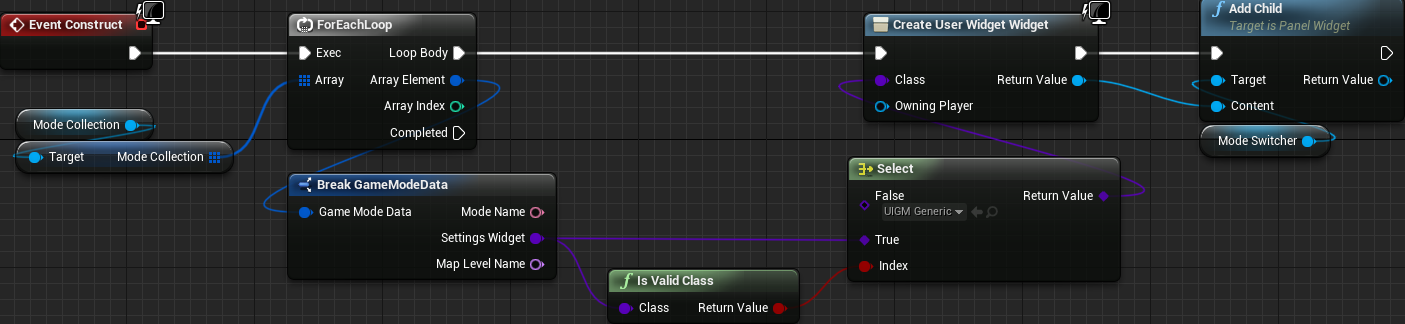
Back to the mode selector, we want to populate the mode switcher widget. From the event construct we iterate through each entry in the mode collection, using the For EachLoop node, and test if the specified widget class is valid or not. If not, we create the generic widget, otherwise the specified one:
Of course, now right after updating the CurrentGameMode variable, within the previous and next buttons OnClicked event, we use the variable's new value to set the active widget in the switcher:
And:
The last thing we have to add now is one function that will be used to retrieve the name of the map that we want to load when the Go button is pressed. That said, crate a new function, GetModeMap and add one output of the type Name. All we do in this function is use the CurrentGameMode variable as the index input to the Get node of the ModeCollection asset. And directly plug the name property into the output of the function.

If you are wondering how to get that last node without a break node, you can right click the output pin of the Get node and then Split Struct Pin. Nevertheless, the game mode selector widget is done! At a later moment we will work with some proper game mode settings widgets and update the mode collection data asset accordingly.
The Pause Menu
Early in the tutorial we did add a pause/game over menu and while it does have some functionality it lacks any actual layout. Let's fix that. The great thing here is that our buttons are already styled. Well, almost since we have to restrict the width. Since our main menu still doesn't transition into the in game map, make sure to open the relevant map so the changes can be properly tested.
The very first thing to be done in this menu is to cover the playfield when the pause menu is shown. Granted, we don't want to give the ability to pause the game and the player studying the grid in order to properly position the dropping piece. The easiest in this case is to place some opaque widget behind the buttons, so it covers the entire play field. Looking at the widget hierarchy, the entire pause menu is inside of one widget switcher. So let's wrap this switcher (right click it and then Wrap with...) with one border widget. This will effectively place the border as a parent of the switcher in the hierarchy. Remove the padding of this border and edit the brush color (Appearance category) to the desired one. In my case I have set to almost black (RGBA = 0.01, 0.01, 0.01, 0.98).
After doing that, if you try to play the game now the border will be covering the play field, even without pausing the game. The problem is that our logic to hide the menu is affecting MenuSwitcher and we have placed it into a border which is constantly visible. Luckily the solution is very easy. That function that we have created and bound to the Visibility property of the Switcher can be directly used with the new border's visibility. While we can keep the visibility binding on both widgets, in my case I removed it from the MenuSwitcher since the visibility setting affects children widgets.
Now, the spacing. Select the text used for the menu title and set the padding to 32. To follow the same spacing between the buttons we have used in the main menu, select all of the buttons and set the Top and Bottom padding to 24. The height of the buttons is correct since that was setup within the UIC_TextButton. However we have to fix the width. At this point you may be asking why the width is not being restricted in the widget itself. The reason is that soon we will need text buttons that aren't as wide as the ones we have added until now. Nevertheless, to restrict the width now we have to wrap the vertical box holding the buttons with a Size Box and override the width, setting to 300, just like the buttons in the main menu. Remember to change the horizontal alignment of the size box to Center otherwise the size box will continue using the entire width of the border.
The pause/game over menu is now using the same style we have added into the main menu. It looks something like this:

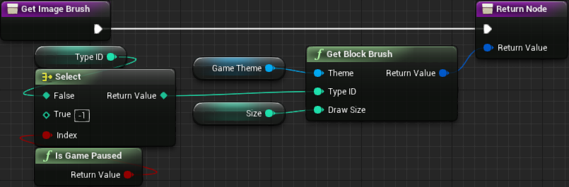
The Next Piece is being shown even with the game paused, but ideally it also should be hidden. The "fix" is relatively simple. We edit the UI_BlockImage helper widget and change the GetImageBrush function that we have bound into the image's brush. In there we check if the game is paused and use that to control the block type ID input of the Get Block Brush node. In other words, if the game is paused we send -1 as the type ID, which will return the empty block image, otherwise we use the type ID stored in the widget:
Custom HUD
While we do have a "HUD" displaying some information, what if an specific game mode requires some extra UI that is not required by another game mode? An example? Ok, suppose we create a new game mode where there is a time limit. Of course, we will want to display the remaining time somewhere! But our Traditional game mode does not require this kind of information.
One possible approach is to create a player controller and a HUD widget for each game mode. This means duplicating a lot of layout and blueprint graph. Then, if we find a bug in one graph that is duplicated, fixing that will not be ideal since we would have to repeat the fix everywhere. Instead we can create a system where the game mode specify one or two extra custom widgets that will be dynamically spawned by the HUD, UI_InGame.
One of the areas where we can add something is bellow the next piece blocks. Because we restricted this widget to use 40% of the height, we have quite a bit of vertical space for extra UI. In this case, we add a vertical box into the ExtraBox, named ExtraBoxCustom, setting it to be a variable and its size to Fill. The idea is to make this new box fill the entire remaining space inside the ExtraBox and then, when building the widget, we check if the game mode contains any widget for this spot and, if so, dynamically create it and add into the ExtraBoxCustom. And we try to ensure some spacing between the widget and the borders by setting the padding to 32 (again, the same value we have been using throughout the entire UI layout). If you want to temporarily test this area, add a colored border inside of ExtraBoxCustom, completely filling it and check inside the game (remember to remove the border later).
Now, at the top panel we have some horizontal space without use, at least for the moment. Perhaps we might add a "High Score" section to display the highest score. If desired we could compact everything (current score + highest score) into a "single column" and leave the rest of the horizontal space for additional UI elements. While this would give us plenty of space and some flexibility regarding what to place in there, it would also not look very good, specially for game modes not requiring anything in that spot. Instead, let's divide the top section into 3 equal sections, the player score, highest score of the game mode being played and then the custom widget space.
We don't have the widget meant to occupy the second section. Create the helper widget, UI_HighScore, and leave it empty for now. We will come back to this widget at a later moment in the tutorial, when we start to deal with the high score system. Now in the UI_InGame add one UI_HighScore into the TopBox box. Of course nothing will be shown in the preview because the widget is empty.
Now let's create an spot for the custom widget. Add a vertical box into the TopBox and name it TopBoxCustom. Don't forget to make it a variable as we will refer to it from the blueprint graph.
Now, we want to divide the top box into 3 equal parts, which is not happening right now. Besides that, we want some spacing between them as well as the borders. To do that, on each of the three widgets within the TopBox, we have to change the following properties:
Padding = 32(on all directions)Size = FillHorizontal Alignment = FillVertical Alignment = Center
If you want to test the layout now, add temporary borders, one into the UI_HighScore and another into the TopBoxCustom box. Nevertheless, the Score text may seem a bit off (misaligned), not to mention that it's a bit small. So, edit the UI_PlayerScore and increase a little the font size to 36 on both text widgets, while setting the justification of the Score to center, with Size = Fill.
After doing all this, each widget has its own section in the top area of the HUD. The next step now is to allow us to specify the custom widgets in the game modes. That will be done through two private properties within our AGameModeInGame class:
// Specify a custom widget element that will be placed in the top are of the HUD
UPROPERTY(EditAnywhere, Category = "User Interface", meta = (DisplayName = "CustomHUDTop"))
TSubclassOf<UUserWidget> mCustomHUDTop;

// Specify a custom widget element that will be placed in the extra area of the HUD
UPROPERTY(EditAnywhere, Category = "User Interface", meta = (DisplayName = "CustomHUDExtra"))
TSubclassOf<UUserWidget> mCustomHUDExtra;
We sure want to obtain those values from the blueprint, so we add two public functions meant to retrieve them:
// Obtain the custom HUD widget meant to be placed at the top are
UFUNCTION(BlueprintPure, Category = "User Interface", meta = (DisplayName = "Get Custom HUD Top"))
TSubclassOf<UUserWidget> GetCustomHUDTop() const { return mCustomHUDTop; }

// Obtain the custom HUD widget meant to be placed at the "extra" area
UFUNCTION(BlueprintPure, Category = "User Interface", meta = (DisplayName = "Get Custom HUD Extra"))
TSubclassOf<UUserWidget> GetCustomHUDExtra() const { return mCustomHUDExtra; }
All that is left now is check if any of those is valid and, if so, create them adding into the proper spots within our UI_InGame widget. To make the graph simpler from the construct node, let's create a new blueprint function, AddCustomHUD, and call it right after we bind the game over event. In this function we add a sequence node and in each execution pin we check one of the properties. We already have a variable holding the game mode object, GameModeRef. From it we call the two new functions, GetCustomHUDTop and GetCustomHUDExtra, checking if their return values are valid. From the true of the branch we create the specified widget and add as child of the relevant *BoxCustom widget:

Then, the updated event construct graph:

In this part we have done quite a few improvements to the user interface, specially in the main menu functionality. We have also created a system (two actually) that allows us to use custom widgets to create additional UI elements based on the requirements of specific game modes. The way this system works gives the opportunity to focus on the specifics of those game modes while not needing to edit the main widgets to make them "recognize" those new elements. In the next part we will begin to see how to actually use the structure we have just built.